


The Old Guard: The Power of the Perfect Match
For decades, the pinnacle of formal elegance, particularly in British society, was the perfectly matching set. Think of a tailored dress with a coordinating jacket, accompanied by a handbag and shoes all dyed to the precise same shade. This approach signals
polish, tradition, and an effortless, almost pre-packaged propriety. It’s a look perfected by the late Queen Elizabeth II, whose monochromatic outfits were a masterstroke of visual branding and classic decorum. There's an undeniable safety in the matching set; it eliminates guesswork and guarantees a look that is, by all traditional metrics, 'correct.' It says you understand the assignment and have the resources to execute it flawlessly.
The New Elegance: Coordination Over Matching
However, a scroll through the best-dressed lists from recent Ascot gatherings reveals a clear shift. The women turning heads aren't the ones in head-to-toe cerulean, but those who are artfully combining colors, textures, and prints. The new north star of style isn't matching, but coordinating. The difference is crucial. Matching is about finding identicals; coordinating is about finding complements. It requires a more confident eye and a deeper understanding of color theory and personal style. This move away from rigid uniformity is a quiet rebellion that broadcasts sartorial intelligence. It suggests the wearer isn't just following a dress code, but creating a look entirely her own within its boundaries.
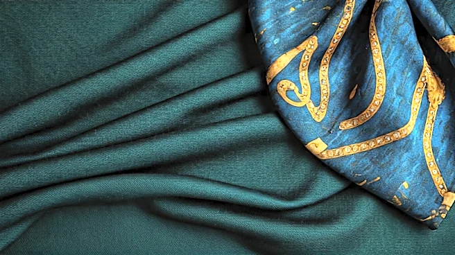
The Tonal Approach: A Study in Shades
The most accessible and popular way to break the matching rule is through tonal dressing. This involves layering different shades, tints, and tones of a single color family. Picture a guest in a pale blush dress, accented with a vibrant raspberry fascinator and softer rose-colored heels. The effect is cohesive and intentional, yet far more dynamic and visually interesting than if all three pieces were the exact same shade of pink. The Princess of Wales, Kate Middleton, is a master of this technique, often pairing a dress in one hue with a hat or accessories in a slightly darker or lighter version of the same color. It creates depth and sophistication, proving that you don't need a perfect match to look perfectly put-together.
The Calculated Clash: Finding Harmony in Contrast
For the bolder fashion enthusiast, the calculated clash offers a high-reward strategy. This isn't about throwing random pieces together, but about finding an unexpected harmony between seemingly disparate colors or prints. It might be a primrose yellow dress paired with a lilac hat, two colors that sit beautifully together on the color wheel but are rarely worn in tandem. Or perhaps it’s a delicate floral print dress grounded by a sharp, geometric-print clutch. The key is to find a subtle link between the clashing elements—a shared undertone, a similar scale of print, or a complementary intensity. When done right, it’s a power move that looks chic, modern, and utterly self-assured.
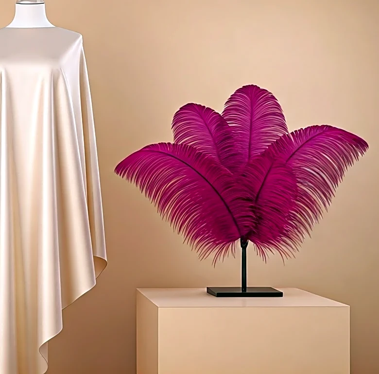
The Neutral Anchor: Grounding the Look
Another elegant strategy is to use a neutral as an anchor point. A vibrant, intricately patterned dress can be overwhelming if paired with equally bold accessories. Instead, the chicest attendees will ground the look with a timeless neutral. A crisp cream hat, a simple navy clutch, or classic black patent pumps can provide a sophisticated counterpoint to a riot of color or print. The neutral doesn't compete for attention; it serves as a quiet, elegant frame that allows the statement piece to truly shine. This method demonstrates an understanding of balance and restraint—often the most difficult and impressive style principles to master.