




It Starts with a System
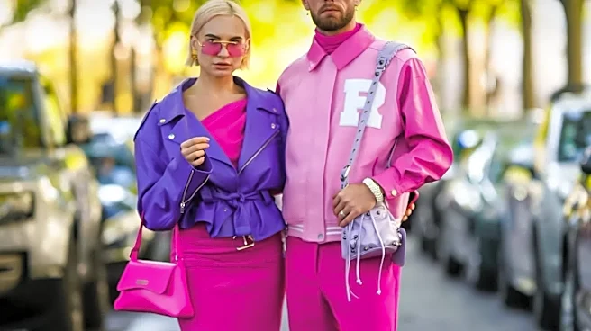
The secret to the Copenhagen girl’s masterful use of color isn’t that she ignores the rules; it’s that she reimagines them. Many outfits subtly follow a classic design principle: the 60-30-10 rule. But where a traditionalist might use beige, gray, and
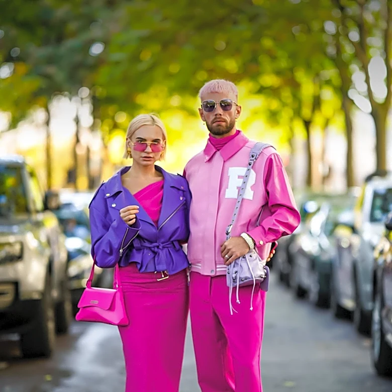
a pop of navy, the Danish It-girl uses, say, butter yellow as her 60% base, a rich chocolate brown for her 30% secondary color, and a sharp, electric blue as her 10% accent. The formula provides structure, while the audacious color choices provide the personality. This framework allows for bold experimentation that still feels balanced. It’s a controlled chaos, where one dominant color sets the stage, a secondary color supports it, and a final, often surprising, pop makes the whole look sing.
Texture Is the Great Equalizer
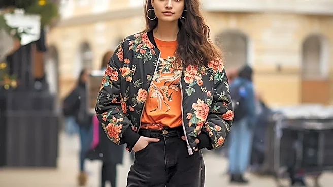
A key reason these vibrant combinations work is the heavy reliance on texture. Pairing a slick, patent leather trench with a chunky wool knit, or a delicate silk slip with rugged denim, creates tactile contrast that grounds the look. The different surfaces—smooth, rough, soft, and structured—prevent the colors from feeling flat or overwhelming. Texture adds depth and sophistication, making an outfit of seemingly clashing colors feel rich and considered. A bright green knit sweater doesn't just feel like a loud color choice; it feels like a cozy, deliberate statement when paired with the sleekness of a vinyl skirt. This mix of materials is a core tenet of Scandinavian style, which prioritizes quality fabrics that are both functional and beautiful.
Embrace the 'Weird Neutral'
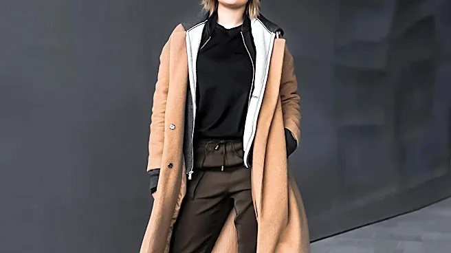
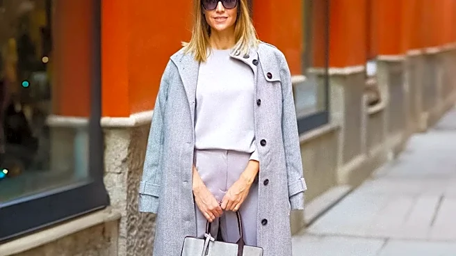
While traditional neutrals like black, white, and beige certainly have their place, the Copenhagen aesthetic expands the definition. Shades like olive green, dusty lavender, buttery yellow, and even chocolate brown are often used as the grounding base of an outfit. These “weird neutrals” are more interesting than their classic counterparts but serve the same purpose: they provide a sophisticated canvas for bolder pops of color. A pair of chocolate brown trousers, for instance, can anchor a bright lime green top, making the combination feel edgy and modern rather than cartoonish. This approach allows for a colorful palette that still feels earthy and wearable, a signature of modern Scandi style.
The Psychology of 'Dopamine Dressing'
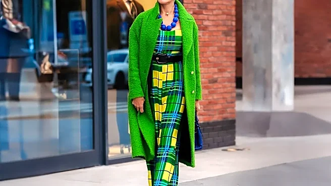
Underpinning the entire aesthetic is a philosophy known as “dopamine dressing”—the idea of wearing clothes that boost your mood. The vibrant, saturated colors are chosen not just for their visual impact, but for the joy and energy they evoke. This approach prioritizes personal expression and emotional well-being over adhering to fleeting trends. The confidence required to pair fuchsia with red or cobalt with emerald is what ultimately sells the look. It feels intentional because it is intentional—a conscious choice to wear what feels good. The clash isn't a mistake; it's a declaration of defiance against a muted landscape and a celebration of individuality.
Grounded in Practicality
For all its playful color, Copenhagen style remains deeply rooted in practicality. The most whimsical, color-blocked outfits are almost always anchored by comfortable, functional pieces. Think oversized blazers, relaxed-fit trousers, and, most importantly, sensible footwear like chunky sneakers or flat boots. This blend of the extraordinary and the everyday is what makes the style so aspirational and achievable. The practicality keeps the look from veering into costume territory. It’s fashion for people who have places to be—often on a bicycle. The sensible foundation gives permission for the riot of color on top, creating a look that’s both expressive and perfectly suited for real life.