



The Animated Blueprint
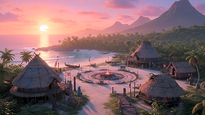
In Disney's 2016 animated classic, Motunui isn't just a place; it's a paradise defined by its color palette. The island glows with warm, saturated oranges, lush greens, and earthy browns. This isn't accidental. Animation artists use a "color script" to
map a film's emotional journey. For Motunui, these colors were chosen to evoke safety, community, and tradition. The warm tones of the village contrast sharply with the vast, sometimes intimidating blues of the open ocean, reinforcing Moana's internal conflict between her duty and her calling. Moana's own orange-red attire connects her directly to the island's enthusiastic and creative spirit. The animators created a world that felt enveloping, pushing the already rich colors of the Pacific Islands into a slightly caricatured, hyper-real version of paradise. The goal was to make you want to jump right into the screen.
The Live-Action Hurdle: Light vs. Pigment
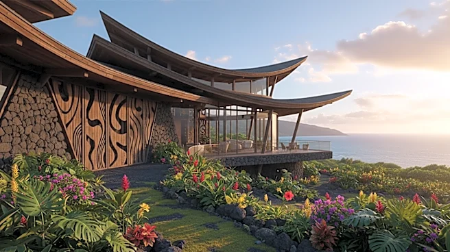
Here’s the fundamental challenge for the live-action production team: a color that glows on a screen (emitted light) behaves very differently than a color on a physical object (reflected light). That perfect, luminous orange that looks so inviting in the animation could look flat, or even garishly bright, under the real Hawaiian sun. Translating animation to live-action is notoriously difficult because animation isn't bound by the limits of biology or physics. The production designer's job isn't to perfectly match the animated hex codes, but to translate the feeling those colors evoked. According to director Thomas Kail, the goal was to make the fictional Motunui feel so real you'd try to find it on a map. This means selecting real-world materials—thatch, wood, woven fabrics, and native plants—that capture the island's spirit. The textures of these materials interact with natural light, creating a depth and reality that CGI alone often struggles to replicate.
More Than a Look, It's a Feeling
Building Motunui is about more than aesthetics; it's about cultural authenticity. The colors in Polynesian art are deeply symbolic. In many cultures, red signifies power, leadership, and the sacred, while green represents life, nature, and healing. Yellow can stand for joy and abundance. These aren't just decorative choices; they are a visual language that connects the story to a rich heritage. The original film's creative team conducted extensive research to ensure this respect was woven into the fabric of the story, a commitment the live-action team has promised to continue. For the new film, this means costume designer Liz McGregor's creations must be more than just copies; they have to be intricate and beautiful representations of the culture. The success of the set, therefore, hinges on its ability to feel like a place rooted in real-world tradition, even within a fantasy narrative.
It's All About the Light
Ultimately, the color of Motunui will be defined by how it is lit. The look of the animated island was as much about light and shadow as it was about the pigments themselves—the golden hour glow during village ceremonies, the dappled light filtering through palm fronds, the cool blues of the pre-dawn ocean. The cinematographer and lighting designers for the live-action film face the task of recreating these painterly moods. They have to sculpt with light to ensure the vibrant costumes and earthy tones of the village don't get washed out in the harsh tropical sun, a criticism already leveled at early promotional materials by some fans. They must capture that magical quality that makes Motunui feel both like a real, functioning village and a place of mythic importance. The set itself is just the canvas; the final image is painted with light.