




1. Bad Lighting Drowns Everything
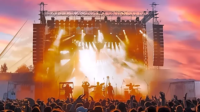
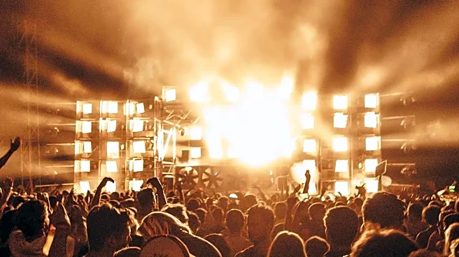
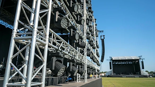
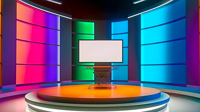
Lighting isn't just about visibility; it’s about creating depth, mood, and focus. The most common error is flooding the stage with flat, uniform light. This washes out textures, makes expensive materials look dull, and eliminates shadows that give objects
shape and dimension. Another pitfall is using overly saturated or chaotic colors that distract from the performance instead of enhancing it. A high-end look comes from layering light: using a mix of key lights, fill lights, and backlights to sculpt performers and set pieces, separating them from the background. Smart lighting design guides the audience's eye and makes a simple set look dynamic and rich.
2. Ignoring Scale and Proportion
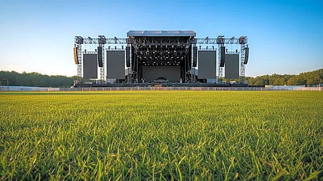
A design can look cheap when the elements are out of proportion with the stage, the venue, or each other. A tiny podium on a massive stage looks lost, while oversized furniture on a small stage feels clumsy and restrictive. This mistake shows a lack of planning and makes the entire production feel amateurish. Professional designers use scale models and digital renderings to ensure every piece is perfectly sized to create a balanced and intentional composition. The goal is to create a world that feels believable and immersive, where every object relates correctly to the space around it.
3. Using the Wrong Materials
Nothing screams 'cheap' faster than poor material choices. Think shiny, plastic-looking fabrics when a deep matte velour was needed, or a backdrop that's visibly wrinkled and poorly stretched. Some materials, like basic drywall or flimsy foam board, are difficult to finish professionally and can look shoddy under stage lights. The pros know that a simple design executed with high-quality, appropriate materials will always look more expensive than an elaborate design made from the wrong stuff. This includes not just fabrics and set pieces, but also flooring. A scuffed or inappropriate floor can undermine the entire look.
4. Overcomplicating and Cluttering the Stage
An expensive budget can tempt designers to add more and more elements, but an overcrowded stage often just looks messy and distracting. When the audience's eye doesn't know where to land, the core message or performance gets lost in the noise. A strong design has a clear focal point. Every item on stage should have a purpose. The principle of "less is more" is crucial; a few well-chosen, impactful pieces will always read as more sophisticated than a jumble of competing props and decorations. Removing clutter allows the key elements—and the money spent on them—to truly shine.
5. Poorly Integrated Technology
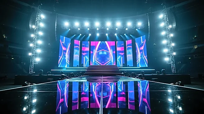
Modern stage design often involves LED screens, projections, and other tech. When done well, it's magical. When done poorly, it's a disaster. Visible cables, awkwardly placed screens that create bad sightlines, or projections that wash out performers are common culprits. Technology should feel like an integrated part of the world on stage, not a last-minute add-on. This means hiding the hardware, ensuring content is crisp and properly mapped, and seamlessly blending digital elements with physical set pieces. When tech draws attention to its own clunkiness, it cheapens the entire experience.
6. Neglecting the Finishing Details
The difference between professional and amateur is often in the details. Even a multi-million dollar set can be undermined by small, sloppy mistakes. This includes wrinkled backdrops, visible seams on fabric, scuffed paint on the stage floor, or props that aren't properly finished. These tiny flaws signal a lack of care and precision, which the audience perceives as cheapness, regardless of the actual cost. A production that looks expensive is one where every edge is clean, every surface is perfect, and every element has been thoughtfully considered from top to bottom.