


The Uniform of the Outsider
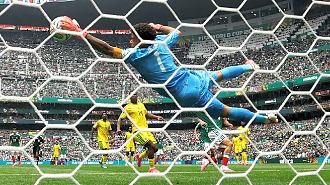
First, let's establish a basic truth: goalkeepers are different. They are the lone wolves of the beautiful game, the only players allowed to use their hands, confined to a specific zone, and tasked with the singular, heart-stopping job of preventing goals.
Their uniform reflects this fundamental otherness. By rule, it must be a different color from their teammates’ and the opponents’ kits to avoid confusion. But over time, that rule has evolved into a creative license. The keeper’s jersey isn’t just a functional requirement; it’s a canvas for personality. While the ten outfield players present a united front, the keeper stands apart, visually and psychologically. Their shirt is the first clue that you’re not dealing with just another player; you’re dealing with the team’s specialist, its last line of defense, and often, its biggest character.
The Golden Age of Glorious Kitsch
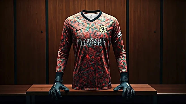
If you want to understand the soul of the goalkeeper shirt, you have to go back to the 1990s. This was the peak, the absolute zenith of keeper kit expression. It was an era of glorious, unapologetic chaos. The undisputed king was Mexico’s Jorge Campos, a short-in-stature but huge-in-personality keeper who famously designed his own neon, zig-zagging, kaleidoscopic monstrosities. Inspired by the surf culture of his native Acapulco, his kits were a riot of pink, yellow, and electric green. They weren’t just shirts; they were statements. In Europe, England’s David Seaman wore a multi-colored creation at Euro '96 that looked like a collaboration between a fauvist painter and a bag of Skittles. These jerseys were deliberately loud, baggy, and impossible to ignore. They screamed individuality in a sport that prizes the collective. They were, in a word, perfect.
A Psychological Weapon
There was a theory, popular at the time, that these audacious designs served a tactical purpose. The idea was that the disorienting patterns and vibrant colors could act as a psychological distraction for an onrushing striker. In that split second before a shot, the chaotic visuals might make the keeper seem larger, drawing the eye and causing the forward to aim their shot closer to the body. While there’s little scientific proof to back this up, it speaks to a deeper truth about the position. Goalkeeping is as much a mental game as a physical one. A keeper needs to command their box, to project an aura of invincibility. A shirt that looks like a high-art fever dream can be part of that arsenal. It says, “I’m not like the others. I’m unpredictable. You don’t know what I’m going to do next.”
The Modern Malaise of the Template
Sadly, the wild creativity of the '90s has largely vanished. Today, most goalkeeper kits feel like a contractual obligation. Major manufacturers like Nike and Adidas often roll out a standard template in a handful of colors—highlighter yellow, fluorescent green, a basic black—and assign it to all their sponsored teams. The U.S. keeper might be wearing the exact same design as Brazil's or France's, just with a different crest. It’s efficient, but it’s soulless. The jersey has been reduced from a bespoke piece of art to a catalog item. It’s an afterthought for the brands, and therefore an afterthought for the fans. We’ve lost the storytelling, the personality, and the sheer fun that made the keeper kit a unique piece of soccer folklore. We’ve traded Jorge Campos’s self-designed masterpieces for off-the-rack conformity.