




Beginner: Matching a Foundation Shade
A beginner often walks into a store, swatches a few foundation stripes on their hand or jawline, and picks the one that seems to disappear. The focus is entirely on the shade's depth—is it light, medium, or dark? This shade-first approach is why foundation can
sometimes look like a mask, creating an unflattering, flat, or ashy appearance. Even if the depth is right, ignoring the subtle, underlying color of your skin is the most common pitfall. The result is often a visible line of demarcation at the jaw and a color that just feels slightly 'off' all day.
Pro: Matching the Skin's Undertone First
A professional makeup artist knows that skin has two color components: the surface tone (the shade) and the undertone (the subtle color beneath the surface). Undertones are typically cool (pink, red, or blue), warm (yellow, peach, or golden), or neutral (a mix of both). A pro always identifies the undertone first. They know a warm-toned person will look sallow in a cool foundation, while a cool-toned person might look unnaturally orange in a warm one. By matching the undertone, the foundation becomes a true extension of the skin, creating a seamless, natural look that requires less product and blending.
Beginner: One Concealer for Everything
For many beginners, concealer is a one-size-fits-all solution. They typically buy a single tube, usually a shade or two lighter than their skin, and apply it to undereye circles, red blemishes, and dark spots. While this can sometimes work for brightening, it often fails at true correction. Applying a light concealer over a dark purple undereye circle can result in a chalky, gray area, and using it on a red pimple can make the spot look ashy without actually hiding it. It's a strategy of covering, not correcting.
Pro: Using Color Correctors to Neutralize
Professionals see the face as a canvas that first needs to be neutralized. They turn to the color wheel, a fundamental tool in their kit. To cancel out undereye darkness, which is often blue or purple, they'll use a complementary color like peach or orange before applying concealer. For redness from acne or irritation, they'll dab a small amount of green corrector to neutralize the red. This neutralizing step means they need far less concealer on top, resulting in a flawless finish that looks like perfect skin, not layers of makeup.
Beginner: Muddy or Monochromatic Eyeshadow
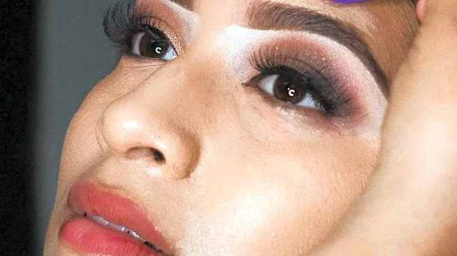
A beginner often approaches an eyeshadow palette by either using only one color across the lid or attempting to blend multiple shades that end up looking muddy and undefined. They might pile on analogous (similar) colors without a clear purpose, losing all dimension. Without understanding how colors interact, it's easy to over-blend, causing vibrant shades to turn into a murky brown or gray. The result is a look that lacks punch and can actually make the eyes look smaller.
Pro: Building Dimension with Purposeful Color
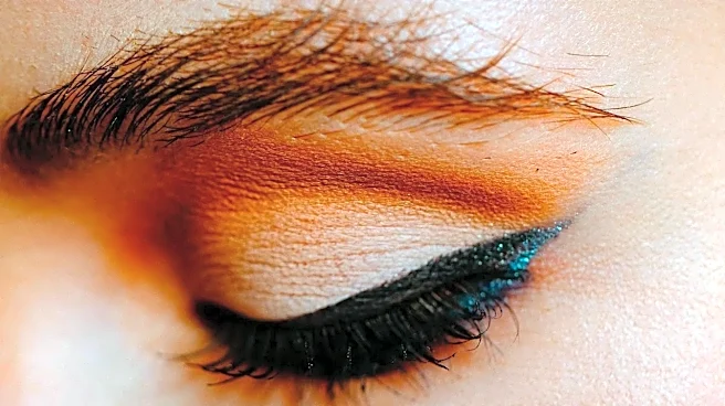
A pro uses color with intention to create shape, depth, and impact. They understand that complementary colors (opposites on the color wheel, like purple and yellow) make each other pop, which is perfect for making eye color stand out. They also use analogous colors (next to each other on the wheel) to create smooth, harmonious gradients. But the key is placement and technique; they use darker, less saturated colors to create shadows and define the crease, and lighter, brighter values to highlight and bring areas forward. Their blending is strategic, ensuring each color remains distinct yet seamlessly transitioned.
Beginner: Choosing Colors in Isolation
It's easy for a beginner to fall in love with a bold lipstick, a shimmery blush, and a vibrant eyeshadow quad as separate items. The mistake happens when they try to wear them all at once without considering the overall harmony. This can lead to a look where the features compete for attention rather than working together. A cool-toned pink blush might clash with a warm, coral lipstick, creating a discordant and unflattering effect that the wearer can't quite put their finger on.
Pro: Creating a Cohesive Color Story
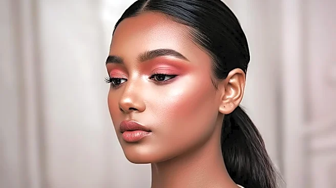
A professional thinks about the entire face as a single composition. They decide on a 'color story' before they even begin. Will the look be warm, cool, or neutral? If they opt for a bold, warm-toned red lip, they will likely choose a blush and eyeshadow in the same warm family to create harmony. Alternatively, they might use a bold lip as the focal point and keep the rest of the face intentionally neutral to provide balance. This holistic approach ensures the final look is polished, cohesive, and intentional, rather than a collection of random products.