

Birth of the Cool: The San Francisco Scene
The story of the modern festival poster begins in the mid-1960s, drenched in the psychedelic haze of San Francisco. Promoters like Bill Graham of the Fillmore Auditorium and Chet Helms of the Avalon Ballroom needed to advertise shows for bands like the Grateful
Dead and Jefferson Airplane. But they didn’t commission simple, legible flyers. They hired a group of artists—Wes Wilson, Victor Moscoso, Rick Griffin, Alton Kelley, and Stanley Mouse, now known as the “Big Five”—who were busy creating a new visual language for the counter-culture. Inspired by Art Nouveau, Dada, and, of course, the mind-expanding effects of LSD, they created posters with swirling, melting, and often illegible typography. The letters themselves became part of the art. These posters weren't just informational; they were experiential. They were a visual puzzle, a filter. If you could decipher the details, you were part of the in-crowd. The art was a direct reflection of the music—complex, anti-establishment, and demanding of your full attention.
From Art to Advertisement and Back
As rock music exploded into a stadium-sized industry in the 1970s and 80s, the poster’s role shifted. The bespoke, artist-driven psychedelia gave way to more commercial forms. Posters often became dominated by a simple photograph of the band, with clean, bold text listing tour dates. They were functional, but the soul had been commercialized. They were advertisements, not art objects. However, a rebellious spirit was brewing in the underground. The punk and indie rock scenes of the 80s and 90s revived the poster as a form of raw expression. Using photocopiers and a DIY cut-and-paste ethos, bands like Black Flag and Fugazi created raw, immediate posters that captured their aggressive, anti-corporate sound. This movement reminded the world that a poster could be more than a glossy photo; it could be a statement of identity.
The Modern Festival Renaissance
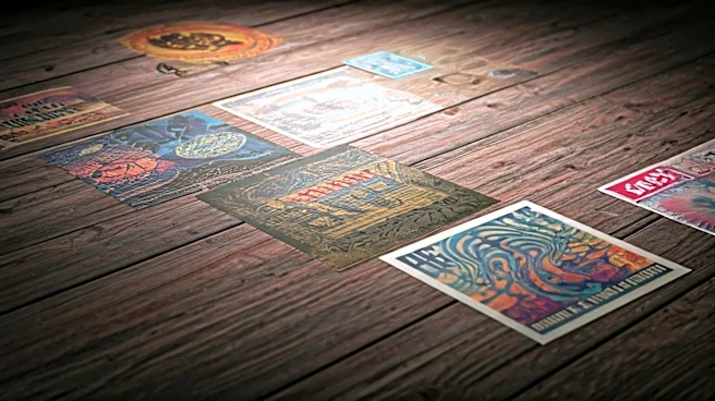
The turn of the millennium brought the rise of the destination music festival. Events like Coachella, Lollapalooza, and especially Bonnaroo became cultural pilgrimages. As fans sought tangible ways to commemorate these experiences, the poster found its new calling: the limited-edition collectible. Festivals began commissioning unique, screen-printed posters for each year, often in signed and numbered runs. Suddenly, the poster wasn’t just a flyer you ripped off a telephone pole; it was a piece of merchandise you waited in line for, a piece of art you had professionally framed. For Bonnaroo, a festival built on a communal, slightly psychedelic ethos inherited from the jam band scene, the poster became a perfect totem. It captured the spirit of “The Farm” in a single image, a visual summary of four days of music and mud.
Why the Bonnaroo 2026 Poster Still Matters
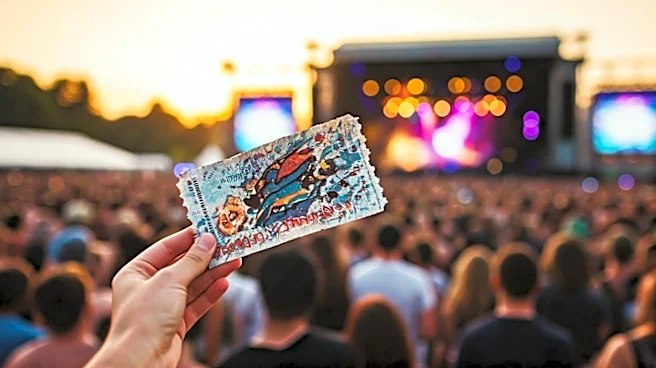
So, let’s imagine it’s 2026. Your Bonnaroo ticket is an NFT, the lineup was announced via a TikTok filter, and your friends are all watching a livestream from home. Why would you still want a physical poster? Because it’s an anchor. In a world of fleeting digital content, the poster is a permanent, tangible record of a cultural moment. It’s proof you were there. It’s a work of art that connects you to the history of the form, from the Fillmore to The Farm. A great festival poster isn’t just a list of band names; it’s a vibe, an aesthetic, a snapshot of a collective memory. It’s the one thing that won’t get deleted, lost in a sea of digital photos, or disappear after 24 hours. The design of that hypothetical 2026 poster will matter because it will be tasked with capturing the essence of an experience that technology can augment but never fully replace.