
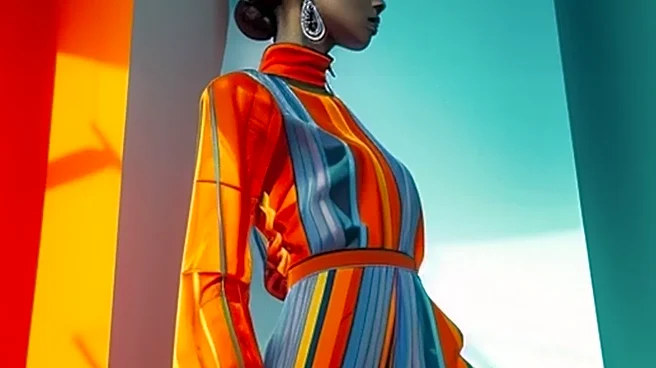
The Slow Fade of the Pantone Proclamation
Remember when every season was crowned with a single, must-have hue? Millennial Pink, Gen-Z Green, or a very specific shade of buttery yellow that suddenly appeared everywhere. This top-down color declaration, once a pillar of trend forecasting, is losing
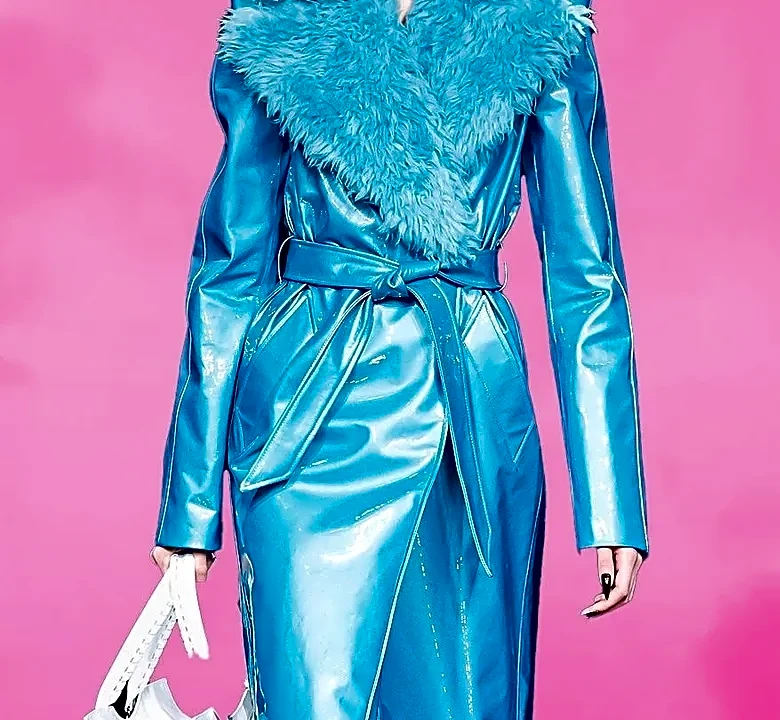
its grip. On the Milan runways, designers are rejecting the idea of a simple, universal mandate. Miuccia Prada and Raf Simons, for instance, delivered a Prada collection built on the idea of “clarity” and stripping away “useless design.” This philosophy is the antithesis of chasing a fleeting, decorative color trend. Instead of splashing one singular shade across their collection, the focus has shifted to more intellectual and personal approaches to building a palette. The message is clear: dressing well is no longer about blindly adopting a pre-approved color, but about understanding how to wield it with purpose.
The Power of a Single-Tone Statement
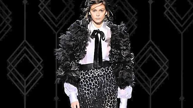
One of the most compelling stories from Milan isn't about a new color, but a new way of wearing old ones: head-to-toe. Tonal and monochromatic dressing dominated, with designers exploring the depth you can achieve by layering varied textures and shades within the same color family. At Gucci, the strategic use of monochromatic looks was curated to project a sense of “quiet elegance.” Fendi, under its new creative direction, leaned into a sober, almost severe palette heavy on black and parchment tones, proving that a lack of bright color can create an even stronger mood. Even Milan's street style stars are embracing the concept, opting for transitional autumn looks built around earthy greens and warm browns. This technique requires more thought than simply buying a bright pink coat; it’s about creating visual interest through nuance and texture, making the wearer, not a trendy color, the center of attention.
Conversations in Unlikely Colors
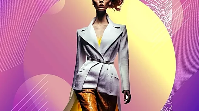
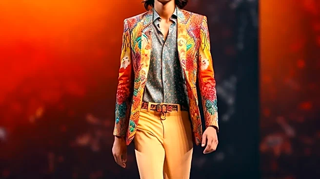
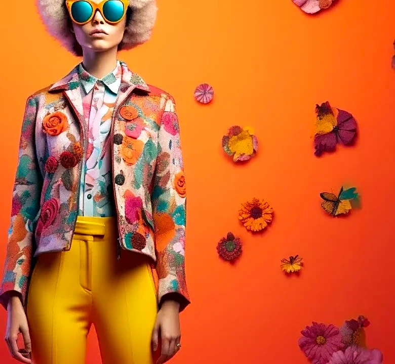
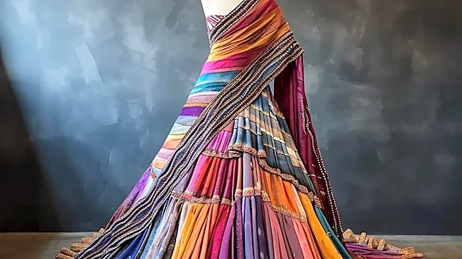
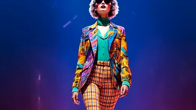
If designers weren't committing to one color, they were making two colors do the work. The most exciting chromatic moments came from unexpected, almost dissonant pairings that somehow worked beautifully. Instead of a standalone shade, the trend is the combination itself, a kind of color-blocking for the aesthetically advanced. Recent Spring 2027 runways have been a masterclass in this, offering up surprising duos that feel fresh and directional. Think of the rich plum paired with a grassy green seen at Tory Burch, or a bold cobalt blue styled with a zesty lemon yellow. These aren't safe, complementary tones; they’re confident, slightly off-kilter choices that create a visual dialogue. This approach signals a shift toward a more playful and individualistic form of expression, where style is found in the confidence to pair a grape purple with a grapefruit orange, simply because it feels right.
When the Newest Thing Is Nothing New
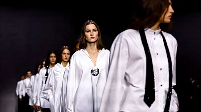
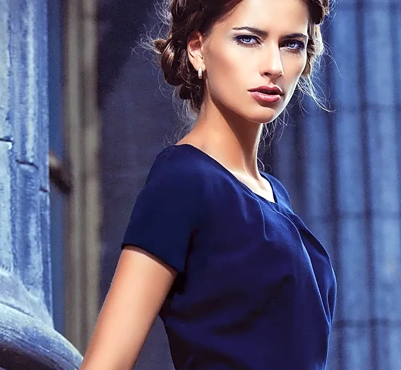
Perhaps the most radical color lesson from Milan is the rise of the non-color. Instead of chasing vibrant, attention-grabbing hues, many collections found their strength in grounded, sophisticated neutrals. But these weren't the boring beiges of seasons past, used merely as a backdrop. Here, shades of stone, ivory, chocolate brown, and deep navy were the main event. This embrace of a refined, timeless palette speaks to a collective desire for longevity and quiet luxury over fleeting novelty. By focusing on these enduring shades, designers draw attention to silhouette, tailoring, and material quality. It’s a confident move that suggests the most fashionable color is the one that lasts, the one that anchors a wardrobe, and the one that doesn't scream for attention. It’s a quiet rebellion against the very idea of a disposable seasonal “It” shade.