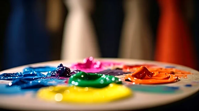


An Injection of Joyful Yellow
One of the most immediate takeaways from recent London showcases has been the unapologetic use of bright, optimistic colors—particularly sunny yellows, zesty limes, and vibrant oranges. This isn't just about aesthetics; it's a direct psychological play.
In the world of color psychology, yellow is the ultimate mood-booster. It's associated with happiness, energy, and warmth. After several years of global uncertainty and anxiety, designers are prescribing a dose of sartorial sunshine. This phenomenon, often called “dopamine dressing,” is the conscious choice to wear clothes that elevate your mood. On the runway, a head-to-toe yellow look isn't just a design statement; it's an act of deliberate optimism, a signal that we're ready to embrace joy and be seen after a period of withdrawal. It’s a vote for confidence and a defiant stand against gloom.
The Search for Stability in Earth Tones
Running parallel to the brights is an equally strong story told in muted, earthy tones. Think olive green, rich terracotta, sandy beige, and deep chocolate brown. If the brights are about shouting for joy, the earth tones are about seeking a quiet sense of calm and stability. These colors ground us. They connect us subconsciously to nature, resilience, and authenticity. In a world of digital overload and fast-paced trends, a palette of grounded, natural colors feels safe, reliable, and timeless. For designers, it’s a way to communicate longevity and thoughtful consumption, subtly pushing back against the frantic pace of fast fashion. For the wearer, these colors offer a sense of security and understated elegance. They don’t scream for attention; they command it quietly, radiating a cool, collected confidence that feels incredibly modern.
Power Plays in Red and Purple
No color commands attention quite like red. Its appearance on the London runways is a perennial statement of power, passion, and vitality. A flash of crimson or a full scarlet gown is a designer’s tool for creating a focal point and conveying unmissable energy. Psychologically, red is known to increase heart rate and evoke strong emotions. It’s the color of action, desire, and determination. But a more nuanced story is being told with shades of purple. Pantone’s much-discussed “Digital Lavender” has been creeping into collections, representing a different kind of power. This softer, cooler hue speaks to a desire for wellness, serenity, and digital escapism. It bridges the gap between the physical and virtual worlds, embodying a calm, hopeful vision of the future. Where red is a primal shout, this new purple is a soothing, tech-infused hum—both powerful, but in distinctly different ways.
It’s Not Just Hue, It’s Feeling
The psychological story of color goes beyond the specific shade. Texture and finish play a massive role in how we perceive and emotionally respond to a garment. A glossy, patent leather red feels aggressive, futuristic, and daring. The exact same shade of red in a soft, matte cashmere feels comforting, luxurious, and intimate. London designers are masters of this interplay. The rise of sheer fabrics, for instance, adds a layer of vulnerability or etherealness to a color. A metallic sheen can make a simple color feel celebratory and futuristic. By manipulating texture, designers can add depth and complexity to their color messages. They aren’t just choosing a color; they are crafting a multi-sensory experience designed to evoke a specific feeling, whether it’s the slick confidence of liquid silver or the cozy security of a chunky-knit brown.