

The Anchor Color Rule
This is the single most important principle and the true 'trick' to making any combination look intentional. When pairing a printed piece with a solid one, the solid bottom or top must match one of the secondary colors in the print. Don't just default
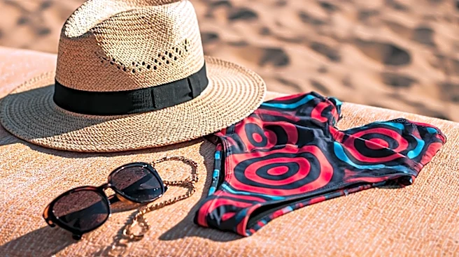
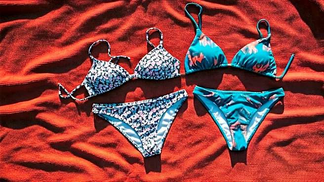
to black or white unless they are genuinely part of the pattern's color story. For example, if you have a floral top with splashes of navy, coral, and cream, don't pair it with a random pink bottom. Instead, pull out the navy and pair it with a solid navy bottom. This 'anchor color' instantly creates a visual connection, making the two separate pieces look like a thoughtfully curated set. It tells the world, 'I did this on purpose.' This works in reverse, too. Have a pair of striped bottoms with green and white? A solid green top will look far more polished than a generic black one.
Play with Print Scale
Mixing two prints can feel like advanced-level fashion, but it’s surprisingly easy if you follow one guideline: vary the scale. The key to avoiding a chaotic, clashing mess is to pair a large, bold print with a small, delicate one. Think of it as creating a visual hierarchy. Let one print be the star and the other the supporting act. For instance, you could pair a top with wide, graphic stripes with a bottom featuring a tiny, micro-floral pattern. Or try a bold, oversized leopard print top with a subtle pin-dot bottom. What makes this work is that the smaller print reads almost like a texture from a distance, so it doesn't compete for attention. Just make sure both prints share a common anchor color to tie them together, and you’ll look like a seasoned stylist.
Balance Your Silhouettes
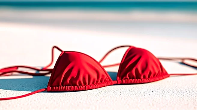
A great look is about more than just color and pattern; it’s also about shape and proportion. Use your mismatched pieces to create a balanced silhouette that flatters your frame. The general rule is to pair a 'busy' piece with a 'simple' one. If you have a top with lots of ruffles, ties, or intricate details, pair it with a clean, classic, and simple bottom. A sleek, high-waisted brief or a simple string bikini bottom will let the top be the focal point. Conversely, if you have a statement bottom—perhaps with a belted waist, side-ties, or a bold pattern—pair it with a minimalist top, like a simple triangle or bandeau style in a solid color. This prevents your look from becoming visually overwhelming and ensures the overall effect is chic and harmonious, not chaotic.
Master Strategic Color Blocking
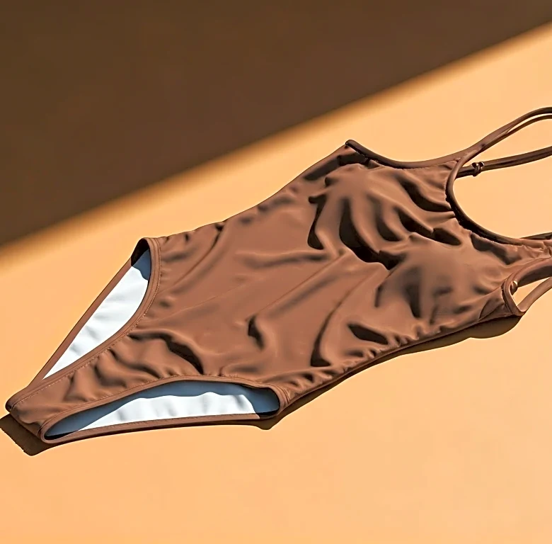
You don't always need a pattern to make a statement. Mixing two solid-colored pieces is a modern and sophisticated way to create a new swimsuit, a technique known as color blocking. The secret here is to choose colors that complement each other intentionally. For a high-impact look, pair complementary colors—those that sit opposite each other on the color wheel, like a vibrant orange top with a rich blue bottom. For a more subtle, analogous look, pair colors that are next to each other on the color wheel, such as a fuchsia top with a red bottom. And when in doubt, pairing a bright, saturated color with a neutral is always a winning formula. A neon yellow top with a heather gray bottom, for example, feels modern and fresh.
Lean into Texture
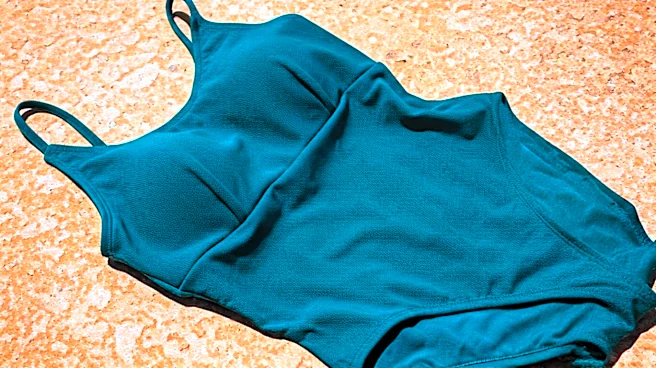
Sometimes the most interesting combinations come from mixing textures, even if the colors are the same. This adds a subtle, high-end dimension to your swimwear. Think about pairing a ribbed-fabric top with a classic, smooth-finish bottom in the same color family. The slight difference in material creates depth and visual interest without being loud. Other combinations to try include a crinkle-fabric piece with a standard nylon-spandex one, or even a terry cloth bikini top with a simple Lycra bottom. This approach is perfect for those who prefer a monochromatic or neutral palette but still want their look to feel special and curated. It’s a quiet statement that shows a deep understanding of style.