




The Pioneer Who Made Credits Cool
You can’t talk about title design without talking about Saul Bass. In the 1950s and 60s, when most films just ran text over a static card, Bass turned opening credits into an event. Working with directors like Alfred Hitchcock and Otto Preminger, he used
kinetic typography and bold graphics to create a prologue that set the film's tone. For "The Man with the Golden Arm" (1955), a jagged, animated arm set the stage for a story about addiction. For "North by Northwest" (1959), ascending and descending lines resolve into a skyscraper, establishing a world of sleek, modern anxiety. Bass argued that the audience should be captivated from the very first frame. He treated the title sequence not as a contractual obligation, but as an integral part of the storytelling, a concept that would eventually migrate to television in a big way.
The HBO Effect and the Birth of Prestige TV
For decades, TV title sequences were mostly functional, often featuring a catchy jingle and clips of the show’s stars. But in 1999, something changed. When "The Sopranos" premiered, its opening sequence was a statement. We see Tony Soprano’s gritty drive from the Lincoln Tunnel into suburban New Jersey, the world of New York City shrinking in his rearview mirror. Set to Alabama 3’s menacing “Woke Up This Morning,” the 90-second journey established the show’s central conflict: the clash between a brutal criminal life and a mundane domestic one. It wasn’t just a list of actors; it was a mini-movie that set a mood and told a story. HBO continued this tradition, treating title sequences as a hallmark of quality for shows like "Six Feet Under" and "Carnivàle," signaling to viewers that they were watching something cinematic and ambitious. This was the turning point where the title sequence became a key part of the prestige TV package.
An Industry of Artistry Takes Shape
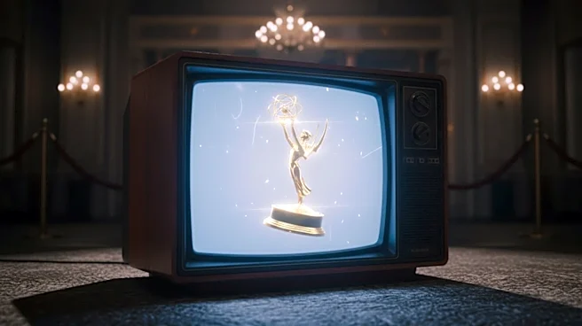
As budgets grew, so did the ambition. The Primetime Emmy Award for Outstanding Main Title Design, which had existed in various forms since the 1970s, became a fiercely competitive category. Specialized design studios like Imaginary Forces, Digital Kitchen, and Elastic became the go-to creators for television's most iconic introductions. Elastic, for example, was the studio behind the legendary opening for "Game of Thrones." First airing in 2011, the clockwork map of Westeros and Essos wasn't just beautiful; it was functional, updating each episode to reflect the shifting locations of the narrative. This dynamic world-building tool won an Emmy and set a new standard for what a title sequence could achieve, becoming a cultural phenomenon in its own right.
The 'Skip Intro' Paradox
The rise of streaming and binge-watching brought a new threat: the "Skip Intro" button. It seemed poised to make the title sequence obsolete. Yet, paradoxically, it may have made them even more important. Knowing viewers have an easy out, creators now have to make their intros unskippable—so compelling, artful, or thematically rich that you choose to watch every time. Recent examples like the surreal, Emmy-winning claymation for "Severance" prove the point. The sequence, which shows different versions of protagonist Mark S. navigating a bizarre, goopy office world, is a puzzle box of symbolism that rewards repeat viewings. In an era of infinite content, a unique and memorable title sequence is a powerful branding tool that helps a show stand out and define its identity from the very first second.