


The Serene Blues
From powder and cornflower to dusty periwinkle, serene blues are a perennial favorite among the royals for a reason. This color family is universally flattering and communicates a sense of calm confidence. Unlike electric blues or vibrant turquoise, these
softer shades don't compete with the wearer or the intricate millinery that Ascot demands. They perform beautifully in the bright, often unpredictable British daylight, absorbing light rather than reflecting it harshly. Think of the Princess of Wales in a pale blue Elie Saab creation or Sophie, Duchess of Edinburgh's consistent mastery of this palette. The key is to choose a shade with a grey or white undertone, which gives it a sophisticated, almost ethereal quality that looks expensive and photographs like a dream.
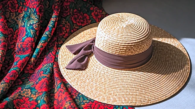
The Sophisticated Creams
Wearing white or cream to a major event can feel risky, but at Ascot, it’s a power move. The trick is to steer clear of stark, bridal whites and embrace the nuance of cream, ivory, ecru, and oyster. These off-white shades provide a clean, elegant canvas that allows texture and tailoring to shine. A beautifully cut cream dress in a structured fabric or delicate lace appears polished and intentional, not like an afterthought. This palette also serves as the perfect neutral base for a more adventurous hat, allowing the millinery to be the focal point without creating a chaotic visual. When worn monochromatically from head to toe, the effect is impossibly chic and elongated, creating a statuesque silhouette that stands out for its pure refinement.
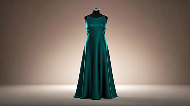
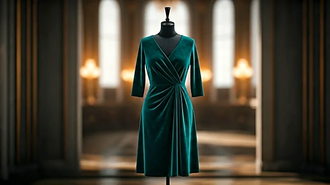
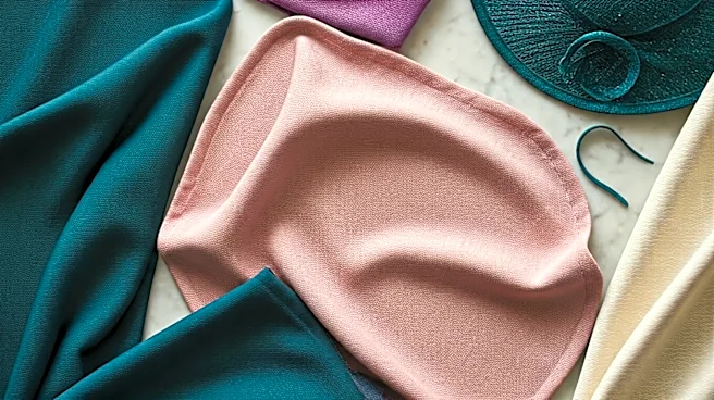
The Modern Greens
While emerald green can certainly make a statement, the more subtle end of the green spectrum offers a modern and surprisingly versatile option. Sage, mint, pistachio, and muted olive tones are sophisticated choices that feel fresh and connected to the event’s garden-party atmosphere. These are not the aggressive greens of a traffic light but the gentle, complex greens found in nature. They pair wonderfully with neutral accessories in beige or metallic tones and provide a soft, flattering glow to the skin. A soft seafoam or a pale pistachio dress avoids the potential harshness of other brights, ensuring you look poised in photos, whether under a grey sky or in full sun. It’s a color family that says you understand trends but aren't a slave to them.
The Dusty Pinks and Rose
Forget bubblegum and hot pink. The elegant way to wear pink at a formal daytime event is to lean into its softer, more complex variations. Dusty rose, blush, and muted raspberry have a romantic, feminine feel without appearing juvenile. These shades have a warmth that is incredibly flattering on a wide range of skin tones, casting a healthy, rosy glow. They are staples for a reason: they are celebratory and cheerful but maintain an air of grown-up grace. A monochromatic look in a shade of dusty pink is particularly powerful, creating a cohesive and polished statement that is soft yet strong. It’s the perfect balance for an event that requires formality but still celebrates personal style.
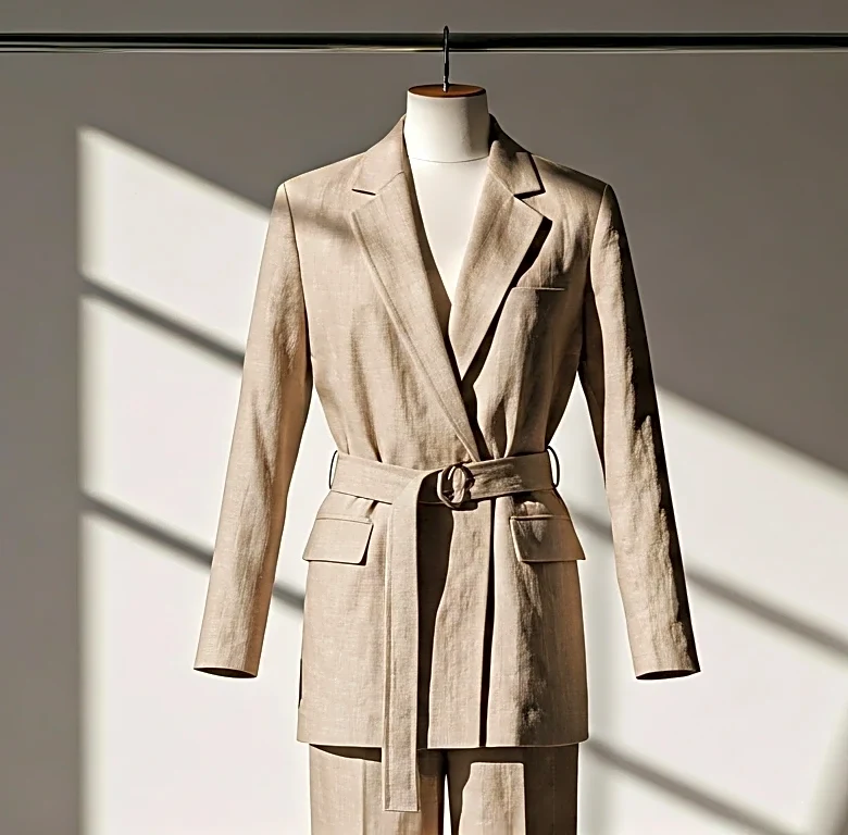
The Understated Neutrals
Beyond cream, the broader family of understated neutrals offers a masterclass in quiet luxury. Think of shades like dove grey, taupe, mushroom, and camel. In a sea of bright florals and bold patterns, a thoughtfully executed neutral outfit can be the most impactful of all. The success of a neutral look depends entirely on silhouette, fabric, and fit. A sharp, tailored dress in a sophisticated taupe or a flowing silk design in dove grey relies on its own architecture for drama, not color. This approach communicates immense confidence. It suggests you don't need a loud color to be noticed; the elegance of the design and the way you wear it is enough. It's a subtle, powerful choice that never fails to look impeccably tasteful.