

The Tyranny of the 'Skip Intro' Button
Let’s be honest: we are all guilty. When you’re ten episodes deep into a binge-watch at 1 a.m., hearing that theme song for the tenth time can feel like a test of endurance. Streaming platforms know this, which is why the skip function has become a ubiquitous
feature, a nod to our collective impatience. We’ve been conditioned to see the opening credits as a hurdle, a throwback to the days of broadcast television when we couldn’t just fast-forward through the formalities. But in optimizing our viewing for maximum efficiency, we are inadvertently treating a curated art form as disposable filler. These aren't just credit rolls; they are carefully constructed overtures designed to pull you into a specific world. They are the lobby of the grand theater you are about to enter, decorated with intent and purpose. Rushing past them is like showing up to a five-star restaurant and asking them to just put the steak in a to-go bag.
A Mini-Film Before the Story
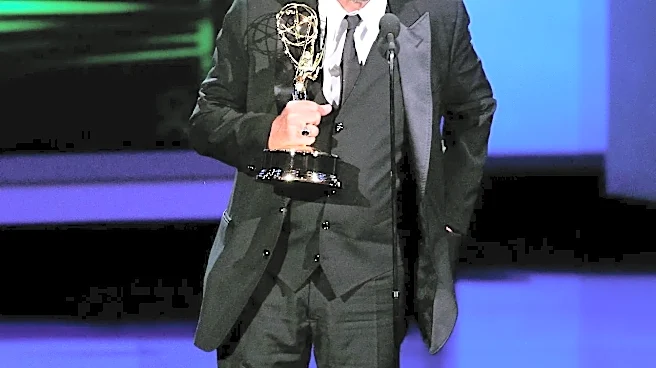
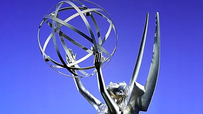
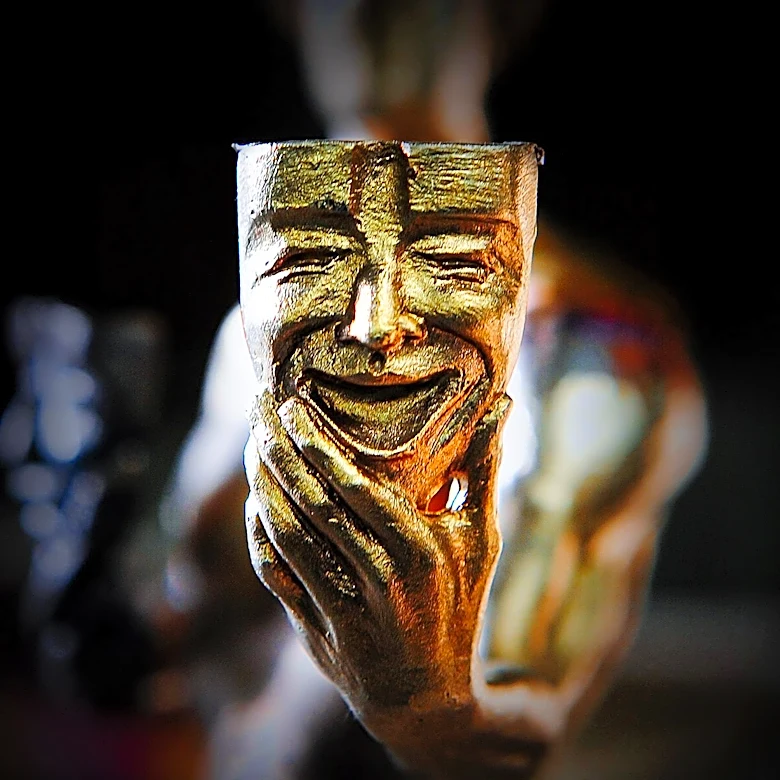
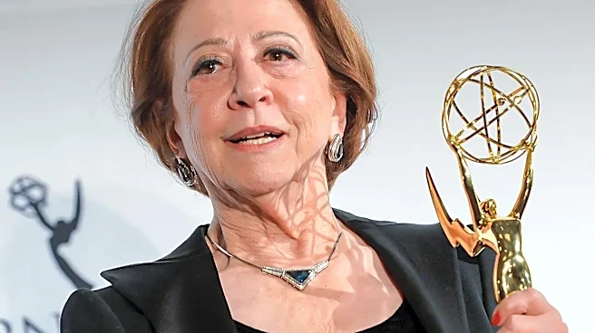
A great title sequence is not just a list of names set to music. It’s a mission statement. In 30 to 90 seconds, it must establish a show's tone, hint at its central themes, and create a distinct mood that lingers long after the scene cuts to the opening shot. It's a concentrated blast of visual storytelling, a short film that plays before the main feature. The television industry itself recognizes this as a high art, honoring it with the Primetime Emmy Award for Outstanding Main Title Design. This isn't a minor technical award; it’s a fiercely competitive category celebrating the fusion of graphic design, animation, music, and narrative theory. The teams behind these sequences are specialists, commissioned to distill the essence of an entire series into a single, repeatable, and unforgettable package. They provide the visual and sonic language for a show, an identity that becomes as iconic as any of its characters or catchphrases.
Case Study: An Award-Winning Vision
For a perfect example of what you're missing, look no further than the title sequence for Apple TV+'s “Severance.” It deservedly took home the Main Title Design Emmy in 2025, and it is a masterclass in thematic art. The sequence features unnerving, glitchy CGI animations of its protagonist, Mark, interacting with distorted, inky versions of himself in a sterile corporate environment. We see him being sucked into a keyboard, his brain overflowing from a coffee mug, and wrestling with a blob-like form of his own body. Every frame is loaded with symbolism reflecting the show's core premise: the surgical division of one's work life and personal life into two separate consciousnesses. The unsettling score and stark visuals perfectly capture the psychological horror and bleak satire of the series. Skipping this intro isn't just missing credits; it's missing a key piece of the puzzle that makes the show so profoundly brilliant and creepy.
The Unsung Artists of Television
The artists and studios behind these works, like Elastic (who created the sequence for 2024 Emmy winner “Shōgun”) or Antibody, are some of the most creative minds in the business. The intro for “Shōgun” uses imagery of a zen garden’s sand being disturbed to represent the show's fragile political landscape. Consider the evolving wallpaper in the intros for both seasons of “The White Lotus,” where the lush illustrations subtly depict the dark dramas and character arcs to come. Or think of the iconic clockwork map of “Game of Thrones,” which literally oriented the viewer in its sprawling world before each episode. From the unnerving montages of “True Blood” to the playful animated stories of “Only Murders in the Building,” these sequences are designed to be watched and re-watched, offering new details upon every viewing. They are a vital part of the viewing experience, not an obstacle to it.