

The Delicate Art of 'Safe Scares'
The primary challenge in creating a Halloween episode for kids is navigating the fine line between spooky and terrifying. Production designers are experts at this psychological balancing act. True horror can be harmful, leading to anxiety and nightmares
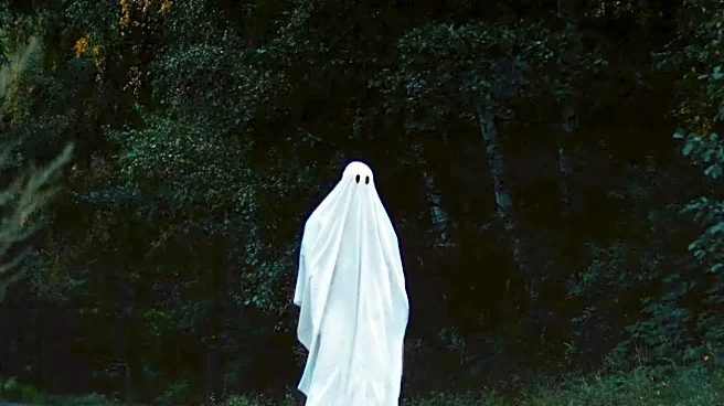
in younger viewers. Instead of genuine terror, these shows aim for what could be called 'safe scares,' which provide a thrill without the trauma. Designers use specific visual language to achieve this. Monsters often have rounded edges, large, non-threatening eyes, or a clumsy demeanor. Take the classic "SpongeBob SquarePants" episode "Scaredy Pants.". SpongeBob’s attempt to be a ghost involves simply throwing a sheet over his square head. Patrick's solution isn't to make him more menacing, but to shave his head into a more traditional round shape, a silly and harmless interpretation of what makes a ghost scary. This approach allows kids to engage with the concept of fear in a controlled, manageable way, giving them a sense of mastery over the emotion.
World-Building in Autumnal Hues
More than just jump scares, the best Halloween specials create an unforgettable atmosphere, and color is the primary tool. Shows like Cartoon Network's miniseries "Over the Garden Wall" are revered for their stunning visual language. The series uses a rich, painterly palette of rustic oranges, deep browns, and hazy yellows to build a world that feels like a half-remembered folktale. This aesthetic, inspired by everything from vintage Halloween postcards to 19th-century illustrations, creates a feeling that is simultaneously cozy and unsettling. Similarly, the Netflix series "Hilda" employs a minimalist animation style with a carefully controlled color palette to ground its characters in a world of Scandinavian folklore. The contrast between the simple character designs and the richly textured, atmospheric backgrounds makes the magical world feel both cohesive and deeply immersive, proving that smart design can build a whole seasonal mood.
Visual Gags for the Grown-Ups
Smart production design works on multiple levels, often embedding jokes and references intended for the adults watching alongside their kids. Disney's "Gravity Falls" and its episode "Summerween" is a prime example. The episode introduces the Summerween Trickster, a genuinely menacing villain made of discarded, cheap Halloween candy. His design is not only creepy but also a clever commentary on the commercialism of the holiday. In one form, he even pays homage to the iconic No-Face from the Studio Ghibli film "Spirited Away," a reference aimed squarely at animation-savvy parents. These layers don't detract from the child's experience but add a level of wit and intelligence that elevates the material. It transforms the show from a simple kids' cartoon into a shared cultural object, rewarding viewers of all ages for paying close attention to the details hidden in plain sight.
Creativity Forged by Constraints
Sometimes, the most brilliant design isn't born from an unlimited budget but from creative problem-solving under pressure. The limitations of television animation—whether budget, runtime, or network standards—can force designers to be more inventive. A simple, iconic design is often more memorable and effective than an overly complex one. The enduring appeal of "It's the Great Pumpkin, Charlie Brown" lies in its minimalist, heartfelt simplicity. The ghosts are just kids with poorly cut holes in their sheets, yet the imagery is iconic. In an era of CGI-heavy blockbusters, the handcrafted feel of stop-motion specials or the flat, graphic style of older 2D animation carries a unique charm. This isn't a flaw; it's a feature. By focusing on strong shapes, expressive character animation, and evocative color, these specials prove that clever artistry and clear storytelling will always be more impactful than a spectacle that lacks a soul.