


The 'Secret' Hiding in Plain Sight
The magic trick that elevates a standard TV show into something that feels like a feature film is a postproduction process called color grading. It's a crucial part of a larger workflow known as the Digital Intermediate (DI), where footage is digitized
and refined. While color correction is the technical, first step of fixing issues—like making sure shots filmed on different days match—color grading is where the artistry happens. It’s the process of manipulating color to create a specific mood, style, and emotional tone. Think of it like this: color correction is making sure all the ingredients for a cake are measured correctly; color grading is the decorative icing that makes it a work of art.
More Than Just an Instagram Filter
To the untrained eye, color grading might just seem like a fancy filter. But it's far more complex and intentional. Professional colorists, working in specialized suites, can isolate and alter nearly any aspect of the image. They can change the hue of a single object, darken the edges of the frame to draw your eye, or apply a universal look that becomes the show's visual signature. For example, a sci-fi series might have a cool, sterile palette of blues and grays to feel futuristic and detached. A period drama, in contrast, might use warm, golden tones to evoke nostalgia and romance. This is achieved by meticulously adjusting attributes like saturation, contrast, and luminance to serve the story. It’s a painstaking process that can transform footage that originally looks flat or washed-out into something vibrant and textured.
Painting with Mood and Meaning
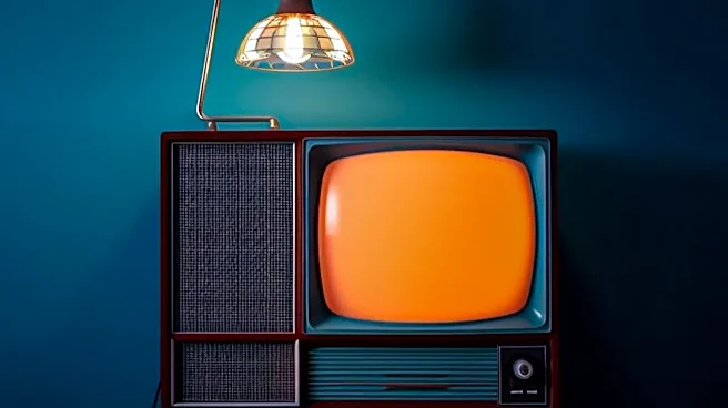
Color has a profound psychological effect on viewers, and filmmakers use this to their advantage. A skilled colorist, in collaboration with the director and cinematographer, uses color to enhance the narrative without you even consciously noticing. A scene's colors can tell you if a place is safe or dangerous, if a character is happy or filled with dread. The iconic orange-and-teal look, common in many blockbusters, uses complementary colors to make scenes pop and create a dynamic, high-energy feel. The desaturated, gloomy look of a grim detective show immediately establishes its tone. By painting with color, creators can guide audience emotions, heighten tension, and add layers of meaning to the story.
The August Arms Race for Eyeballs
So why is this particularly relevant for August premieres? Late summer has become a fiercely competitive window for streaming services and networks to launch major new shows. With a flood of content, making a strong first impression is critical. A striking, expensive-looking visual style is one of the fastest ways to grab a viewer's attention and signal that a show is a prestige, must-watch production. In a sea of thumbnails, a series with a unique and compelling color palette is more likely to stand out. This visual polish helps new shows compete with established hits and big-budget movies, creating the perception of high production value even if the budget wasn't astronomical. It’s an investment in atmosphere that pays dividends in audience engagement.