
The Mood Board as a Time Machine
In fashion, a mood board is more than a collage of pretty pictures; it’s a visual thesis. For a designer, it’s the first step in translating an abstract feeling into a tangible collection. An archival
mood board dives even deeper, using historical photographs, old advertisements, and ephemera to capture the essence of a bygone era. It’s not about copying old designs but about bottling a specific spirit. The goal is to build a world—one that defines the colors, textures, and silhouettes of the clothes to come. This process helps keep a creative vision focused and cohesive from the first sketch to the final stitch.
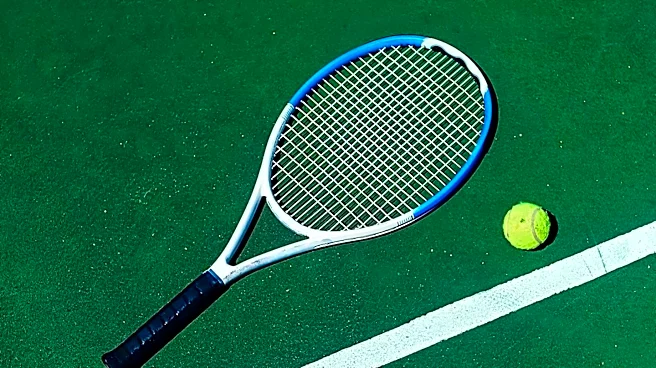
The Wimbledon Archive: More Than Just White
Wimbledon’s aesthetic is iconic, governed by its notoriously strict all-white dress code that dates back to the Victorian era. But a designer’s mood board looks past the obvious. It finds inspiration in the nuances: the texture of the grass courts, the shadow play under a wide-brimmed hat, the elegant arc of a wooden racket. Think of the grainy quality of 1920s photographs, where players like Suzanne Lenglen defied convention in knee-length pleated skirts instead of restrictive corsets. Consider the shift to tailored shorts in the ‘30s or the cinched waists and flared skirts of the ‘50s. It's an archive of movement, tradition, and subtle rebellion, all captured in shades of white against green.
The Lacoste Lens: A Legacy of Motion
Now, view that archive through a Lacoste heritage lens. The brand’s founder, René Lacoste, was a tennis titan of the 1920s, one of the famous “Four Musketeers” who dominated the sport. Nicknamed “the Crocodile” for his tenacity, he was a pragmatist obsessed with performance and elegance. Frustrated by the restrictive long-sleeved shirts of his era, he designed his own short-sleeved, breathable piqué cotton shirt—the polo—revolutionizing sportswear forever. A Lacoste-inspired mood board, therefore, filters the Wimbledon archive through this ethos: functionality, freedom of movement, and a clean, sophisticated style. It focuses on how clothes perform, not just how they look.
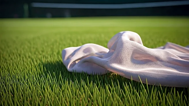
Silk Organza: The Perfect Translation
This brings us to the fabric: silk organza. Why this material? Because it perfectly embodies the mood board’s collected feelings. Organza is a sheer, lightweight, and surprisingly strong fabric. Its transparency makes it ideal for overlays, allowing a designer to create layers of visual information—much like a faded memory or a photo seen through a veil of time. The fabric has a crispness that can create architectural volume without weight, echoing the structured-yet-airy feel of early tennis whites. A silk organza overlay can suggest the blur of a fast-moving player, the shimmer of sunlight on a white dress, or the delicate ghost of a historical uniform. It’s the material manifestation of memory, elegance, and motion.