






First, What Exactly Are 'Dusty' Colors?
Before diving into the 'why,' let's define the palette. 'Dusty' or 'muted' colors are shades that have been softened, or desaturated, typically by adding a bit of gray, black, or white. Think of sage green instead of kelly green, mauve instead of magenta,
or slate blue instead of royal blue. These colors have a lower intensity, giving them a sophisticated, gentle quality. Unlike their vibrant counterparts, which scream for attention, dusty colors have a calmer, more understated feel. This subtlety is precisely what makes them such a powerful partner for a strong neutral like black.
The Core Principle: High Contrast
The primary reason this pairing is so successful is the power of contrast. Sharp black acts as a visual anchor. It's a deep, definitive color that provides structure and stops the softer, dusty shades from looking washed out or vague. A muted pink, on its own, might feel overly sweet or faint, but when grounded with a black blazer or trousers, it suddenly feels intentional and modern. The black provides a frame that makes the dusty color pop in a sophisticated way, preventing the overall look from becoming bland. It's a classic design trick: the starkness of one element highlights the subtlety of the other.
Why Texture Becomes Your Best Friend
When you're working with a limited or low-contrast color palette, texture does the heavy lifting. Pairing different materials is key to giving an outfit depth and interest. Imagine a dusty rose cashmere sweater paired with black leather pants, or a sage green silk camisole under a black tweed jacket. The interplay between soft and hard, matte and shiny, or smooth and rough creates a rich visual and tactile experience. Without textural variety, a black and dusty color combination can sometimes fall flat. Mixing fabrics like knits with satin, or wool with denim, makes the outfit feel considered and dynamic, even when the colors are restrained.
Mastering the Balance and Proportions
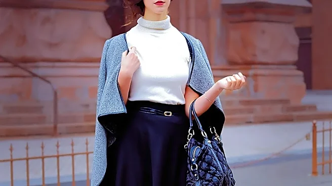
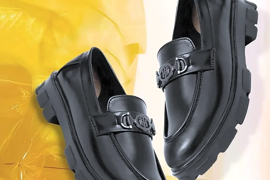
How you balance the two colors is crucial. A roughly 70/30 split is often more visually appealing than a straight 50/50. This prevents the outfit from looking too divided. For example, you could wear a column of black—like a top and pants—with a single dusty-colored piece, like a long cardigan or trench coat. This creates a long, lean silhouette and uses the dusty color as a statement. Alternatively, let the dusty color dominate, using black for your accessories. A dusty blue dress, for instance, looks instantly more polished with a black belt, black shoes, and a black bag. This method allows you to control the intensity and guide the eye.
It's Not Just for 'Winter' Palettes
While pure, jet-black is traditionally considered a 'Winter' color in seasonal analysis, this pairing can be adapted for anyone. The key is choosing the right shade of black and placing it strategically. Those with warmer or softer coloring might find a charcoal or faded black less harsh against their skin than a true, deep black. They can also benefit from keeping the black away from their face—opting for black pants or a skirt paired with a dusty-colored top—to soften the effect. This allows you to leverage the sophisticated contrast of the pairing without letting the black overwhelm your natural complexion.