



The Camera Never Sits Still
The show’s visual energy starts with its camera work. Cinematographer Andrew Wehde, who has shot nearly every episode, treats the camera like another frantic member of the kitchen staff. It’s constantly in motion, weaving through tight spaces, and often
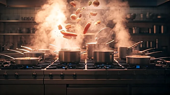
getting uncomfortably close to the actors. This approach uses long, elaborate takes—most famously, a nearly 18-minute unbroken shot in Season 1’s “Review”—to immerse the viewer directly into the claustrophobia and tension of a service rush. Unlike a static, multi-camera sitcom, the camera in The Bear is an active participant. It whips around to catch a line of dialogue, crash-zooms onto a sizzling pan, and then slowly pushes in on a character’s face to capture a fleeting moment of doubt. This handheld, visceral style feels less like watching a TV show and more like being dropped into a real, high-stakes environment where every second counts.
Painting with Light and Grease
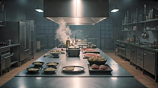
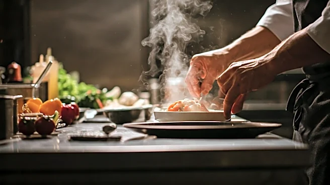
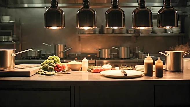
Lighting is where the show’s “expensive” feel truly begins to take shape. Instead of flat, uniform lighting, The Bear employs a high-contrast, cinematic approach. Wehde designed the kitchen set to be lit almost entirely with practical and motivated light sources. This means the light feels real, coming from overhead kitchen fixtures or bouncing off stainless steel surfaces. During the day, warm sunlight streams through the windows, creating a rich, textured look that contrasts with the kitchen's cooler, more sterile tones. This constant play between warm and cool light in the same frame is a deliberate choice to add depth and avoid a visually flat or unrealistic wash. It allows for deep shadows in the corners, which makes the brightly lit areas of action pop even more. The result is a space that feels both authentic and beautifully sculpted by light, turning a cramped kitchen into a dynamic, living set.
The Gospel of Lived-In Details
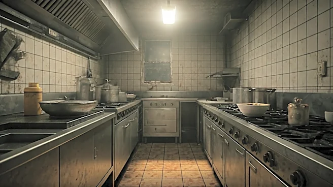
Authenticity is expensive, and The Bear’s production design is a masterclass in curated detail. The original sandwich shop, The Beef, isn't just messy; it’s layered with years of history. Every stain, every piece of aging equipment, and every scuff mark tells a story. When the restaurant transforms into The Bear, that philosophy continues. The equipment is top-of-the-line, the surfaces are clean, but the space still retains a sense of purpose and history. Show creator Christopher Storer’s team focused on getting every detail right, from the way the chefs hold their knives to the specific brands of kitchen gear. This obsession with authenticity means nothing on screen feels cheap or fake. It’s the difference between a generic set and a world that feels completely real and lived-in. That dedication to getting the small things right is a hallmark of high-end production.
The Deliberate Color of Chaos
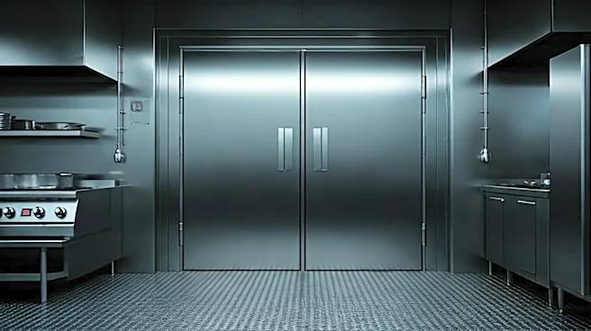
The show’s color palette is another key ingredient. The creators were inspired by gritty 1970s films, aiming for a look with texture and grit. This is achieved in part by shooting on a high-end digital camera but pushing the ISO to its limits, which introduces a subtle grain that feels more like film. The color grading enhances the story’s emotional beats. Scenes inside the chaotic kitchen often have a distinct, slightly cool and frenetic tone, while moments of reflection or connection outside the restaurant are treated with a calmer, warmer palette. When Carmy dreams of a pristine, heavenly fine-dining kitchen, the color becomes almost blindingly bright and clean, creating a stark contrast with The Beef's gritty reality. These shifts aren't random; they are purposeful choices that guide the audience's emotional journey, making the visual style an integral part of the storytelling itself.