


Papers Use Picture-Perfect Data
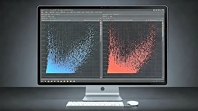
The first and most significant reason for the disconnect is the data itself. Academic papers demonstrating a new algorithm like UMAP (Uniform Manifold Approximation and Projection) are designed to showcase its strengths under ideal conditions. They often use well-known, pre-cleaned, and beautifully structured datasets like MNIST (for handwritten digits) or fashion-MNIST. These datasets are the supermodels of the data world; they are chosen specifically because they have clear, separable patterns that the algorithm can easily find and display. Your data, however, is probably not a supermodel. Real-world data from business analytics, scientific research, or user logs is inherently noisy, full of missing values, and often lacks the clean, distinct
clusters seen in benchmarks. It’s the difference between a carefully staged photograph and a candid snapshot in a crowded room. When UMAP processes this messy reality, the resulting plot reflects that complexity. What looks like a “bad” plot is often just an honest one.
The Dark Art of Hyperparameter Tuning
UMAP is not a one-button-push solution; it’s an instrument that needs tuning. Two key parameters, `n_neighbors` and `min_dist`, have a dramatic impact on the output. `n_neighbors` controls how UMAP balances local versus global structure. A small value focuses on very fine-grained local connections, potentially breaking up large clusters. A large value forces UMAP to look at the broader neighborhood, which can merge distinct groups.
`min_dist` controls how tightly UMAP is allowed to pack points together. A low `min_dist` creates dense, compact clusters, while a high value gives a more spread-out, uniform look. Authors of papers have the time and incentive to meticulously tune these parameters to produce the most aesthetically pleasing and interpretable plot for their specific dataset. In practice, you’re often exploring the data for the first time and don't know the “right” settings. The plot you get is just one of many possible views, each telling a slightly different story.
It's About Connections, Not Distances
This is the most crucial conceptual hurdle. Many users intuitively believe that the distances between clusters in a UMAP plot are meaningful. If Cluster A is far from Cluster B on the plot, it must mean they are fundamentally different in the high-dimensional space. This is a dangerous assumption. UMAP is a manifold learning algorithm focused on preserving *topology* (the structure of connections), not *geometry* (the global distances and shapes).
Think of it like a subway map. The map shows you which stations are connected (topology), allowing you to see that you can get from Times Square to Grand Central. But it does *not* accurately represent the real-world geographic distance between them (geometry). UMAP does the same for your data. It tells you which data points are “next” to each other, but the visual size of a cluster or the empty space between two clusters is an artifact of the projection. You can’t say a big cluster is more varied than a small one, or that two distant clusters are more different than two nearby ones.
A Starting Point, Not the Final Answer
Ultimately, a UMAP plot is not a scientific result in itself. It is a map. It’s a powerful tool for hypothesis generation and exploratory data analysis. When you see a plot, the correct response isn't to declare “we have five customer segments!” but to ask, “Why does the data seem to be forming five groups?” You can then color the points by different features (e.g., user age, purchase frequency, geographic location) to see what explains the structure.
The perfect plots in papers have already undergone this process. The authors have likely used the plot to confirm a known structure or to guide an analysis that they then present as a clean narrative. Your journey with your own data is just beginning at the moment the plot renders. The “mess” is not a failure; it’s an invitation to start asking questions.