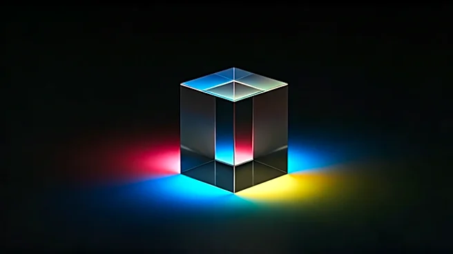


Decoding 'Chroma'
First, let's get one thing straight: there’s no secret algorithm or mystical entity called 'Chroma' making these predictions. In the design and business world, chroma is a technical term for the purity or intensity of a color. But when we talk about what
color—or 'chroma'—predicts, we're really talking about the field of trend forecasting. Companies like Pantone, with its famous 'Color of the Year,' and WGSN spend millions trying to answer a simple question: What color will people want to buy in two, five, or even ten years? They aren't just guessing. They are conducting a massive, global synthesis of culture, economics, and technology to place a bet on the future mood of the consumer. It’s less about one specific hue and more about the entire palette that will define an era.
The Art of Cultural Synthesis
So, how do they do it? Trend forecasters are essentially cultural detectives. They travel the world, observing everything from street style in Tokyo to art installations in São Paulo. They analyze data from social media, track political movements, monitor technological breakthroughs, and even study shifts in wellness and philosophy. They’re looking for patterns—the seeds of a 'big idea' that will eventually blossom into a mainstream trend. For example, a growing societal anxiety about climate change might lead them to predict a rise in earthy, natural tones like terracotta, moss green, and ocean blue. A surge in digital life and the metaverse could point toward iridescent, hyper-saturated colors that mimic screen-based realities. It’s not magic; it’s a meticulous process of connecting seemingly unrelated dots to paint a picture of where we’re headed emotionally and culturally.
What Today’s Colors Say About Tomorrow
Looking at the palettes gaining traction now provides a roadmap for the coming decade. The continued dominance of greens and browns speaks to a deep, cross-generational desire for sustainability, grounding, and a connection to the natural world. This isn’t just a fad; it’s a response to years of digital saturation and ecological concern. At the same time, we see the rise of what forecasters call 'digital pastels' and luminous brights—colors like lavender, soft lime, and electric coral. These hues reflect our increasingly hybrid lives, blending the tangible world with the fluid, often surreal, environment of our screens. They suggest a future characterized by optimism, technological integration, and a playful approach to identity. The tension between these two palettes—the earthy and the ethereal—is the central story color tells about the 2020s: a search for both real-world authenticity and digital escapism.
Prediction or Self-Fulfilling Prophecy?
Here’s the million-dollar question: Does Pantone simply predict that 'Viva Magenta' will be popular, or does its announcement *make* it popular? The answer is a bit of both. The trend forecasting industry is a powerful feedback loop. When a major agency like WGSN or Pantone puts its weight behind a color, thousands of designers, manufacturers, and retailers listen. Car companies, fashion houses, and interior designers have already been working with these color forecasts for years before they hit the mainstream. So, when you start seeing a certain color everywhere, it’s the result of a coordinated, industry-wide adoption. But this adoption only works if the forecast correctly tapped into a latent consumer desire. If a predicted color doesn't resonate with the public's mood, it will fail, no matter how much marketing muscle is behind it. The industry can guide the conversation, but it can't invent a feeling that isn't there.