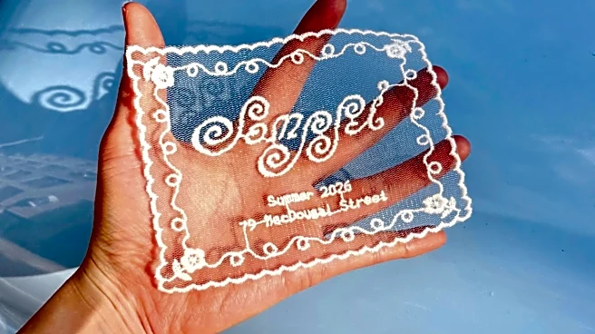




What spoke to me the most about the Instagram announcement for the new Manhattan restaurant Somssi was the fact that it was done in such an unexpected manner. In the photo, a hand holds a piece of lace against the shiny backdrop of a powder blue car.
The lace, custom-made, is about the size of a postcard, bearing the restaurant’s name in looping swirls of white thread, its address and opening date sewn in blockier letters beneath it. Sunlight streams through the lace, casting shadows of the curlicues that border the piece’s scalloped edges. The scene looks tangible, like a moment that really existed. It stopped me in my scroll.
“Somssi” is a Korean word that refers to “a skill or a knack that you polish over time, and has a lot to do with things that you craft with your hands,” explains managing partner Ahris Kim. For Somssi, that sense of the handcrafted continues into the logo, which features the restaurant’s name stitched into cloth, its custom typeface designed to evoke Asian calligraphy. Its curtains are made from old crochet and lace tablecloths, with the one at the front door spelling out the restaurant’s name in cutouts embellished with embroidery (it, too, has been the focus of an Instagram post). Margaret Muza, Kim’s childhood best friend, did the interiors, sourcing vintage glassware and tchotchkes; Muza’s mom made the curtains, using fabric from her own collection built over decades.

More and more, I’m stopped in my scroll by something that evokes the opposite feeling: a kind of semi-defeated revulsion, which I attribute to the barrage of images that bear the grotesque hallmarks of being AI-generated. They are the opposite of handcrafted, often riddled with errors that only a technology without real human experiences would make: the sandwiches that defy gravity; the cocktails in glasses that cast physically impossible shadows; the flyers for events at restaurants that are so overstuffed and overstylized that they’ve almost come full circle into camp; the fantastical scenes, like a cat holding two tacos, which would be cute if dreamed up by an illustrator but which instead feel cynical and smug in one’s absence.
The backlash to AI imagery is growing across a certain part of the culture. Sentiment along the lines of “I’d rather see a poster made with Sharpie on a scrap of paper than an AI event flyer,” or “I’m not going to your restaurant if the ad is the AI” is proliferating. “Frictionmaxxing,” a term that writer Kathryn Jezer-Morton coined to refer to a rejection of technologies of convenience in favor of slower and more analog processes, has escaped containment, coming to mean the general choice to choose pre-internet ways of creation and problem-solving. In this sense, it can refer to the choice of the handcrafted over the AI-generated.
And even when not overtly backlash, there is, at the very least, a friction-filled reaction happening culturally in design right now to the sudden dominance of AI. The work of photographer Szilveszter Makó, known for his reliance on “true materials” like absurd physical props and daylight, has swept the fashion scene in recent months. I see a similar ethos echoed in newer visuals from publications like Bon Appétit, which have recently embraced creative elements that make clear physical, real-life effort, like a stop-motion animation featuring wobbly-edge paper cutouts for an article about throwing watch parties.
I wondered, in the earlier days of AI, if its inevitable abundance would eventually lead to a renewed valorization of the analog, the physical, and the explicitly human-made, and indeed, that seems to have increasingly become reality. Take the New England grocery store chain Market Basket, which recently released a limited edition of its weekly circular that’s entirely hand-illustrated by artist Katie Christensen. It’s meant to call back to the store’s earlier days, when circulars were always drawn by a person.
Or take Fearless Coffee in Johnson City, Tennessee, which posted a series of images promoting its new menu earlier this summer. “Currently our world is saturated with digital noise and content. AI promos and graphics dominate the landscape,” the shop wrote on Instagram. In hopes of standing out amid the slop, the shop commissioned photographer Jamey Booher for a photoshoot intended to take people “back to a time before [AI] existed,” posing a banana latte, for example, in a scene that evoked late-’90s summer, cassette tapes and all. The gesture (and stance) didn’t go unnoticed, hitting the feeds of people like myself who only know Johnson City from “Wagon Wheel” and becoming, it seems, the shop’s most-liked post ever.
Shinji, a new Japanese restaurant in Toronto, caught my attention through a Reel shared by calligrapher Sylvia Wong, who had been commissioned by the restaurant to hand-engrave its logo onto wine glasses. In her post, Wong acknowledged that while hand-engraving is less efficient than machine-engraving, it was more in line with the restaurant’s ethos on craftsmanship. Frictionmaxxing!
Amid this glut of AI content on Instagram, photos of handwritten menus now fill me with a similar feeling as Somssi’s lace and cloth — something between relief and admiration, a grounding in the realm of the real. Melissa Martin of Mosquito Supper Club in New Orleans has recently shifted how she promotes her restaurant on social media, posting simply taken shots of handwritten paper menus instead of the styled professional photos from her cookbooks.
After a startlingly slow summer, the posts are a way of reminding people that her restaurant is still open, Martin explained to me in a message, but she also appreciates the task of it. “I like the feeling of handwriting the menu, trimming it down with scissors, taking a picture, and posting,” she says. Even if the handwritten menu is only for Instagram, the process feels “more personal.” Her menus in the restaurant are done on a chalkboard — mostly to cut down on printing costs, but also because of the analog appeal. “I’ve never used AI for anything and I don’t plan on it,” Martin says.
Superiority Burger, in lower Manhattan, has always had a punk irreverence, thanks to its chef and owner Brooks Headley’s background in the hardcore music scene. It sticks to its guns of vegetarianism in a distinctly non-trendy way (even when plant-based diets are falling out of favor), championing the produce of small farms and getting diners stoked on, say, the short-lived window of sprouting cauliflower from Campo Rosso.
In the age of the AI-slop restaurant, I feel even more drawn to Superiority’s DIY approach to something as corporate-tech as Instagram. Often, specials are announced via hand-scrawled notes with a Sharpie on a piece of paper, which is then photographed and shared online. To announce a collaboration between the restaurant and the Queens sandwich shop Salty Lunch Lady’s Little Luncheonette, the two restaurants posted cutout paper letters, wrinkled and haphazard, spelling out the news.
What might have once seemed like Superiority Burger’s bit of affectation now comes off like a reaffirmation of the restaurant’s values. Someone made this, just as someone made your food, just as someone nurtured the vegetables from seeds. Sometimes, Sharpie on scraps, done quickly and cheaply, says more than an AI-generated image ever could.

At Dean’s, the long-awaited new British restaurant in New York City, the menu is also handwritten. Every week, interim director of operations Tommy Hunt receives the menu updates, then comes in and writes the menu by hand for it to be photocopied. “When we talked about the pubs that we admired most, like our sources of inspiration in the [United Kingdom], there was always a handwritten menu, because it’s a really personal experience,” says co-owner Annie Shi. “[Hunt] has really classic, to me, English handwriting. It’s bold, and it’s between cursive and straight writing.”
She imagines that, over time, the handwriting might change, but she likes this possibility: a way of tracking the restaurant’s evolution. At Shi’s other restaurant, King, which opened in 2016, the branding appears similarly handmade, with illustrations by artist RF. Alvarez; its logo is a kind of scratchy, squiggly scrawl. For Shi, there’s a tether between these clearly handcrafted visuals and her restaurants’ perspectives on food. Even during the peak of farm-to-table, it’s never been her style to “shout from the rooftops where we’re sourcing,” she says. “But I think there are other ways where you can indicate that this is a personal, craft-driven project, and it’s in those little touches like a handwritten menu.”
None of this is new for restaurants. But in the post-AI world, these markers of real hands behind something appear even more charming: a direct confrontation with what’s taken over. Let’s return to that phrase “somssi,” or skills honed by time. “Anywhere where we could impose a handmade detail, we did,” Kim says. Thus, “even AI-generated work would go against what ‘somssi’ should stand for.”
It’s hard to think of a path of more friction than choosing to run a restaurant; why add even more friction to that? In these conditions, yes, it costs more to hire a photographer to promote your new menu than to generate one with AI, but it’s also increasingly clear that many people would rather see a badly taken, lo-fi photo than an engineered AI image. For one thing, it feels like a reflection of one’s values. To me, a restaurant that employs AI art is capitulating to the culture of slop, akin to reheating premade food from Sysco. It’s impossible to square with a value system that cares about craft and integrity.