

Pay close attention to the walls of New York City’s restaurants, and you might see RuPaul, queen of drag, performing the Heimlich maneuver on a choking Donald Trump. Elsewhere, the Statue of Liberty is in danger, but saved by a notable Taiwanese politician.
On another poster, an anthropomorphic parrot saves a fellow bird from suffocating.
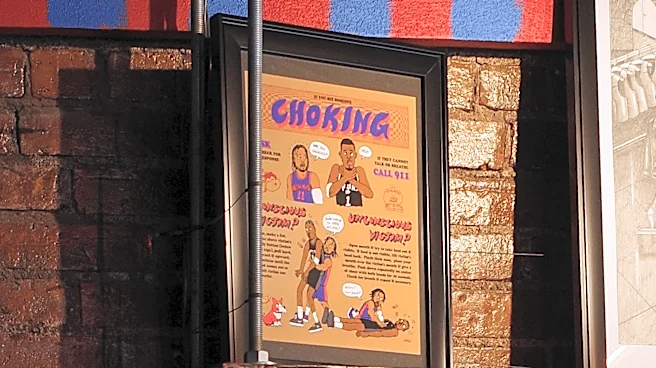
Those aren’t just comic strips or quirky artwork; those are informational first-aid choking signs. The first came from the now-closed French bistro Little Prince in Soho; the second hangs at Wenwen, a Taiwanese restaurant in Greenpoint; and the last is at Rosella, a sushi spot in the East Village. The required health signage illustrates New Yorkers’ creativity when faced with uninspiring parameters; in this case, the NYC Administrative Code’s rule that any place where food is sold must display a choking sign in plain view.
Instead of settling for the city’s generic default — which features sterile red lettering and dull, procedural illustrations — many restaurants and bars have been designing their own posters to match their aesthetic, ethos, and cultural underpinnings. This is a topic of extensive study for Rhea Kapur, a researcher who runs Cultural Fingerprints, a podcast and TikTok account she started in late 2025, where she discusses how culture, language, technology, and place interact.
Choking signs in NYC are more than just instructive signs: “They’re also public art, which is all around you if you look hard enough,” Kapur tells Eater. She recounted how she noticed that NYC choking signs were a convergence of all these elements, exemplifying what she calls cultural fingerprinting, or the process of “when and why you see consistency and variation in the visual environment of different cities, how it appears, and what contributes to it,” she says. She photographs interesting choking signage she finds or is referred to and talks with the designers and restaurateurs, sharing her findings on her Substack and podcast.
Offering a glimpse into the uber-cool, sometimes irreverent, and always beautiful choking signage around the city, here are the stories behind three striking signs, which — through illustration, typography, and color — work as windows into the restaurants and bars where they hang. See: queer love at Boyfriend Co-op in Bushwick, Jalen Brunson to the rescue at Hoy on the Lower East Side, and comic-book worker-power at Sea & Soil in Boerum Hill.


Boyfriend Co-op
1157 Myrtle Avenue, Broadway, Bushwick, Brooklyn, NY 11206
Starting strong: the choking sign at Boyfriend, a queer cocktail bar and coffee shop, was created by NYC’s very own first lady, Rama Duwaji, who is an animator and illustrator. The co-op’s co-founder and co-owner Hena Mustafa says she got connected with Duwaji after seeing a choking sign she had designed at Williamsburg Middle Eastern bistro Huda. Boyfriend opened in March 2025, and from the start, the team was intentional about each piece of signage, from the poster outlining the co-op’s guiding principles down to its winking sun logo on the front door, surrounded by a fantastical constellation of gold stars, flowers, and cocktail glasses. As a queer and anti-Zionist space run by Southwest Asia and North Africa (SWANA) co-owners, the team set out to work with like-minded people from the co-op scene. “We wanted to make sure that the people we partnered with were also reflected in the ethos of this space,” says Mustafa, who is Palestinian.
Boyfriend’s poster is rendered in olive green and steel blue and is hung in a gold frame to the right of the bar. “We wanted it to be funny, but also sexy,” Mustafa says. “The only creative direction I really gave [Duwaji] was ‘Can you make them look gay and have them kiss?’” The sign pairs nicely with the bar’s overall color story, best defined by its moody, purple-and-blue-washed walls. The final scene — in which the two people embrace in a kiss as butterflies flutter around them — perfectly complements the decor found elsewhere, including framed photos of Meg from Hercules, Dolly Parton, and Queen Latifah.


Hoy!
1 Clinton Street, E Houston Street, Lower East Side
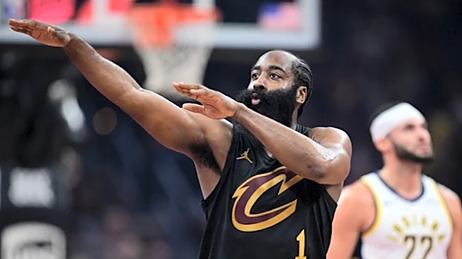
In 1994, Indiana Pacers basketball player Reggie Miller famously mimed a “choke” gesture at Knicks superfan and filmmaker Spike Lee when the Knicks began “choking” their lead, or, in other words, losing the game after Miller scored 25 points in the last quarter during the Eastern Conference Finals (the Pacers might’ve won the game, but the Knicks went on to win the series). This moment in basketball history was the peg for Kristofferson San Pablo as he worked on the choking poster for his cousin Cyed Adraincem’s new Filipino restaurant, Hoy. Around the time when San Pablo was designing the sign, the San Antonio Spurs blew their lead against the Knicks in Game 4 of the 2026 NBA Finals. “I remember going, ‘Oh my God, this is the perfect time to make something referencing choking the lead,’” says San Pablo, who is Hoy’s designer and art director, as well as an artist based in Los Angeles.
San Pablo’s poster intertwines that iconic reference with nods to Filipino culture. In San Pablo’s illustration, King of New York Jalen Brunson is performing the Heimlich maneuver on the Spurs’ towering star player Victor Wembanyama. “[Victor] is spitting out a lumpia, which is like a Filipino egg roll, and my dog is in the bottom left corner waiting to catch it,” he says.
The poster’s title font is loosely based on the popular lettering styles of sign paintings in the Philippines, San Pablo explains. And underneath that is an illustration of a textile with a warping checkered pattern — a design motif drawn from traditional Filipino woven textiles, which is also incorporated throughout the rest of the restaurant, including on the walls in bright red and golden yellow.


Sea & Soil
388 Atlantic Avenue, Bond Street, Boerum Hill
Sea & Soil, a worker-owned sandwich shop and bakery, is delightfully eclectic. Mismatched frames collage the walls in clusters, with artwork ranging from natural landscapes to colorful, politically conscious prints. A swirling honey-yellow line acts as a welcome mural, snaking from the entryway past the cash register and beyond.
Evan Dahm, who does much of Sea & Soil’s lettering, wall paintings, and illustrations, describes the space as having a “humanist approach,” which is also reflected in the choking poster he created. He self-publishes comic books for a living and uses that style to create the sign. “I wanted it to be hand-lettered because that feels friendly and legible,” he says. “I tried to make the characters extremely simple and graphic, leaning into the strength of brush-drawn line art.”
The human- and hand-made quality of Sea & Soil’s choking poster illustrates the co-op’s broader worker-powered philosophy — including that all of its sandwiches are made from scratch, with each menu item priced on a sliding scale model as a way to strike a balance between affordability for customers and sustainability for the co-op and its workers. The poster also goes along with Dahm’s qualms with unfortunately now-ubiquitous AI-generated menus, ads, and flyers, which “constantly disgusts” him, he says. “The place of hand-made illustration and design is extremely clear and important.”