
Walk into a beautifully curated boutique, and you instantly feel something. Before you even register the products, the atmosphere pulls you in. That feeling isn't an accident; it’s a masterclass in visual merchandising, starting with a subtle rule.
It All Starts with a Feeling
Long
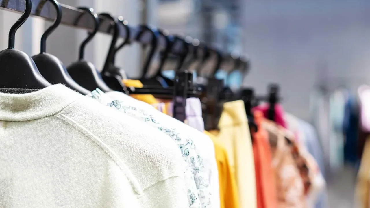
before our brains process color, we react to texture on a primal level. It's the silent language of materials. A display combining chunky knits, soft cashmere, and smooth leather doesn't just show you sweaters and bags; it makes you feel 'cozy', 'luxurious', and 'sleek'. Visual merchandisers use this to build a foundational mood. By grouping textures, they create a story. A collection of rough, natural woods and nubby linens might evoke a rustic, organic feel, while polished metals and glossy surfaces suggest modernity and sophistication. This 'textural landscape' is the stage. Only once the emotional tone is set does color enter to play its role. Without a strong textural base, color can feel flat or chaotic. With it, color becomes the powerful accent that completes the narrative.
Creating Contrast That Guides the Eye
Our eyes are naturally drawn to contrast, and texture provides a powerful, sophisticated way to create it. Placing a silky, fluid blouse next to a pair of structured, raw denim jeans creates a point of visual tension. The eye is intrigued by the difference and moves between the two items, engaging with them more deeply. This technique is more subtle than using bold, opposing colors. It allows designers to create a visual hierarchy, making certain items pop without shouting. This principle, known as composition, is about arranging elements to guide the viewer's gaze through the display in a deliberate, rhythmic way. A smooth surface next to a rough one, or a matte finish against a high gloss, creates focal points that feel intentional and curated, encouraging shoppers to look closer and discover the details of each product.
Texture Is the Ultimate Signal of Quality
We are wired to make snap judgments through touch. Even when we only see texture, our brains associate it with a physical sensation and, by extension, a certain level of quality. A thick, heavily woven fabric feels more substantial and durable. A velvety finish on a box suggests a luxury item inside. Retailers know this and use texture to communicate a product's value before a customer ever looks at the price tag. Studies show that consumers are often willing to pay more for a product with a texture they find ideal, as it directly impacts their perception of quality, craftsmanship, and even how satisfying the product will be to use. By layering textures in a display—for example, placing a high-quality leather good on a polished marble slab—merchandisers are making a non-verbal argument for its worth.
Color Is the Final, Powerful Flourish
Once texture has established the mood, created a visual path, and communicated value, color is used for its ultimate purpose: to evoke emotion and drive action. Because the textural groundwork is already laid, color can be used more strategically. A single, vibrant color in a neutral, multi-textured display can act as a powerful focal point, drawing immediate attention to a new arrival or a key item. Alternatively, a harmonious color palette can unify a diverse group of textures, making the entire display feel cohesive and intentional. Color is often the element that creates urgency (like red for sales) or calm (like blues and greens). By adding it last, merchandisers ensure it enhances the story the textures are already telling, rather than competing with it. The texture provides the substance; the color provides the personality.