
Ever notice a jacket or a pair of jeans and find your eye drawn to one specific detail? Chances are, a clever designer is using a powerful, subtle tool to guide your gaze. It’s called pocket contrast, and it’s a secret weapon in fashion.
The Designer’s Secret Tool
At its core, pocket
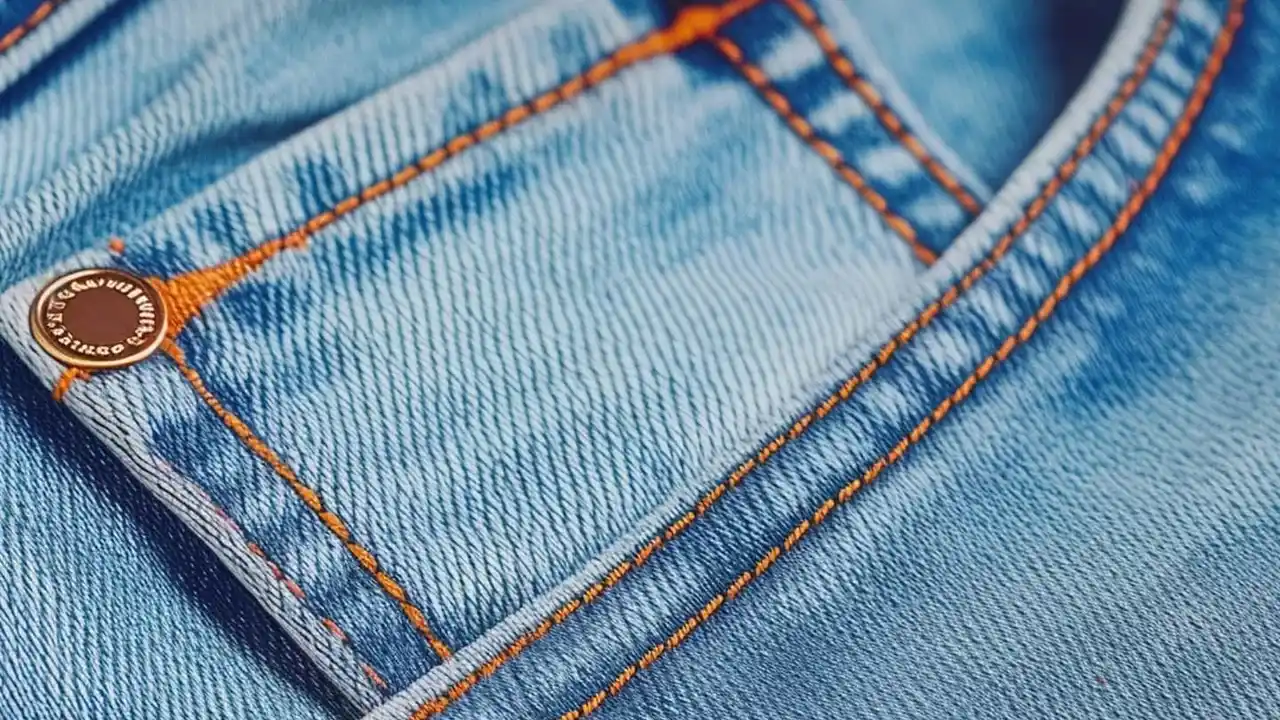
contrast is a design principle that uses a pocket to introduce a focal point on a piece of clothing. It’s a deliberate move to make one small area stand out. Think of a simple navy blue chore coat. Now, imagine one of its chest pockets is made from a different material, like tan corduroy. Suddenly, that single pocket does more than just hold your keys—it defines the entire jacket. This is achieved by creating contrast, which can be done through color, texture, or even stitching. It works by breaking up the visual uniformity of a garment, forcing the eye to land on the element that is different. A plain t-shirt becomes a statement piece with a small, leather-trimmed pocket. A pair of jeans gets a shot of personality from back pockets stitched in a vibrant, contrasting thread. It’s a simple trick with a surprisingly significant impact, turning an otherwise mundane feature into the star of the show.
A Trick with a Practical History
The idea of using pockets to add visual interest isn't new; it has roots in functional workwear. In the past, reinforced or different-colored pockets on work jackets and pants often signaled a reinforced area, designed for durability where it was needed most. A patch pocket, sewn onto the exterior of a garment, was simple to construct and repair, making it a utilitarian staple. Over time, what was once purely practical became an aesthetic choice. Designers began to borrow these visual cues from vintage workwear and military garments, appreciating the character and story they added. The contrast that once signified strength or repair now signifies style and intention. That chore coat with the single off-color pocket might not be intended for a factory floor, but it carries the visual DNA of clothing that was built to last, giving it a sense of authenticity and rugged charm.
How to Make Pocket Contrast Work for You
Incorporating this trend into your wardrobe is simple, but a few guidelines can help. First, let the pocket do the talking. If you’re wearing a shirt or jacket with a strong contrast pocket, keep the rest of your outfit relatively simple. A neutral t-shirt or sweater allows the garment’s focal point to stand out without competing for attention. Secondly, think about placement. A contrasting chest pocket draws attention upward, toward your face and shoulders. Contrasting pockets on pants or a skirt will draw the eye downward. You can use this to your advantage to subtly direct where people look. Finally, don't be afraid to embrace the playfulness of it. A formal blazer with unexpected patch pockets in a casual fabric breaks down the stuffiness of traditional tailoring. It's a sign that you appreciate the classics but aren't afraid to bend the rules, proving that sometimes, the smallest details make the biggest statement.