



The Problem With 'Perfectly Matching'
The old-school approach of dressing everyone in identical outfits—think white button-downs and jeans—often feels dated and stiff. It can be a struggle to find one single item that everyone likes, feels comfortable in, and has in their size. The result
is often a photo where individual personalities are erased, replaced by a uniform that feels more forced than festive. On the other end of the spectrum, having no coordination at all can lead to a visual clash of colors, patterns, and styles that makes the final picture feel busy and disjointed. The goal is to look connected, not copied.
The Solution: A Coordinated Color Palette
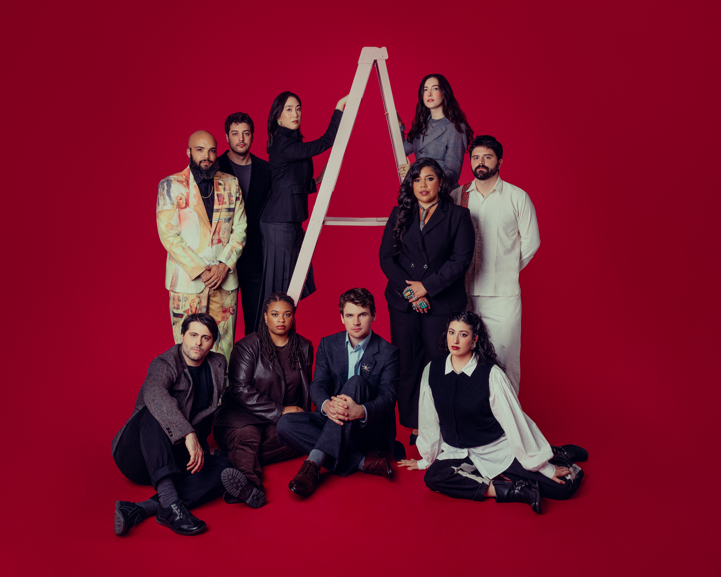
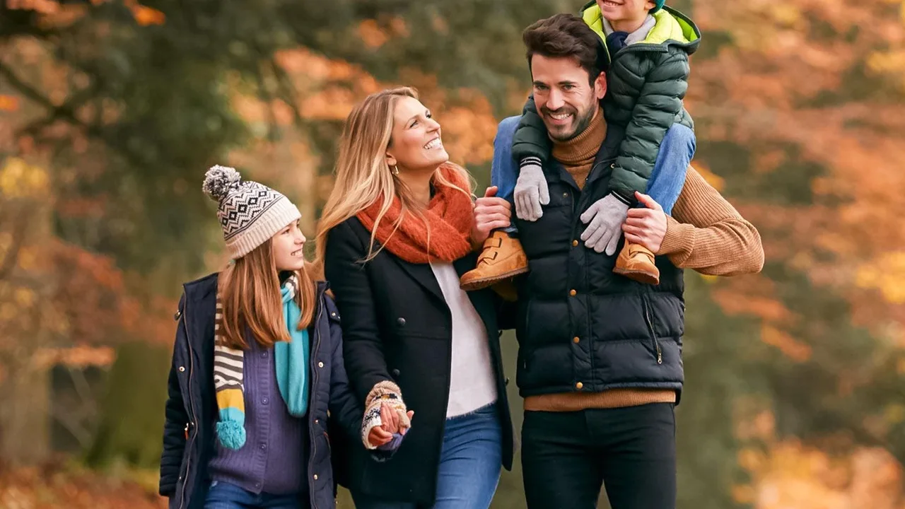
The modern, stress-free solution is to coordinate, not match. The strategy is simple: choose a palette of three to four complementary colors and let everyone build their own outfit from that selection. This allows each person to wear clothes that fit their style, body, and comfort level, all while contributing to a cohesive, polished, and visually harmonious group shot. A child can wear their favorite soft sweater, a teen can stick to their preferred silhouette, and adults can choose pieces they feel confident in. Everyone wins, and the resulting photo looks effortlessly stylish.
Choosing Your Thanksgiving Palette
Fall provides a naturally beautiful color scheme to draw from. For Thanksgiving, think warm, rich, and earthy tones that complement the season. Popular palettes that photograph beautifully include combinations like rust, olive green, cream, and denim, or a moodier mix of burgundy, navy, and camel. Other winning combinations include mustard yellow with brown and taupe, or a simple, elegant blend of deep browns and creams. The key is to select colors that are similar in brightness and tone. Avoid neon brights or having one person in a stark white while another is in black, as the high contrast can be distracting.
How to Communicate the Plan (Without the Drama)
The secret to rolling out the family photo plan is to frame it as a way to make things easier for everyone. A week or two before the gathering, send out the chosen color palette—a simple text message with digital color swatches works perfectly. Present it as a guideline, not a strict rule. Phrases like, 'Here are some color ideas for the family photo to make it easy—anything in the family of browns, creams, or rust would be beautiful!' work well. One pro tip is to start with the person who is hardest to dress, whether it's a picky toddler or a style-conscious teen. Letting them choose their outfit first from within the palette can ensure their comfort and cooperation from the start.
Don't Forget Texture and Accessories
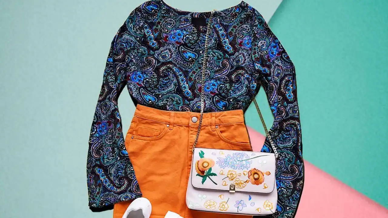
Color is just the first step. Adding a mix of textures is what gives a photo depth and visual interest. Encourage a variety of fabrics like chunky knits, soft corduroy, classic denim, smooth cotton, or even a touch of velvet. These different surfaces catch the light in unique ways, making the overall image feel richer and more dynamic. Accessories are another powerful tool for tying looks together. A scarf, a pair of boots, or a hat in one of the palette's accent colors can create a subtle connection between outfits, reinforcing the coordinated feel without being obvious about it.