


What's Happening?
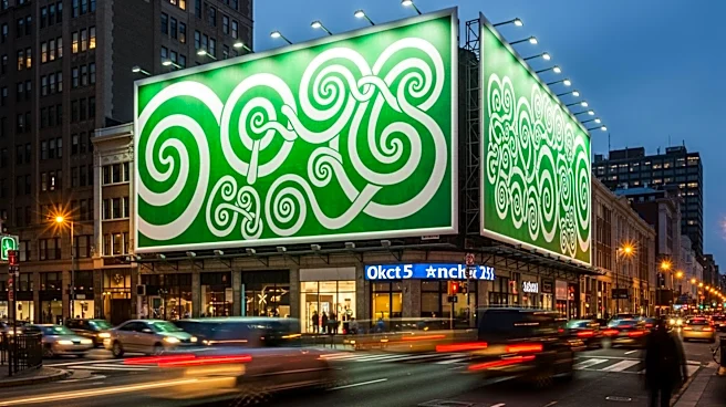
Spotify recently changed its app icon to a green disco ball in celebration of its 20th anniversary, sparking a range of reactions from the marketing community. The temporary redesign has been criticized for readability and brand recognition issues, with
some users expressing confusion over the app's new appearance. Despite the criticism, the change has also been seen as a bold move that adds emotion and cultural play to the brand. The debate highlights the tension between maintaining brand consistency and embracing creativity in marketing strategies.
Why It's Important?
The reaction to Spotify's icon change underscores the challenges tech brands face in balancing distinctiveness with creativity. While brand recognition is crucial, the ability to evoke emotion and engage with cultural moments can enhance a brand's memorability and consumer connection. Spotify's decision to temporarily alter its icon demonstrates a willingness to take risks and prioritize user engagement over strict adherence to brand guidelines. This approach can set a precedent for other tech companies to explore more dynamic and culturally relevant marketing strategies.
Beyond the Headlines
The controversy surrounding Spotify's icon change reflects broader trends in tech branding, where minimalism and consistency often overshadow creativity. As tech brands strive to stand out in a crowded market, the ability to adapt and resonate with cultural moments becomes increasingly important. Spotify's move may encourage other companies to reconsider their branding strategies, potentially leading to more innovative and engaging marketing campaigns. The discussion also highlights the role of emotion in brand building, suggesting that memorable experiences can drive consumer loyalty and brand success.