


What's Happening?
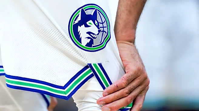
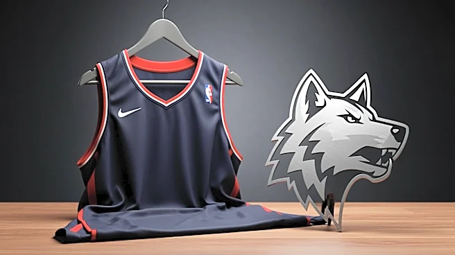
The Minnesota Timberwolves have officially revealed their redesigned jerseys and logo for the 2026-27 NBA season. The new design eliminates the previous shades of blue, opting instead for a royal blue reminiscent of the team's early years from 1989-95.
The uniforms will be available in white, royal blue, and black, each featuring 'Wolves' across the chest. The updated logo, which closely resembles the previous design, incorporates the color scheme from the team's early history. This rebranding effort follows fan demand for a return to the team's roots, although some fans had hoped for a revival of the Kevin Garnett-era uniforms.
Why It's Important?
The Timberwolves' rebranding is a strategic move to reconnect with the team's history while appealing to both long-time fans and new audiences. By revisiting the color scheme from the franchise's early years, the team aims to evoke nostalgia and strengthen its brand identity. This change could enhance fan loyalty and increase merchandise sales, contributing to the team's financial success. The rebranding also aligns with broader trends in sports marketing, where teams leverage historical elements to create a unique and memorable brand experience.
What's Next?
As the Timberwolves prepare to launch their new look in the upcoming season, the team will likely engage in marketing campaigns to promote the rebranding. The response from fans and the impact on merchandise sales will be closely monitored. The team may also consider additional throwback elements in future designs, depending on fan feedback. The success of this initiative could influence other NBA teams to explore similar rebranding efforts, potentially leading to a wave of nostalgic redesigns across the league.