



The Case for Harvest Orange
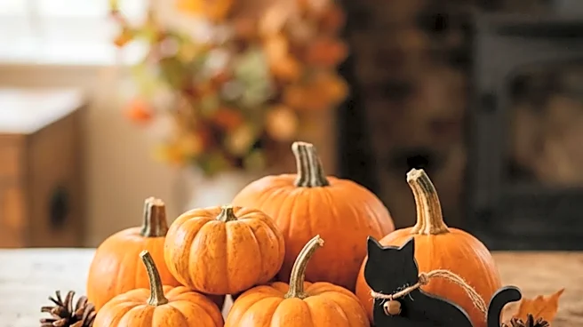
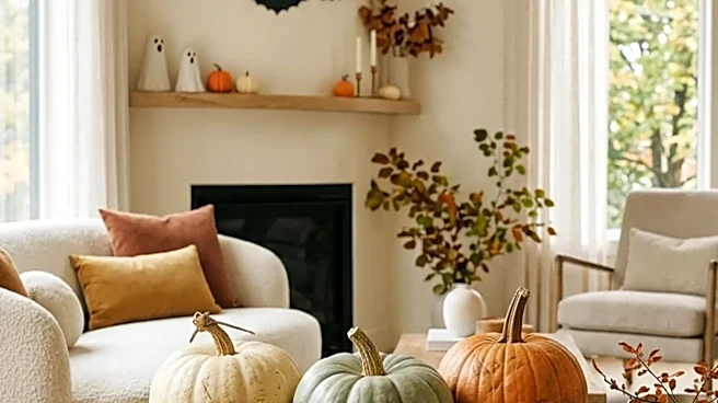
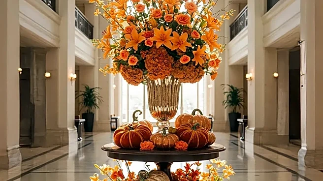
Harvest orange is the quintessential color of fall, evoking feelings of warmth, energy, and nostalgia. It’s the color of pumpkin patches, changing leaves, and cozy firesides. This classic hue is incredibly versatile and works wonders to create a cheerful, welcoming, and family-friendly atmosphere. Think of it as the color equivalent of a warm hug for your home. It’s a choice that feels both traditional and full of life, perfect for a lively Thanksgiving gathering. Items like gourds, potted mums, and plaid blankets in shades of orange make it easy to incorporate this color naturally and affordably.
When to Choose Orange
Harvest orange truly sings in rooms with a specific personality. It’s an ideal choice if your home has a base of warm neutrals like cream, beige, or soft
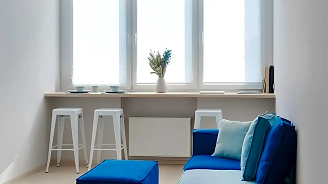
gray. The vibrant orange provides a beautiful 'pop' without overwhelming the space. It also pairs exceptionally well with blues, its complementary color, creating a dynamic and stylish look. If your home decor leans toward rustic, farmhouse, or traditional styles with lots of warm wood tones, orange will feel right at home. It thrives in spaces with abundant natural light, where its optimistic glow can fill the room.
The Allure of Deep Burgundy
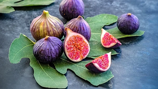
Where orange is cheerful, burgundy is elegant. This deep, wine-inspired hue brings a sense of sophistication, drama, and intimacy to a room. It feels luxurious and intentional, perfect for a more formal Thanksgiving dinner or an evening celebration. Burgundy creates a cozy, enveloping atmosphere that encourages guests to settle in and linger. It’s a color that speaks of richness and warmth, from a glass of red wine to the deep red of autumn berries. This palette works especially well for table settings, using velvet runners, satin napkins, or floral arrangements to build a layered and opulent look.
When to Choose Burgundy
Deep burgundy is the star in rooms with a moodier or more modern aesthetic. It pairs beautifully with metallic accents like gold, brass, and copper, which make the rich color feel even more luxurious. If your home features dark wood furniture, jewel-toned accents, or a more minimalist design, burgundy can add depth and warmth without clashing. It’s particularly effective in dining rooms or spaces with controlled, ambient lighting, where it enhances a sense of intimacy and occasion. If your goal is a refined and memorable tablescape, burgundy is a surefire way to achieve it.
The Best of Both Worlds
Feeling torn? You don't always have to choose. While both colors are strong, they can coexist beautifully if you follow one simple rule: pick a dominant player. Don't give them equal weight, as they can compete for attention. Instead, choose one color to be your primary theme and use the other as a subtle accent. For example, build a tablescape around a rich burgundy tablecloth and napkins, but add a few small, muted orange pumpkins to the centerpiece. Conversely, a room filled with cheerful orange decor can be grounded with a few deep burgundy candles or a floral arrangement that contains wine-colored leaves. This approach gives you a layered, designer look that feels both balanced and uniquely yours.