


The Great Grey Fatigue
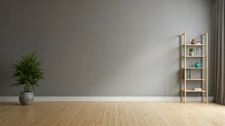
Take a moment and picture a recently renovated home, a new boutique hotel, or a modern office space from the last ten years. Chances are, you’re picturing grey. A lot of grey. For years, 'Agreeable Gray,' 'Repose Gray,' and a hundred other variations
became the default shorthand for sophisticated, clean, and contemporary. It was the color of choice for house flippers and minimalist designers alike, a safe bet that wouldn’t offend anyone. But after a solid decade, a collective exhaustion has set in. What once felt sleek and modern can now feel sterile, impersonal, and a bit melancholy. Our homes became our everything during the pandemic—office, school, gym, and sanctuary—and we collectively realized we wanted them to feel less like a blank canvas and more like a warm hug. The era of cool, passive neutrality is giving way to a desire for something with more life.
Why Artichoke Green, Why Now?
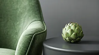
Enter artichoke green. This isn’t the bright, electric green of a lime or the deep, formal green of a pine forest. Artichoke green is a complex, muted, and earthy hue. Think of the dusty leaves of a sage plant, the soft color of a sun-drenched olive grove, or the vegetable itself—a grayish-green with subtle yellow undertones. Its current popularity is deeply tied to the concept of biophilia, our innate human desire to connect with nature. In a world of screens and concrete, this color brings a sense of the outdoors in, creating a calming, grounding atmosphere. It feels restorative and stable, a perfect antidote to the chaos of modern life. It doesn't shout for attention; it confidently whispers, creating spaces that feel both sophisticated and deeply comfortable. This is a color that nurtures, which is exactly what people are craving from their homes right now.
The New 'Goes-With-Everything' Color
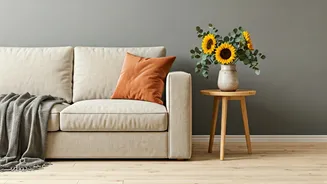
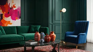
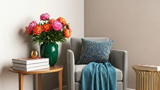
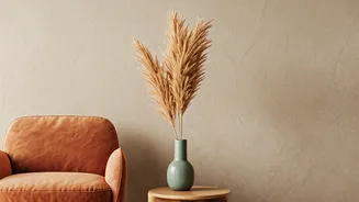
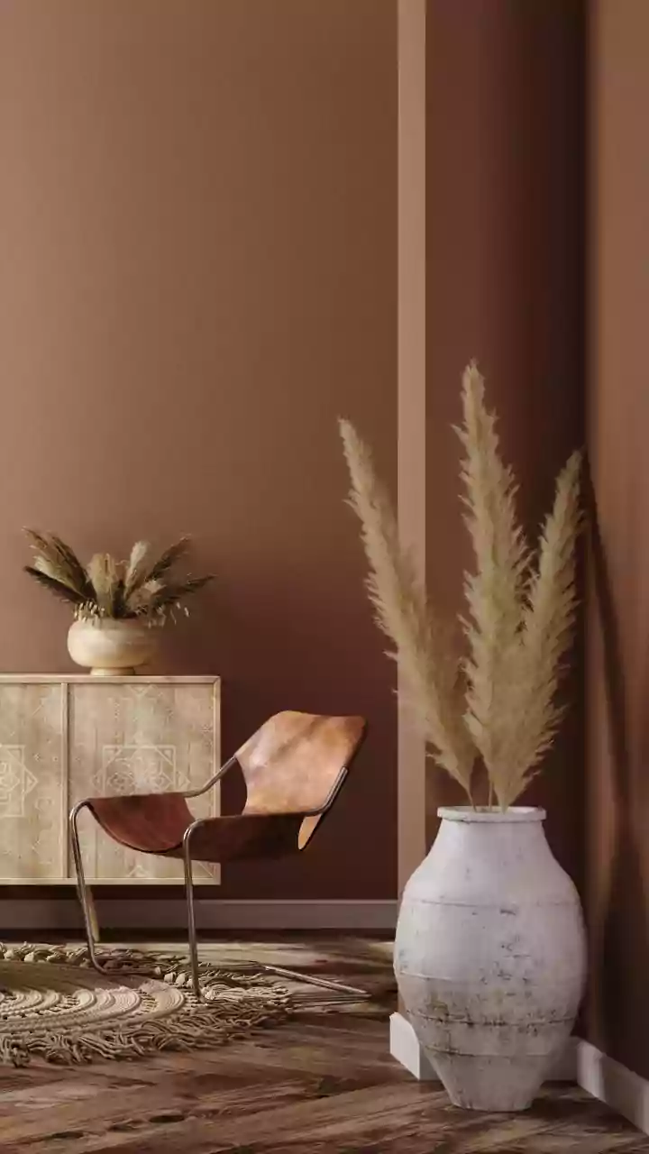
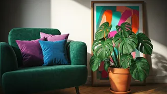
The biggest misconception about a color like green is that it’s difficult to decorate with. While that might be true for its more vibrant cousins, artichoke green functions as a 'new neutral.' Its muted, earthy quality allows it to pair beautifully with the materials and colors already in most homes. It provides a stunning backdrop for natural wood tones, from light oak to deep walnut, making them feel richer. It complements warm metals like brass, bronze, and copper, giving them a sophisticated glow. Unlike cool grey, which can sometimes feel stark against warm tones, artichoke green harmonizes with creamy whites, soft beiges, and rich leather. It can also act as a grounding element for bolder accent colors. Imagine it paired with a deep navy blue, a dusty rose, or a warm terracotta. Instead of being a blank slate like grey, it’s a character-filled foundation that makes everything around it look better.
How to Bring It Home (Without Regret)
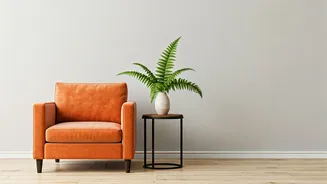
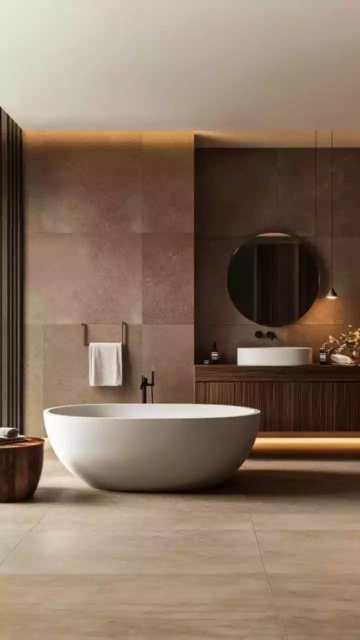
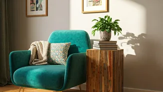
Ready to move past grey but nervous about taking the plunge? The beauty of this trend is its scalability. You can start small or go all-in. For a low-commitment entry, introduce artichoke green through accessories. A set of velvet throw pillows on a neutral sofa, a ceramic lamp, a cozy wool blanket, or even kitchen canisters can add a touch of timely color and warmth. Feeling a bit bolder? Choose a single statement piece. An upholstered armchair, a painted vintage sideboard, or a bathroom vanity in this sophisticated green can become a stunning focal point. For those ready for full immersion, paint is your best friend. An accent wall behind a bed or sofa can redefine the room's mood. In a small space like a powder room or home office, painting all four walls creates a chic, enveloping 'jewel-box' effect. And for the ultimate 2020s upgrade, kitchen cabinets in a soft artichoke green have become the new status symbol of stylish, welcoming homes.