

Decoding the 'Healthy Convenience' Mandate
So, what does it mean that 'healthy-looking convenience food is the 2026 brief'? Think of it as a creative assignment for every food company in America. The 'brief' is to design products that solve two of the modern consumer's biggest problems: a lack
of time and a desire to feel good about their food choices. The key here isn't just convenience—the frozen pizza aisle has that covered. And it isn't just health—the produce section handles that. The magic, and the money, is in the synthesis. This new generation of food must be quick, easy, and, crucially, *project* an aura of wellness. It's less about being a perfect nutritional powerhouse and more about hitting the right visual and psychological cues that signal 'health' to a busy shopper in the three seconds they spend looking at a package.
The Time-Starved, Health-Conscious Shopper
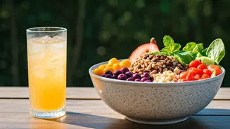
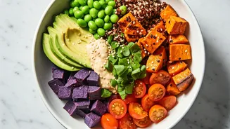
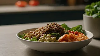
This trend isn't happening in a vacuum. It's a direct response to a cultural shift. Post-pandemic, there’s a heightened awareness of wellness, but the pressures of daily life—long work hours, commutes, and family responsibilities—haven't eased up. Consumers are experiencing 'cooking fatigue,' yet they’re also more skeptical of the ultra-processed foods that defined convenience for decades. They want the virtue of a home-cooked meal without the labor. This is the sweet spot where brands are innovating. They're targeting the shopper who wants to eat a grain bowl for lunch but doesn't have 45 minutes to chop vegetables and cook quinoa. This consumer is willing to pay a premium for a product that saves them time while aligning with their identity as someone who cares about what they eat. It's a quest for control in a chaotic world, one refrigerated meal kit at a time.
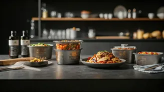
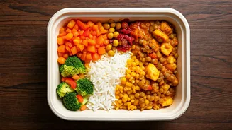
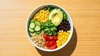
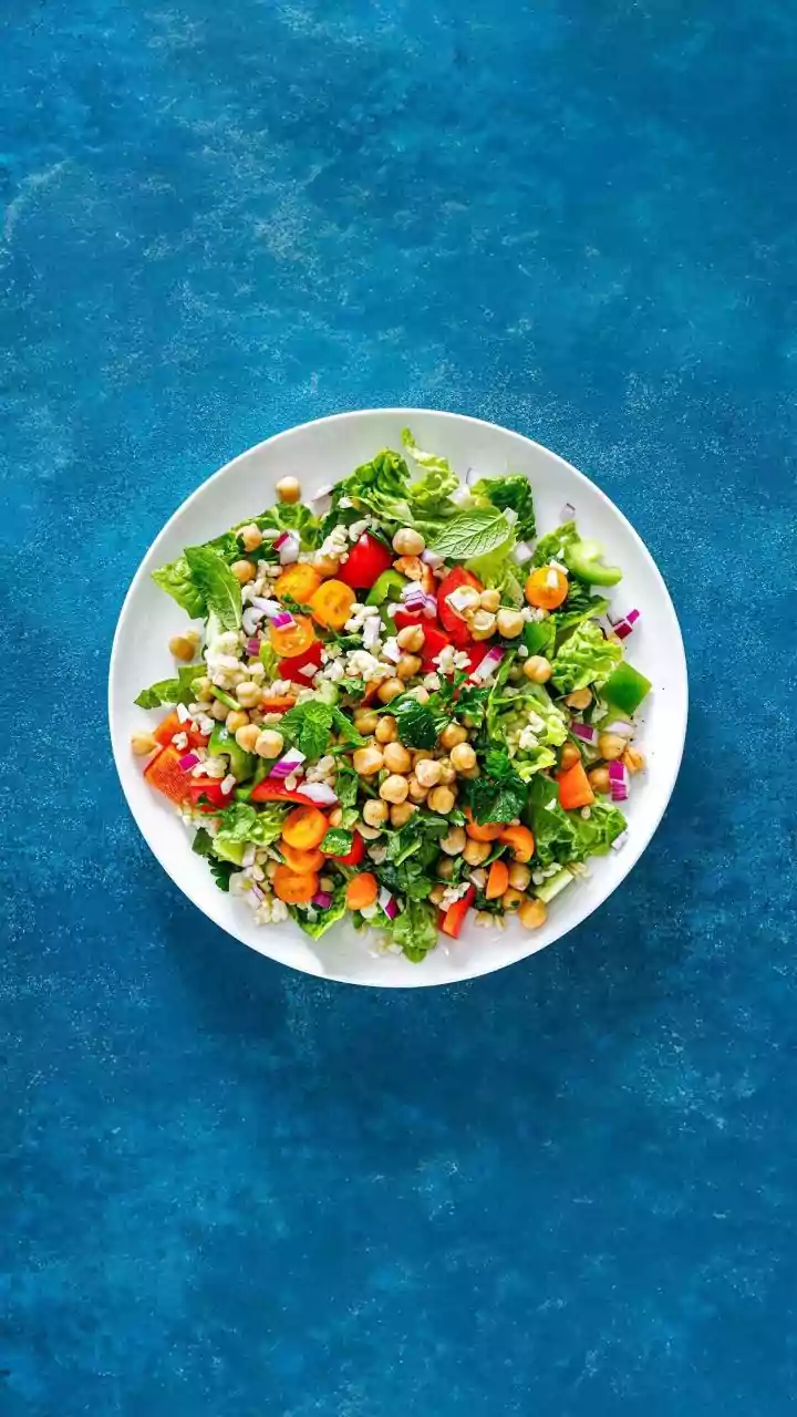
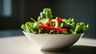
The Visual Language of Health
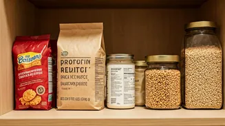
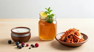
If you want to see the 2026 brief in action, just look at the packaging. The old signifiers of 'diet' food—stark white boxes, clinical fonts, and low-fat claims—are gone. The new language of health is warm, minimalist, and transparent. It’s matte cardboard instead of glossy plastic. It’s a color palette of earthy greens, gentle beiges, and vibrant, natural tones. The front of the package is a masterclass in messaging. Buzzwords like 'plant-based,' 'high protein,' 'no added sugar,' and 'gut health' are prominent. Ingredient lists are shorter and feature recognizable items. Clear windows that show off the actual food—the colorful vegetables, the whole grains—build trust. It’s a carefully crafted aesthetic designed to communicate freshness, quality, and a lack of 'bad stuff' before you even read the nutrition label.
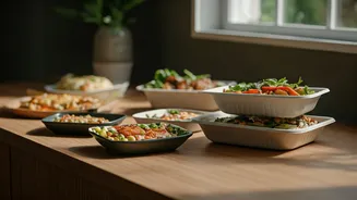
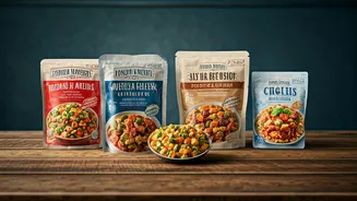
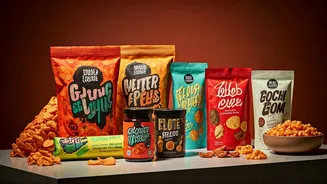
From Niche Brands to Supermarket Staples
What started in specialty stores and with direct-to-consumer startups has now gone completely mainstream. The refrigerated section of the average supermarket is ground zero for this transformation. Brands like Kevin's Natural Foods offer paleo and keto-friendly sous-vide entrées that are ready in minutes. Sweetgreen, once just a salad chain, now sells its dressings in grocery stores nationwide. You'll find high-protein, low-sugar versions of everything from yogurt to ice cream. Even the frozen aisle is getting a makeover, with companies like Daily Harvest and Caulipower proving that frozen food can be seen as fresh and nutritious. This isn't about one product category; it's a philosophy being applied across the store, from grab-and-go snack packs to fully prepared meals, forcing legacy brands like Kraft Heinz and General Mills to either innovate or acquire the companies that are.