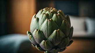


So, What Exactly Is Artichoke Green?
Forget the vibrant lime of a mojito or the deep emerald of a forest. Artichoke green is its more complex, worldly cousin. It’s a muted, mid-tone green with significant gray or brown undertones, much like the outer leaves of its namesake vegetable. Think
of the soft, dusty green of a eucalyptus leaf, the hazy color of hills in the distance, or the weathered patina on a copper statue. It’s sophisticated, earthy, and deeply versatile. Unlike brighter greens that demand attention, artichoke is a quiet collaborator. It’s a color that feels found, not made—as if it were pulled directly from a landscape painting. This organic quality allows it to act as a “new neutral,” providing a dose of color that feels as calming and foundational as a classic beige or gray, but with far more personality.
An Antidote to the All-White Box
For years, the design world orbited around Scandinavian minimalism and the modern farmhouse aesthetic, both of which championed bright white walls, clean lines, and a less-is-more approach. While beautiful, these spaces can sometimes feel stark, clinical, or even empty—a blank canvas that never quite gets painted. After spending more time at home than ever before, many of us realized we don’t just want a space that looks good on Instagram; we want a space that *feels* good to live in. Artichoke green is a direct and gentle rebellion against that austerity. It wraps a room in subtle warmth, absorbing light rather than reflecting it, which creates an instant sense of coziness and intimacy. It suggests a turn toward interiors that are more personal, layered, and lived-in, moving away from the impersonal perfection of the showroom floor.
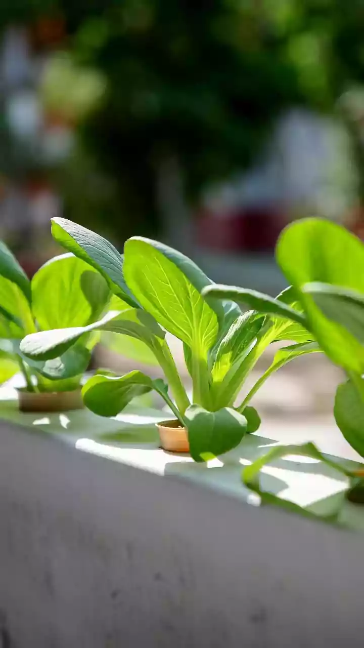
The Soothing Power of Nature
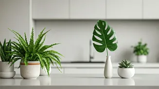
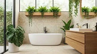
The headline’s claim that this color makes interiors “less sad” isn’t just poetic license; it’s rooted in basic color psychology. Green is overwhelmingly associated with nature, growth, and renewal. Our brains are hardwired to find it restorative. Studies have shown that exposure to green, even just as a color, can reduce stress, lower blood pressure, and evoke feelings of tranquility and balance. It’s the color of life itself. In a world of digital screens and concrete jungles, bringing a nature-inspired hue into our most personal environment provides a subconscious sigh of relief. It’s a core principle of biophilic design, which argues that connecting our indoor spaces to the natural world improves our mental and physical well-being. Artichoke green is biophilia in a paint can—an easy, accessible way to foster that connection.
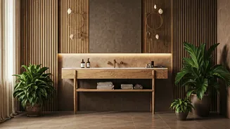
How to Bring It Home
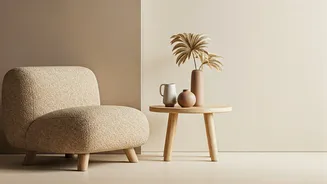
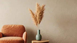
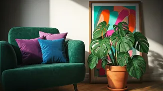
The beauty of artichoke green is its flexibility. It’s bold enough to make a statement but muted enough to avoid overwhelming a space. For a high-impact look, consider painting all four walls of a den, library, or bedroom to create a cozy, enveloping cocoon. It’s especially effective in rooms with great natural light, where the color can shift and change throughout the day. If that feels like too much commitment, start smaller. Kitchen cabinets painted in this sophisticated green feel both timeless and modern, pairing beautifully with brass hardware and marble countertops. An accent wall behind a bed or sofa can provide a focal point without dominating. For the color-shy, artichoke green works wonders in textiles and decor. Think of a velvet sofa, plush throw pillows, a heavy linen duvet cover, or ceramic lamps. These touches introduce the color’s calming effect in a low-risk, high-reward way.