

The Great Grey Burnout
For the better part of a decade, grey was the undisputed king of interiors. It was the color of sophistication, the backdrop of Scandinavian minimalism, and the developer’s safest bet. ‘Agreeable Gray’ and its countless cousins blanketed walls, cabinets,
and floors, promising a clean, modern aesthetic that wouldn’t offend anyone. But in its ubiquity, it lost its edge. After years of living inside what sometimes felt like a black-and-white movie, homeowners are experiencing a collective burnout. The color that once felt sleek and versatile now often feels impersonal, sterile, and, let’s just say it, boring. We spent more time at home than ever before, staring at those same four grey walls, and realized we craved something more—something with life.
Defining the 'Artichoke' Vibe
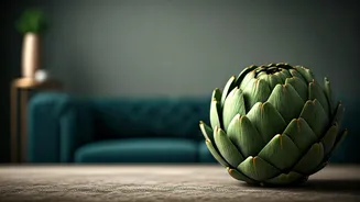
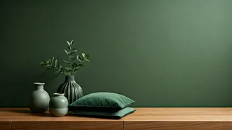
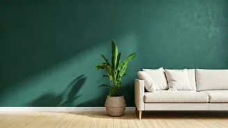
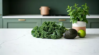
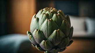
When we say artichoke green, don’t picture a cartoonish, St. Patrick’s Day shamrock. This isn’t one specific paint swatch but rather a family of complex, organic greens. Think of the dusty, silvery-green of a sage leaf, the deep, moody tone of a forest floor, or the velvety, muted shade of an artichoke heart itself. These are greens that have been toned down with hints of grey, yellow, or brown, giving them a rich, earthy depth. Major paint brands have been riding this wave for a few years, with popular shades like Sherwin-Williams’ ‘Evergreen Fog,’ Benjamin Moore’s ‘October Mist,’ and Farrow & Ball’s beloved ‘Green Smoke’ all capturing this same grounded, sophisticated spirit. It’s a green that feels less like a trend and more like a timeless neutral borrowed directly from the natural world.
A Cure for the Common Wall
So, why this shift from cool and controlled to earthy and organic? The answer lies in design psychology. The rise of these greens is directly tied to the concept of biophilia—our innate human desire to connect with nature. After years of being surrounded by sleek technology and man-made materials, we’re collectively yearning for the calming, restorative effects of the outdoors. Green is the color of life, growth, and balance. It’s restful for the human eye and has been shown to reduce stress and anxiety. Bringing these nature-inspired hues inside is a powerful way to make our homes feel like true sanctuaries. It’s a rebellion against the perfectly curated, untouchable spaces of Instagram and a move toward creating rooms that feel lived-in, warm, and deeply comforting.
How to Actually Use It
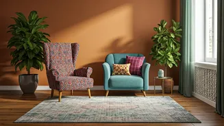
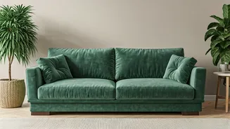
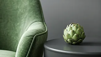
The best part about artichoke green is its surprising versatility. It’s bold enough to make a statement but muted enough to act as a neutral. If you’re ready to invite it in, here are a few ways to start. For a high-impact, cozy vibe, go for full immersion by painting an entire room, like a den, office, or bedroom. The deep color will create an enveloping, jewel-box effect. If that feels too daunting, use it on kitchen cabinets or a bathroom vanity for a pop of sophisticated color. An accent wall behind a sofa or headboard remains a classic for a reason, adding depth without overwhelming the space. And for the color-averse, you can still embrace the trend with textiles—think velvet pillows, a chunky knit throw, or a patterned area rug that anchors the room in this grounding hue.
The New Neutral That Plays Well With Others
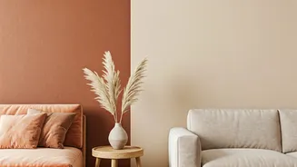
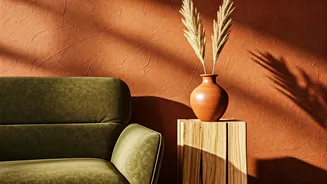
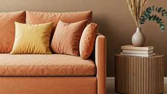
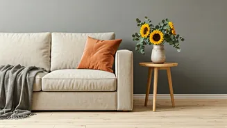
Unlike some demanding trend colors that require you to redecorate your entire home, this family of greens is a fantastic team player. It pairs beautifully with the materials you likely already own. Natural wood tones, from pale oak to rich walnut, come alive next to it. It makes warm metals like brass and bronze glow and provides a soft counterpoint to modern matte black fixtures. For a foolproof palette, combine it with creamy whites, warm beiges, and charcoals. Want something more adventurous? Artichoke green is stunning next to terracotta, rust, and even soft, dusty pinks. It proves that a neutral doesn’t have to be devoid of color; it just has to be versatile enough to let the rest of your home shine.