


Defining the Perfect Green
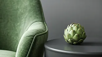
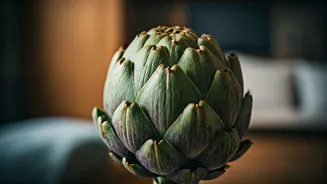
So, what exactly is artichoke green? Forget the bright, electric greens of limes or the deep, dramatic shades of a pine forest. Artichoke green is a mid-tone, muted color firmly rooted in the natural world. It’s characterized by its complex undertones,
often a mix of gray and a touch of yellow or ochre, which gives it a soft, dusty quality. Think of the color of sage leaves, olive branches, or the outer leaves of its namesake vegetable. This complexity is its greatest strength. Unlike simpler greens, it changes beautifully with the light, appearing cooler and more reserved in the morning and warmer and cozier in the afternoon sun. It’s a color that feels sophisticated and organic, making it a versatile choice for modern and traditional homes alike.
Why It Works (And Why Now)
The rise of artichoke green isn’t just a random trend; it’s a direct response to our collective desire for more calming, grounding, and nature-connected interiors. The design world calls this 'biophilic design'—the practice of incorporating nature into our built environment to improve our well-being. After years of minimalist palettes that sometimes felt sterile, artichoke green provides a dose of restorative color. It’s comforting without being dull and interesting without being loud. It serves as a perfect backdrop, allowing other elements in a room to shine while still making a statement of its own. It feels mature, intellectual, and deeply comforting, turning a house into a sanctuary from the outside world.
Start Small: The Accent Approach
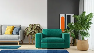
Dipping your toes into a new color can be intimidating. The beauty of artichoke green is that it works brilliantly in small doses. If you’re not ready to commit to a full room, consider an accent project. Painting the lower cabinets in your kitchen this shade can instantly ground the space and give it a bespoke, high-end feel. A single accent wall, especially behind a bed or a sofa, can add depth and focus. Other high-impact, low-commitment ideas include painting a front door for a welcoming and chic entrance, refreshing a vintage dresser or bookcase, or coating the walls of a small powder room for a jewel-box effect. These small applications allow you to enjoy the color’s calming effect without a massive undertaking.
Go Bold: Full Immersion
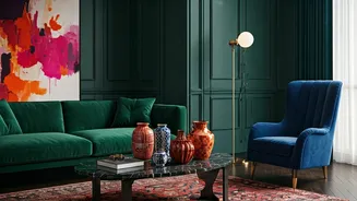
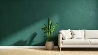
For those ready to embrace the look fully, using artichoke green on all four walls of a room creates a wonderfully enveloping and cohesive atmosphere. It’s an especially effective choice for spaces designed for relaxation or focus, like a bedroom, a home office, or a cozy den. In a bedroom, it fosters a sense of tranquility conducive to rest. In a study or library, its muted quality helps reduce glare and creates a sophisticated, studious mood. When going for full immersion, pay close attention to the finish. A matte or eggshell finish will enhance the color's soft, velvety nature and minimize imperfections, making the room feel like a warm hug.
Perfect Pairings: Colors and Materials
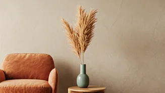
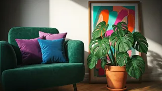
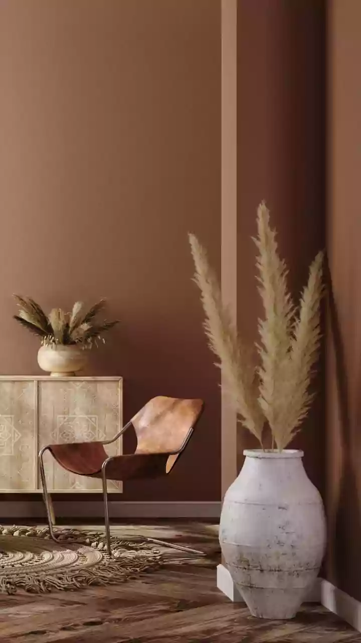
Artichoke green is a surprisingly good team player, pairing beautifully with a wide range of colors and materials. For a natural, organic feel, combine it with warm woods like oak and walnut, along with textures like linen, wool, and rattan. It looks stunning next to creamy, warm whites, which provide a crisp contrast without feeling stark. For a more dynamic palette, consider pairing it with complementary colors like dusty rose, terracotta, or deep mustard. These combinations are earthy and rich. In terms of hardware and fixtures, both warm and cool metals work. Brushed brass or gold adds a touch of glamour and warmth, while matte black provides a modern, graphic contrast. The key is to lean into its natural, sophisticated vibe.