
The Rise and Reign of Greige
To understand where we’re going, you have to remember how we got here. The 2010s were the undisputed Age of Grey. It wasn’t just a color; it was an ethos. Spun off the minimalist movement and supercharged by the post-2008 housing crisis, grey—and its
warmer cousin, “greige”—became the official color of financial safety and mass appeal. Flippers and developers painted everything in Sherwin-Williams’ “Agreeable Gray” because it was the ultimate neutral: modern, clean, and inoffensive. It photographed well for Zillow and provided a blank canvas that wouldn't scare away potential buyers. HGTV turned this formula into a national phenomenon, where knocking down a wall and applying a coat of grey paint was the fastest route to “updated.” The result was a sea of monochromatic living rooms and kitchens that were sophisticated but often soulless, looking more like hotel lobbies than personal sanctuaries.
Pandemic-Driven Color Correction
Then, we all got stuck at home. The COVID-19 pandemic acted as a massive, unexpected catalyst for a design rethink. The spaces that once felt sleek and modern suddenly felt sterile and cold. When your home has to be your office, gym, school, and sanctuary all at once, you start to notice what’s missing. Staring at the same four grey walls for months on end, many Americans came to a collective realization: our homes were boring. The blank canvas aesthetic lost its appeal when we were craving comfort, personality, and joy. The home was no longer just an asset to be staged for resale; it needed to be a place that nurtured us, and grey, for many, simply wasn’t up to the task. The desire for a home that felt uniquely *ours* began to bubble to the surface.
The New Mood: Warmth and Personality
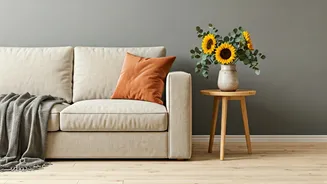
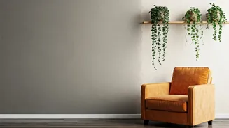
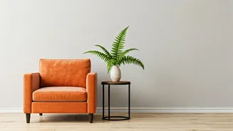
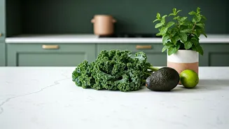
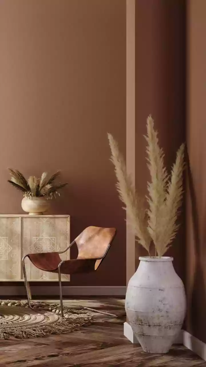
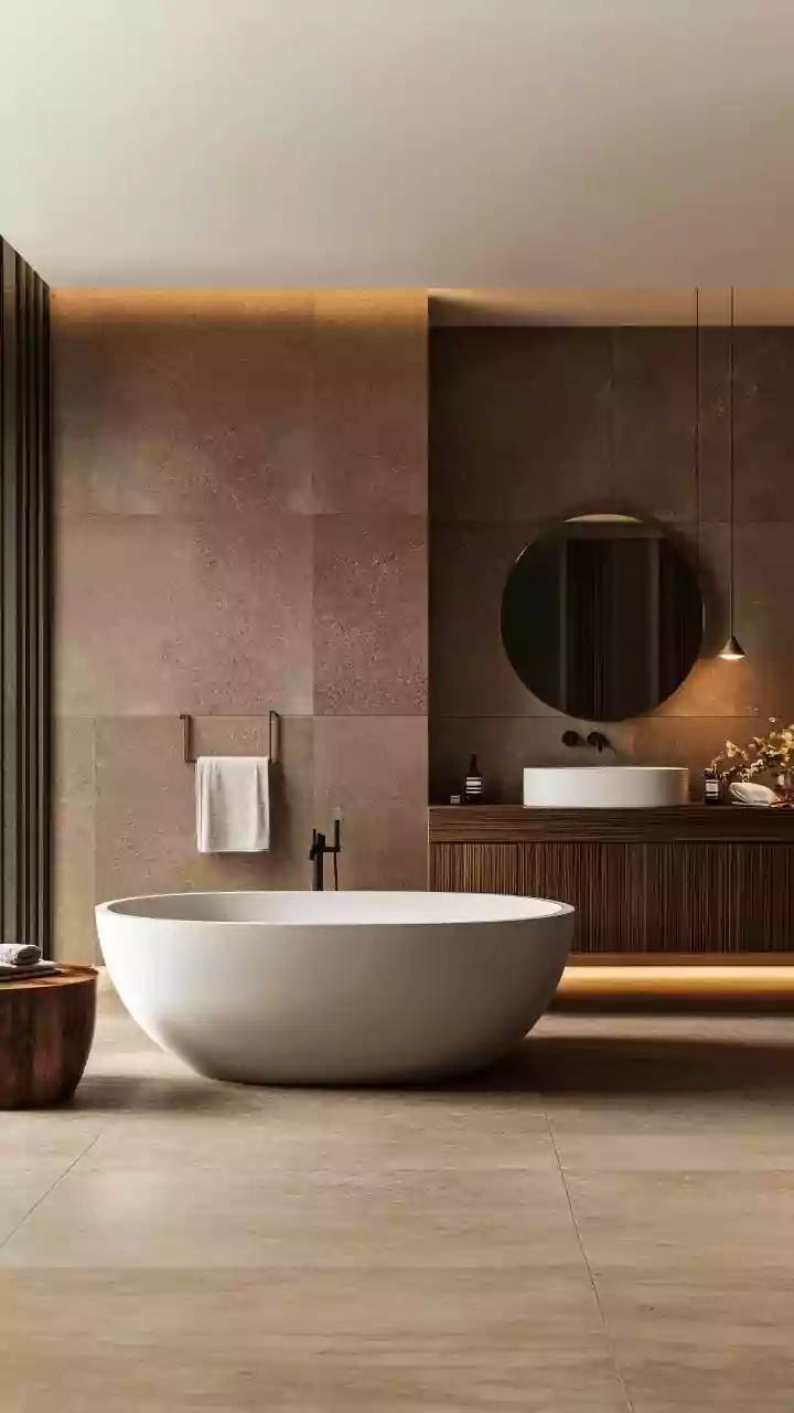
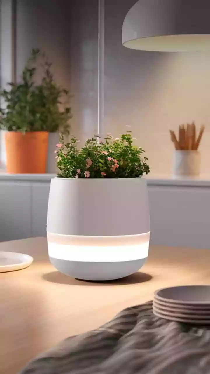
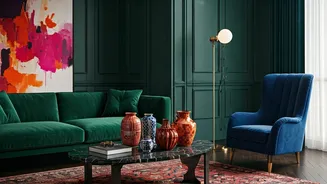
The movement away from grey isn’t toward one single new color, but rather a whole new feeling. Designers and homeowners are embracing what’s often called “dopamine decor”—surrounding yourself with colors, textures, and objects that make you happy. This has splintered into several major trends. First is the return of earthy, grounding tones: rich terracotta, warm ochre, deep olive green, and creamy, complex beiges are replacing cool greys. These colors connect us to nature and create an instant sense of warmth and stability. Think of Benjamin Moore’s and Sherwin-Williams’ recent “Color of the Year” choices, which have skewed toward cozy, biophilic hues instead of stark neutrals. They feel both timeless and deeply comforting.
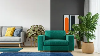
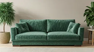
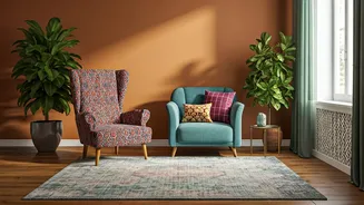
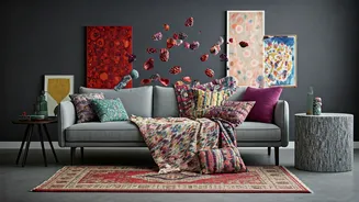
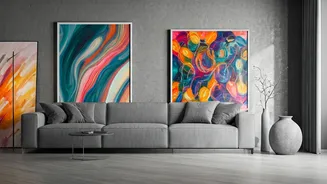
Bold, Expressive, and Unapologetic
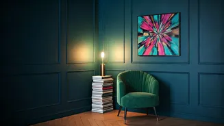
Alongside the earthy tones is a parallel explosion of bold, saturated color. After years of playing it safe, people are ready to be expressive. This means moody jewel tones like sapphire blue and emerald green for a dramatic, enveloping feel. It means sunny yellows and even vibrant, saturated reds in kitchens and dining rooms. It’s about using color to define a mood and create a story. Instead of an all-grey-everything approach, the new rule is that there are no rules. We’re seeing more “color drenching,” where walls, trim, and even the ceiling are painted the same shade for an immersive experience. It’s a confident, maximalist turn away from the cautious minimalism that grey represented.