


Identifying the 'Toxic' Hue
Let’s be clear: we’re not talking about all greens. The 'toxic' green in question is a very specific type of monster. Think of the jarring, artificial shades that scream for attention. It's the acidic chartreuse of a 90s Nickelodeon show, the electric
lime of a cheap energy drink, or that flat, vaguely minty green that makes hospital waiting rooms feel so unsettling. These colors are often highly saturated with a heavy dose of yellow, creating a vibrating, almost nervous energy. While they might look fun on a throw pillow in a maximalist space, using them on a large scale—like on all four walls—is a fast track to a room that feels chaotic, dated, and visually exhausting.
Why These Greens Feel So Wrong
The problem with these 'toxic' shades lies in their psychological impact. Our brains are hardwired to associate most greens with the calming, restorative effects of nature. But these hyper-synthetic versions do the opposite. Their high-frequency, yellow-based undertones can induce a subtle sense of anxiety or restlessness. They don’t recede gracefully into the background; they fight with every other element in the room for dominance. Furniture looks awkward against them, natural light can make them look sickly, and artificial light can turn them into a ghastly, fluorescent nightmare. They lack the complexity and depth of the greens we see in the natural world, which is why they often end up looking cheap and unsophisticated, no matter how much you spend on the paint.
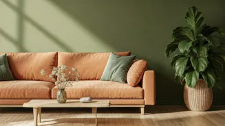
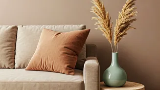
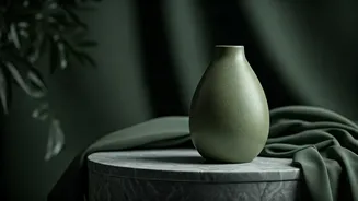
The Antidote: Earthy and Grounded Greens
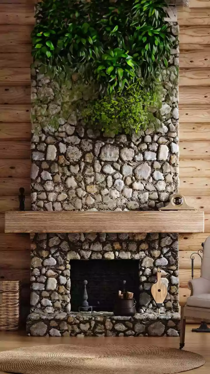
So, how do you get green right? The simplest solution is to look to nature for inspiration. Earthy greens are nearly impossible to get wrong. These are the shades with a bit of gray, brown, or blue mixed in, giving them a muted, grounded quality. Think of sage green, which has a soft, silvery undertone that feels instantly calming and sophisticated. Or consider moss and olive greens—these shades are rich and complex, adding warmth and a sense of history to a space. They work beautifully in a variety of lighting conditions and pair exceptionally well with natural materials like wood, leather, and linen. These are the greens that act as a neutral, providing color without overwhelming the senses.
Going Bold: Rich and Moody Greens
If you crave a more dramatic look, skip the acid brights and dive into the world of deep, moody greens. These jewel-toned shades have an inherent elegance that makes a powerful statement. Emerald green, with its regal and luxurious feel, can turn a small powder room or a study into a captivating jewel box. Forest green, a deep and enveloping shade, creates a cozy, library-like atmosphere that invites you to settle in. Even a dark teal, which straddles the line between blue and green, can add incredible depth and character to a room. The key to using these bolder shades is balance. They work wonders on an accent wall, on kitchen cabinetry, or as a sumptuous velvet sofa.
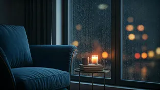
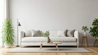
Smart Ways to Bring Green Home
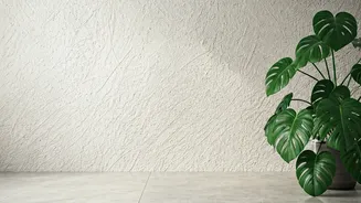
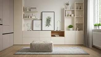
Even with the right shade, application matters. If you’re nervous about painting your walls, start small. Introduce sophisticated greens through textiles like curtains, rugs, or throw blankets. A cluster of healthy, real houseplants is the most foolproof way to add a touch of natural green to any room. When you are ready to paint, always test your chosen color. Paint a large swatch on the wall and observe it at different times of the day. A beautiful olive green in the morning sun might look muddy in the evening lamplight. Don’t be afraid to use a primer, especially if you’re covering a previous color, to ensure the green you chose is the green you get.