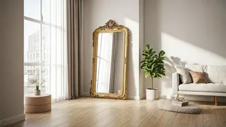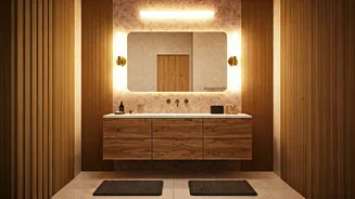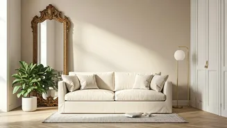


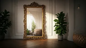
Reflect Light, Not Clutter
The first rule of mirror placement is simple: think about what you’re doubling. A mirror’s job is to bounce light and create an illusion of depth. To maximize this, place a mirror opposite a window. It will capture the natural light and reflect it back
into the room, making the entire space feel brighter and more airy. On the flip side, avoid placing a mirror directly across from a cluttered bookshelf, a messy entryway, or a busy-patterned wall. Reflecting visual chaos will only make the room feel more cramped and disorganized. The goal is to reflect open space, light, or a beautiful piece of art.
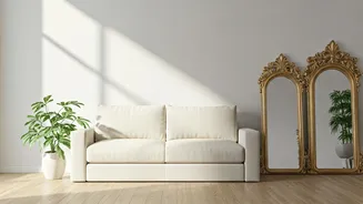
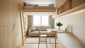
Go Big for Maximum Impact
When it comes to mirrors in a small room, timidness is not your friend. While a small decorative mirror can be a nice accent, a large, floor-length mirror is a true workhorse. Leaning a tall, oversized mirror against a wall is a classic designer trick for a reason. It draws the eye upward, creating a sense of height, while its large reflective surface dramatically expands the perceived dimensions of the room. It essentially acts like a portal, tricking the brain into seeing more space than is actually there. If floor space is too precious, a large, wide mirror hung horizontally above a sofa or console table can have a similar widening effect.
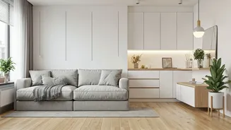
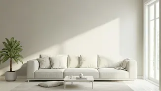
Embrace a Layered Neutral Palette
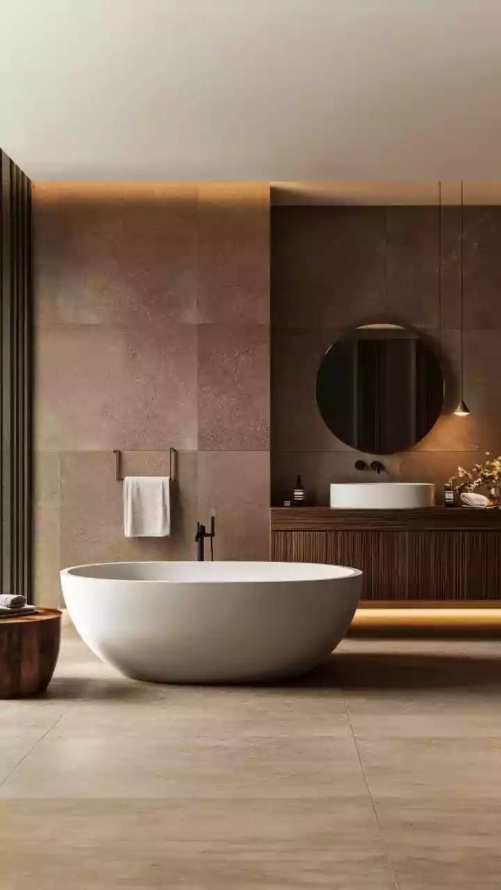
Now for the neutrals. The fear with a neutral color scheme—think whites, beiges, grays, and taupes—is that it will feel boring or sterile. The secret to avoiding this is texture. A successful neutral room is a symphony of different materials. Imagine an off-white sofa in a soft linen, a chunky wool throw blanket, a light-toned wooden coffee table, a jute rug underfoot, and sheer white curtains. Though the colors are all in the same family, the varied textures create visual interest, depth, and a sense of warmth. This layering prevents the room from feeling flat and one-dimensional, instead making it feel sophisticated and inviting.
Understand Your Undertones
Not all neutrals are created equal. A common mistake is mixing neutrals with clashing undertones. Some whites and grays have cool, blue undertones, while others have warm, yellow or pink undertones. Holding paint swatches or fabric samples together in natural light is the best way to see how they interact. For a cohesive, calming space, stick to either a warm or cool palette. A warm palette (creamy whites, beige, taupe) often feels cozier and more traditional, while a cool palette (crisp whites, grays with blue undertones) can feel more modern, clean, and expansive. There’s no right or wrong choice, but consistency is key to a polished look.
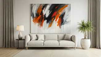
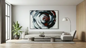
Use a Pop of (Subtle) Contrast
An all-neutral room still needs an anchor. Without any contrast, everything can blend together. This is where a touch of a darker, moodier color can make a huge difference. You don’t need a bright accent wall. Instead, think about incorporating small doses of black, charcoal gray, or deep navy. This could be in the form of picture frames, the legs of a chair, a piece of abstract art, or a single dark throw pillow. These small, dark elements ground the space and make the lighter neutrals around them pop, adding a level of intentionality and sophistication that elevates the entire room.