


The Social Media Snack Aisle
The primary driver behind this aesthetic revolution is the one in your pocket. In a world where we photograph our food before we taste it, a snack’s visual appeal has become a powerful marketing tool. Brands know that a beautiful, surprising, or uniquely
colored product is far more likely to be shared on Instagram or featured in a TikTok unboxing video, generating free advertising and social proof. The snack is no longer just for eating; it’s for performing. Food companies, from global giants to small-batch startups, are now designing with the camera lens in mind. This means focusing on vibrant, natural-looking colors, intriguing shapes, and packaging that serves as a worthy backdrop. A snack that looks good on camera is a snack that sells itself, turning every consumer with a smartphone into a potential brand ambassador.
Eating With Our Eyes First
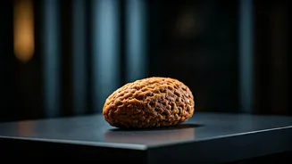
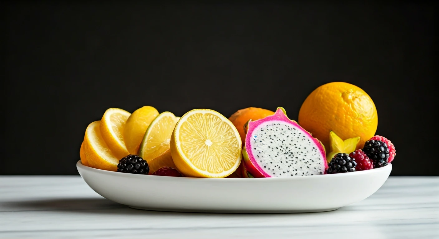
This trend isn't just about cynical marketing; it taps into a fundamental aspect of human psychology. We truly do eat with our eyes first. Studies have shown that the visual presentation of food can significantly influence our perception of its taste, quality, and even how much we enjoy it. A brighter, more artfully arranged snack can literally taste better to our brains. Brands are leveraging this by using color theory to their advantage. Soft pastels can signal a delicate, artisanal flavor, while bold, vibrant hues might suggest intense, fruity, or exotic tastes. Even the shape and texture matter. A perfectly uniform chip, a cookie with an intricate pattern, or a gummy with a novel shape all communicate a sense of care and quality before you’ve taken a single bite. This visual promise sets an expectation of a premium experience, justifying a higher price point and building brand loyalty.
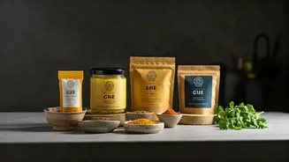
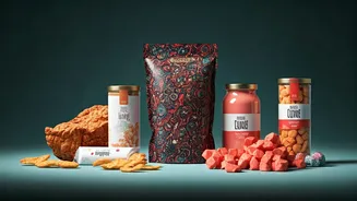
The Rise of the DTC Aesthetic
While big brands are adapting, much of this trend is spearheaded by smaller, direct-to-consumer (DTC) companies that built their entire identity around a sophisticated visual language. Think of the minimalist bags of coffee, the elegantly boxed crackers, or the pastel-hued cans of sparkling water that populate targeted ads. These brands can’t compete with the massive advertising budgets of legacy companies, so they compete on design. They use clean fonts, matte finishes, and a restrained color palette to stand out from the loud, chaotic branding of a traditional supermarket shelf. Their aesthetic signals a different set of values: modern, health-conscious, and curated. This design-first approach has forced the entire industry to take notice. Now, you see established brands borrowing from the DTC playbook, simplifying their logos and adopting more thoughtful, art-inspired packaging to appeal to a new generation of consumers who value aesthetics as much as flavor.
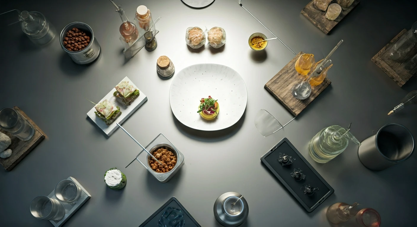
It's What's on the Outside That Counts
The visual upgrade extends far beyond the snack itself. The packaging and the unboxing experience are now integral parts of the product. It’s not just a wrapper; it’s a stage. Brands are investing in higher-quality materials, tactile finishes, and clever opening mechanisms that turn accessing the snack into a small, satisfying event. Resealable pouches with a satisfying zip, boxes with thoughtful interior printing, and even the crinkle of the bag are all considered. This elevates a simple purchase into an experience. For DTC brands that primarily ship their products, the unboxing is the first physical interaction a customer has with the company. A beautifully designed box, thoughtful inserts, and carefully arranged products create a memorable moment that reinforces the brand’s premium identity and makes the customer feel valued. In this new landscape, the package isn't just a container; it’s a promise of the quality within.