
The Psychology of a Neutral Palette
Before you pick up a paintbrush, it helps to understand why these colors are so powerful. Shades of sand, beige, and ecru are deeply connected to the natural world. They are the colors of shorelines, desert landscapes, and sun-drenched stones. This connection
is grounding. Unlike bold, stimulating colors that demand attention, these soft neutrals create a subtle, non-intrusive backdrop that allows the mind to relax. They don’t shout; they whisper. This gentle quality reduces visual noise and cognitive load, fostering a sense of peace and stability that mimics the feeling of a long, lazy summer day without a schedule.
Start with a Monochromatic Base
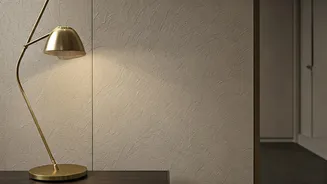
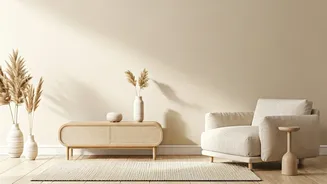
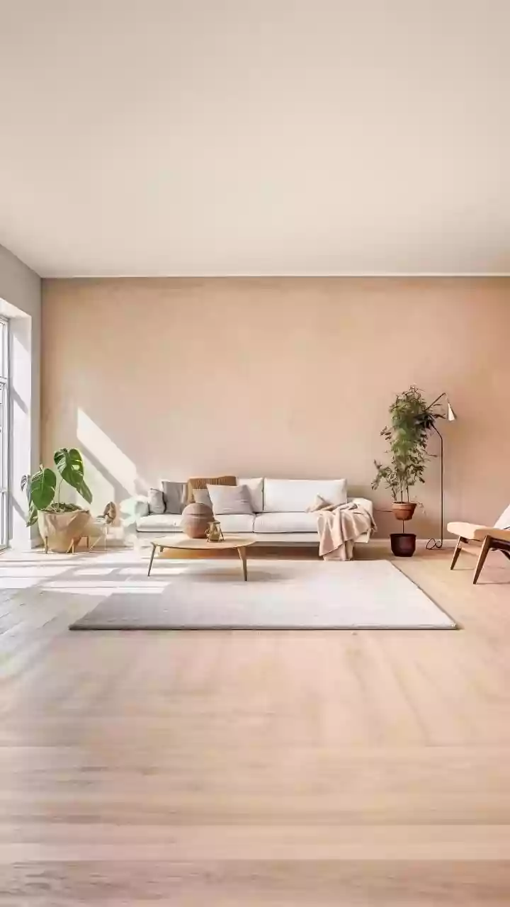
The mistake many make with beige is thinking it’s a single color. In reality, it’s a vast family of tones, from warm, sandy beiges with yellow undertones to cooler, greige shades with hints of gray. To create a truly serene space, start by choosing one dominant shade for your walls. A warm, creamy beige can make a room feel sunny and inviting, while a lighter, more muted sand color can create an airy, open feeling. Don’t be afraid to paint the trim and even the ceiling in a slightly lighter version of your wall color. This monochromatic approach blurs the hard lines of a room, making the entire space feel like a soft, cohesive envelope of calm.
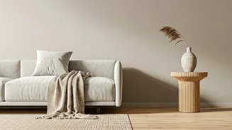
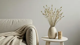
Texture Is the Secret Ingredient
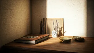
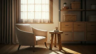
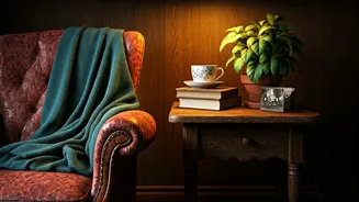
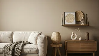
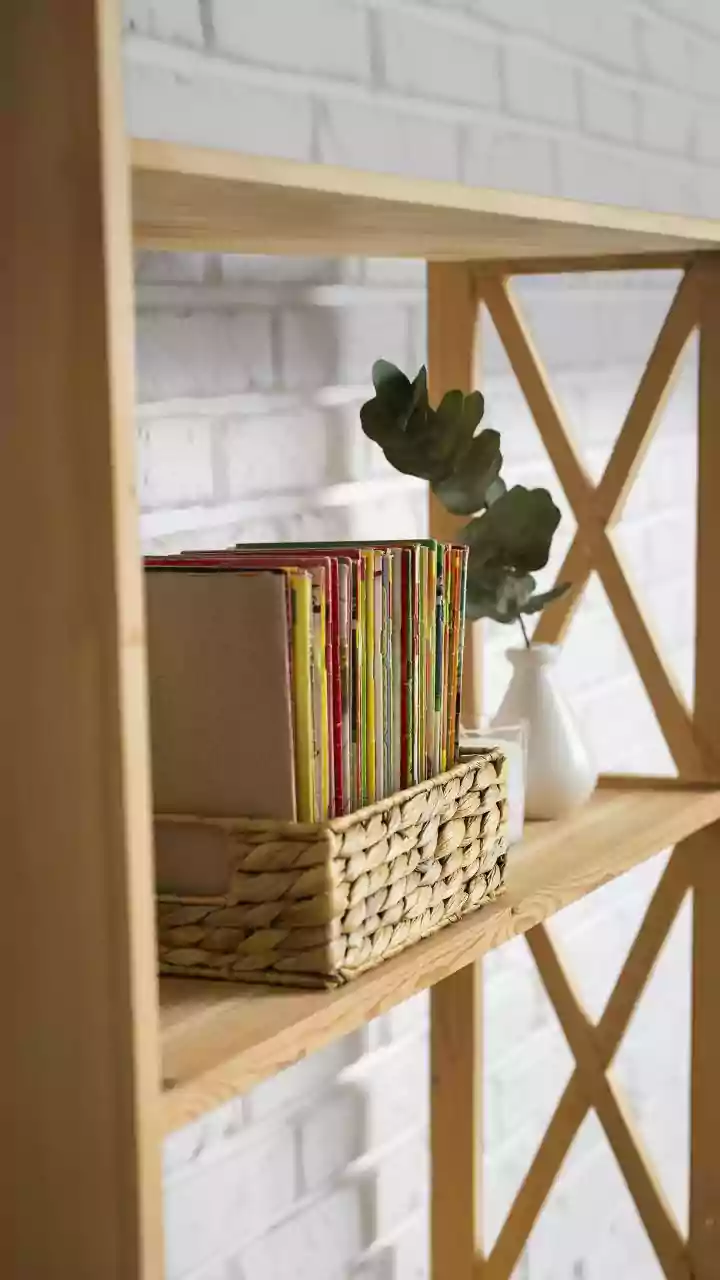
A room full of flat beige surfaces is the definition of boring. The magic of a neutral palette is unlocked through texture. This is where your space gains personality and warmth. Think about all the different textures you’d find on a beach: the fine grain of sand, the rough surface of driftwood, the woven fibers of a beach grass basket. Replicate this in your home. Introduce a chunky jute or sisal rug underfoot. Drape a lightweight linen throw over the arm of a sofa upholstered in a nubby bouclé fabric. Add rattan or cane furniture, woven lamp shades, and ceramic vases with a matte, earthy finish. Each textured element catches light differently, adding visual interest and depth without adding jarring color.
Layer Tones for Sophisticated Depth
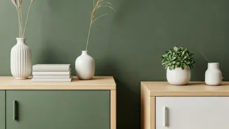
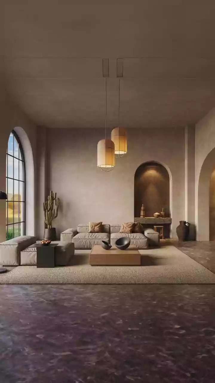
Once you have your textured base, the next step is layering. A truly sophisticated neutral room plays with multiple shades within the same family. Your sandy beige walls will look richer when paired with an ivory sofa, ecru-colored pillows, and a slightly darker tan area rug. The key is to vary the tones just enough to create distinction. Think of it as a watercolor painting, where shades bleed gently into one another. This layering prevents the space from feeling one-dimensional and adds a quiet richness that is both elegant and incredibly calming. Distribute these tones throughout the room—on furniture, textiles, and decor—to ensure the effect is balanced and harmonious.
Choose Accents That Complement, Not Compete
While the core of the look is neutral, it doesn’t mean your home must be devoid of all other elements. The best accents for a sand-and-beige scheme are those that feel organic and complementary. Natural wood tones are a perfect match; a light oak coffee table or a walnut side chair adds warmth and a connection to nature. Soft, cloudy whites keep the palette feeling fresh and bright. For a subtle hint of color, look to the sea and sky. A dusty, muted blue, a pale sea-glass green, or a terracotta shade reminiscent of sun-baked earth can be introduced in small doses through a single pillow, a piece of art, or a ceramic bowl. These accents should feel like they belong, enhancing the serenity rather than disrupting it.