

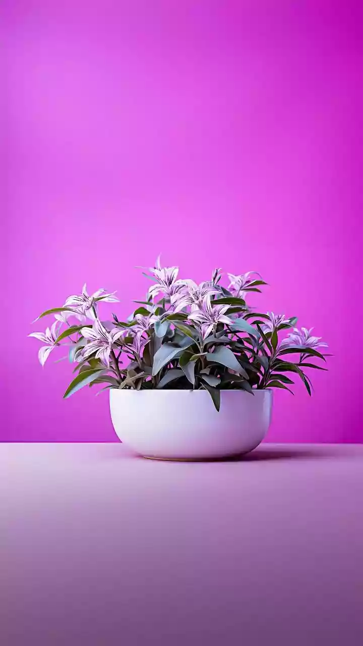


What Exactly Is Artichoke Green?
Before you picture a cartoonishly bright green, let’s clarify. Artichoke green isn't the vibrant hue of a lime or the deep shade of a forest. Instead, it lives in the sophisticated space of muted, earthy tones. Think of the dusty, gray-green color of an actual
artichoke's outer leaves, or the soft shade of sage after a rain shower. It’s a complex color, blended with hints of gray and sometimes a touch of blue or brown, which keeps it from feeling overwhelming. In the world of paint swatches, it’s a cousin to colors like Farrow & Ball’s classic “Cardroom Green” or Benjamin Moore’s “Cushing Green.” This isn't a color that screams for attention; it confidently commands a room with its quiet, organic strength.
Why This Green, Why Now?
The rise of artichoke green isn’t happening in a vacuum. It’s a direct and welcome response to the minimalist fatigue that has settled in after a decade dominated by stark whites and cool grays. Designers and homeowners alike are craving warmth, personality, and a connection to the natural world—a trend known as biophilic design. Artichoke green delivers on all fronts. It’s inherently calming, evoking a sense of tranquility and stability that feels essential in a chaotic world. Unlike more fleeting, trend-driven colors, its earthiness gives it a timeless quality. It functions as a “new neutral,” providing a richer, more interesting backdrop than beige or gray while still pairing beautifully with a wide range of other colors and materials.
The Go-Big Approach: Walls and Cabinetry
Ready to fully embrace the trend? Artichoke green is a fantastic choice for making a significant impact. Painting the walls of a study, den, or bedroom in this shade can create a cozy, enveloping sanctuary. Because of its muted nature, it won’t make a room feel smaller or darker, especially if you use a matte or eggshell finish to diffuse light. In the kitchen, artichoke green cabinetry has become a go-to for designers looking to create a look that is both current and classic. It feels custom and high-end, pairing equally well with modern brass hardware or traditional polished nickel. Don’t be afraid to drench a whole room—walls, trim, and all—in the same shade for a dramatic, deeply chic effect.
Start Small: Accents and Accessories
You don't need a full renovation to bring this color home. For a lower-commitment approach, think in terms of accents. A plush velvet armchair or sofa in a rich artichoke green can become the grounding focal point of a living room. Look for throw pillows, cozy blankets, or a patterned area rug that incorporates the shade. Even smaller touches can make a difference. Consider painting a single piece of furniture, like a vintage side table or a bookshelf, for a pop of sophisticated color. Grouping ceramic vases or decorative objects in varying tones of muted green on a mantel or console table is an easy, low-cost way to experiment with the palette before you decide to paint the town (or at least the living room) green.
Perfect Color and Material Pairings
One of artichoke green’s greatest strengths is its versatility. As a nature-based neutral, it plays well with others. For a warm, organic look, pair it with natural wood tones, rattan, and creamy whites. It creates a stunning and luxurious contrast with warm metals like brass and gold, making hardware and light fixtures pop. For a softer, more romantic palette, combine it with dusty rose, blush pink, or even a deep terracotta. If you prefer a bolder, more dramatic feel, it stands up beautifully next to charcoal gray, inky navy blue, or rich burgundy. The color’s gray undertones ensure it never clashes, acting instead as a stable, elegant foundation for nearly any design scheme you can imagine.