


The Psychology of Calm
There’s a reason a walk in the woods or a day at the beach feels so restorative. Our brains are wired to find tranquility in nature. Earthy tones—the muted shades of soil, stone, forest, and desert—tap directly into this primal connection. This concept,
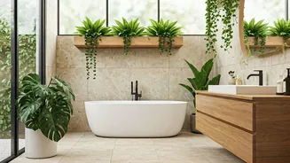
known as biophilic design, centers on bringing elements of the natural world indoors to improve our well-being. When we paint a room in a soft sage green, a warm terracotta, or a sandy beige, we are subconsciously referencing these calming landscapes. Unlike vibrant, high-energy colors that demand our attention, earthy tones recede, creating a serene backdrop that allows the mind to rest. They don’t shout; they soothe. This palette provides a gentle, grounding anchor in our often-chaotic lives, making our living spaces feel like a deep, restorative exhale.
The Quiet Language of Luxury
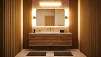
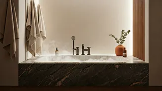
How can a color that feels so natural also read as expensive? The answer lies in what it suggests. True luxury isn’t about flash and gold fixtures; it’s about quality, authenticity, and timelessness. Earthy colors are the foundation of this “quiet luxury.” They evoke natural, high-quality materials like aged leather, raw silk, solid oak, and hand-thrown pottery—items that carry a sense of permanence and craftsmanship. A room swathed in mushroom tones or deep charcoal feels curated, not decorated. This palette serves as the perfect canvas, allowing the texture of a linen sofa, the grain of a wooden table, or the subtle sheen of a marble surface to take center stage. It communicates a design confidence that doesn't need to yell for attention, suggesting a space that has been thoughtfully composed over time rather than assembled from a single season's trends.
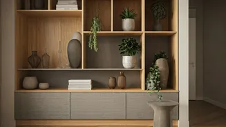
Your Essential Earthy Palette
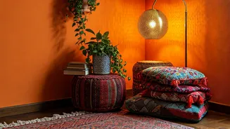
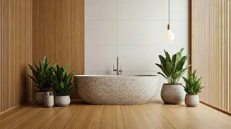
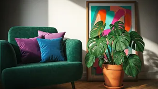
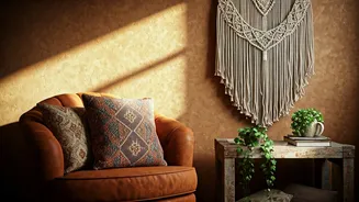
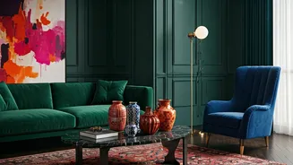
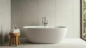
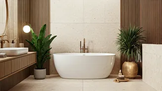
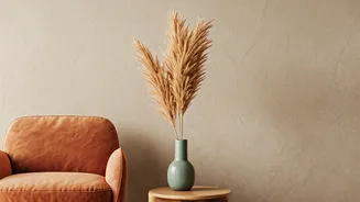
Building an earthy palette is about capturing the nuanced, muted colors found in nature. Think less about bright primary colors and more about their toned-down, sophisticated cousins. - **Terracotta & Ochre:** These warm, sun-baked clay and sand tones bring instant warmth and a touch of the Mediterranean or American Southwest. They feel both ancient and modern. - **Sage & Olive Green:** The ultimate colors of foliage and herbs. These greens are calming and grounding, connecting a room directly to the idea of a garden or forest. - **Mushroom, Taupe & Greige:** These complex neutrals, blends of brown and gray, are incredibly versatile. They provide a soft, sophisticated backdrop that feels much warmer and more interesting than stark white. - **Slate Blue & Charcoal Gray:** Think of the color of a stormy sky or a wet stone. These deeper, moodier tones add depth and a sense of cozy enclosure, perfect for a library or bedroom. - **Sand & Beige:** The quintessential neutral base, these colors evoke sandy shores and open spaces, creating a light, airy, and uncluttered feel.
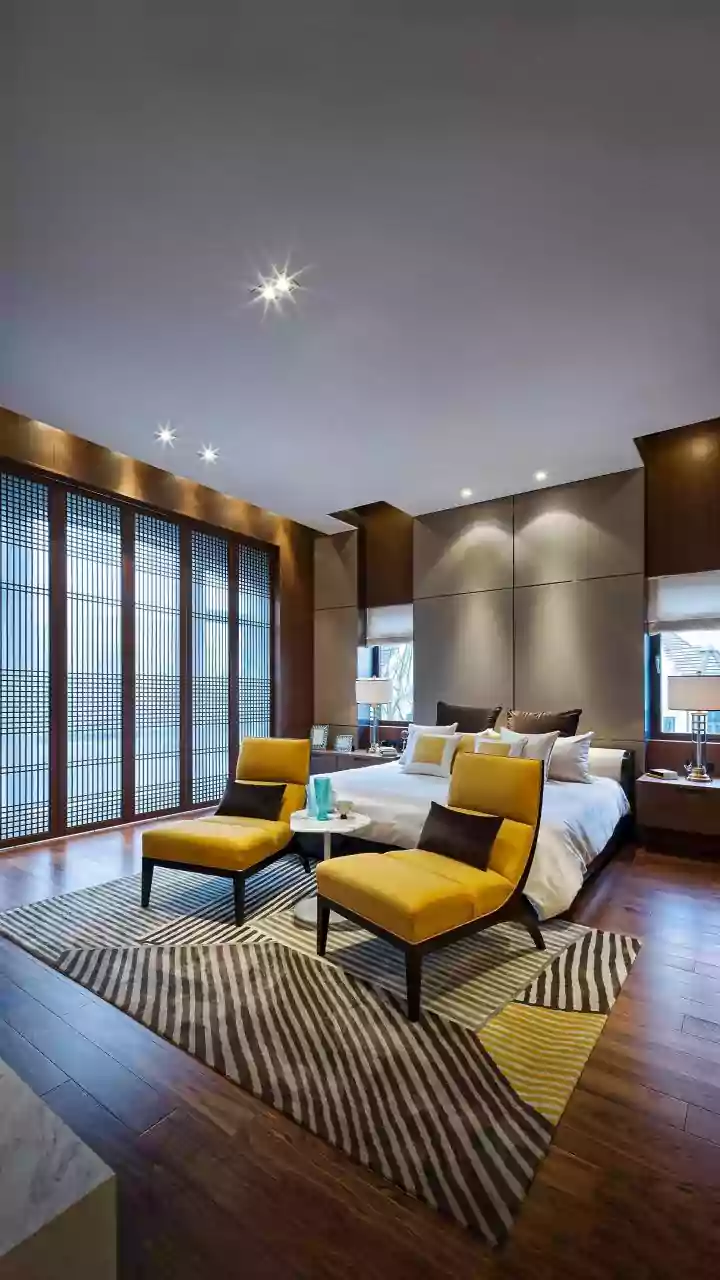
How to Weave Them In
Embracing earthy tones doesn’t require an immediate, floor-to-ceiling renovation. The beauty of this palette is its ability to be layered in gradually. Start small to see how the colors work in your space and with your existing light. A set of rust-colored linen throw pillows on a neutral sofa, a moss-green velvet accent chair, or a large ceramic vase in a sandy glaze can completely shift the mood of a room. An accent wall is another powerful but low-commitment option. Painting the wall behind your bed or sofa in a deep, earthy shade can create a dramatic and cozy focal point. The key is to think in layers of both color and texture. Combine a smooth painted wall with a nubby wool rug, a sleek wooden coffee table, and soft cotton throws, all within the same family of earthy hues. This creates a rich, tactile experience that is the hallmark of a well-designed, luxurious space.