
The Anatomy of a Color Coup
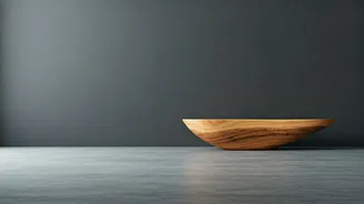
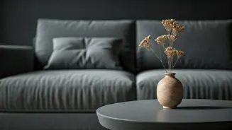
Let’s be clear: we’re not talking about a deep, moody charcoal or a soft, elegant dove grey. We’re talking about a very specific, almost clinical shade that conquered the 2010s. Dubbed “Millennial Grey,” it was the cool-toned, often blue-undertoned hue
that coated everything from luxury vinyl plank flooring to living room walls and upholstered sofas. It was the unofficial uniform of the HGTV house-flipping boom, a color that signaled “newly renovated” and “good taste” with the subtlety of a sledgehammer. Its appeal was obvious: it was a step up from builder’s beige, felt more modern than cream, and provided a clean, unobtrusive backdrop for social media photos. In an era of burgeoning minimalism and Scandinavian influence, grey was the ultimate safe space—a non-color that promised sophistication without risk.
Why the Walls Started Closing In
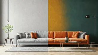
So, what prompted the “brutal exit”? In a word: life. The very qualities that made grey a perfect, sterile backdrop for a staged Instagram photo made it a cold and unwelcoming companion during the long stretches of time we all spent at home post-2020. The clean, minimalist aesthetic began to feel less like a chic hotel lobby and more like an impersonal holding cell. The endless sea of grey suddenly felt draining, lacking the warmth, comfort, and personality people craved when their homes became their entire world. The color became synonymous with a generic, algorithm-driven aesthetic—the “live, laugh, love” sign of color palettes. Its ubiquity became its downfall. When every flipped house, every rental apartment, and every new-build condo looks identical, the backlash isn't just predictable; it's necessary.
Enter Warmth and 'Dopamine Decor'
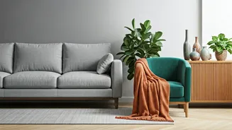
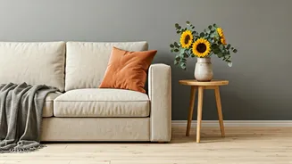
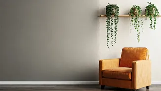
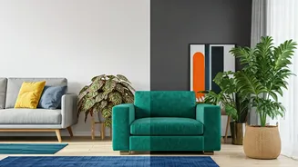
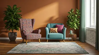
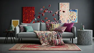
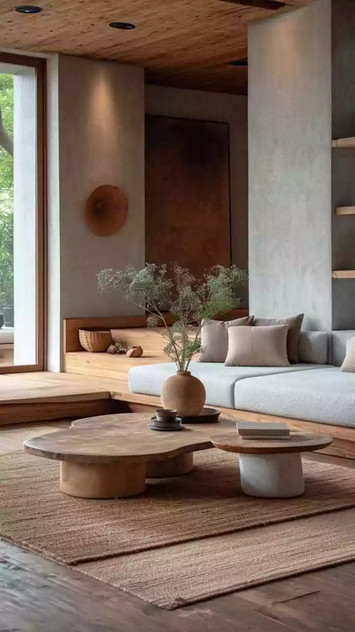
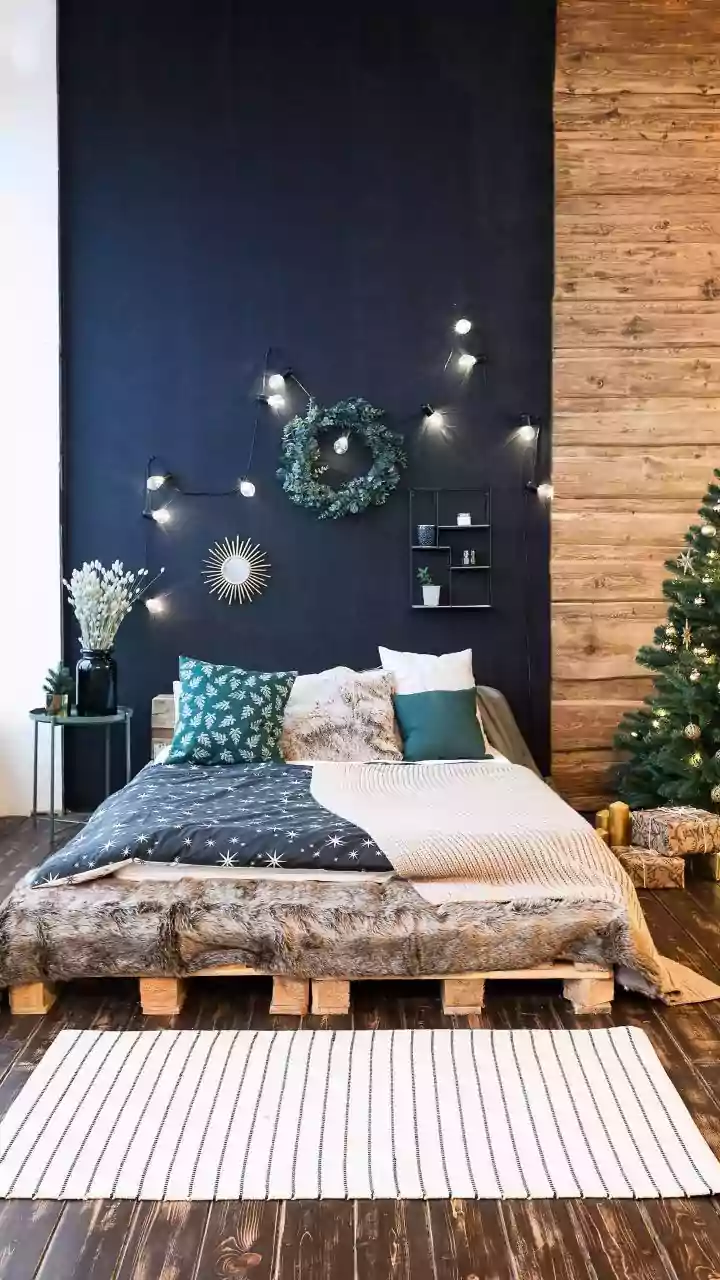
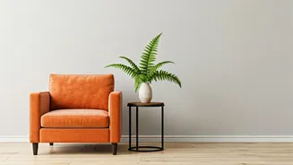
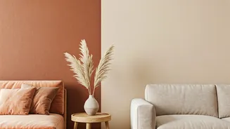
Nature abhors a vacuum, and so does interior design. As grey recedes, a whole new palette is rushing in to fill the void. The most immediate successor is its warmer cousin: beige. But this isn't the bland, pinkish beige of the 1990s. Today’s warm neutrals are earthy, sophisticated, and complex—think creamy whites, sandy beiges, rich camels, and terracotta. These colors create a sense of grounded comfort and pair beautifully with natural materials like wood, rattan, and linen that are also trending. Beyond neutrals, there's a joyful, maximalist rebellion afoot. Known as “dopamine decor,” this trend celebrates bold, saturated colors—mustard yellows, deep greens, vibrant blues—used not just on accent walls, but across entire rooms. It’s a philosophy that prioritizes personal joy and self-expression over resale value and mass appeal. It’s about creating a home that feels uniquely yours, not one designed for a hypothetical future buyer.
What if Your Home is 50 Shades of Grey?
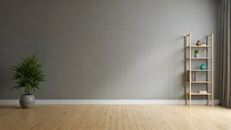
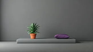
Reading this from a grey-walled living room? Don't panic and call the painters just yet. The headline may be brutal, but the solution doesn't have to be. Evolving a grey space is easier than you think. The key is to break up the monochrome monotony with warmth and texture. Introduce wood tones through furniture, picture frames, or decorative objects. Layer in textiles—throw blankets, pillows, and rugs—in warm colors like ochre, rust, or olive green. Good lighting is crucial; swap harsh, cool-toned LED bulbs for warmer ones to instantly make the grey feel cozier. Add large-scale, colorful art to create a focal point that isn't a drab wall. Finally, bring in life with plants. A few vibrant green plants can do wonders to counteract the sterile feeling of a grey room. The goal isn't to erase the grey, but to use it as a neutral base for a richer, more layered design.