


The Rise of Warmth
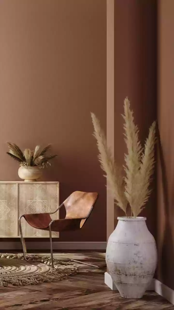
The first and most direct assault on cool-toned grey comes from its opposite: warmth. The stark, almost clinical feel of the 2010s is being replaced by inviting, cozy tones that feel more like a hug than a hospital waiting room. Think less 'depressing
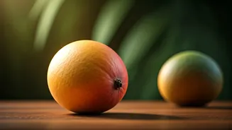
drizzle' and more 'sun-drenched café'. Colors like terracotta, ochre, rich caramel, and soft beige are taking center stage. These aren't the boring, flat beiges of the '90s; they are complex, earthy, and layered. The goal is to create a sense of comfort and stability. After a decade of visual austerity, homeowners are craving spaces that feel nurturing. This shift is also visible in materials, with light, warm woods like white oak and maple replacing the darker, grey-washed finishes that were once ubiquitous.
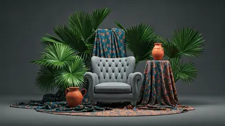
Biophilia Takes Root
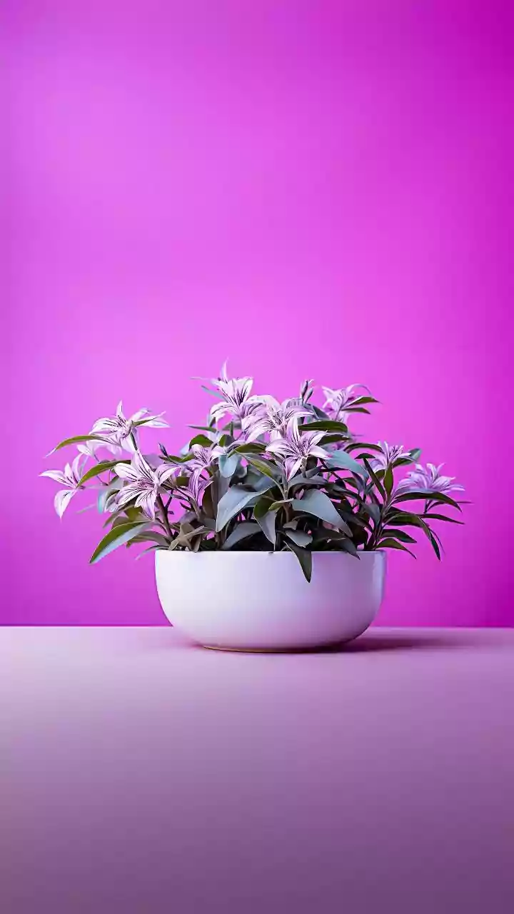
If Millennial Grey was about creating a neutral digital-first backdrop, the trend of biophilia is about logging off. Coined from the idea that humans have an innate need to connect with nature, biophilic design is flooding interiors with the colors, textures, and patterns of the natural world. This goes beyond just adding a few more houseplants. We're seeing deep forest greens, earthy browns, and watery blues used on walls, furniture, and textiles. Natural materials are non-negotiable: rattan, jute, stone, and unfinished wood bring an organic, tactile quality that flat grey paint could never achieve. The trend embraces imperfection—the grain in a wood table, the texture of a linen curtain—reminding us that our homes are living spaces, not sterile showrooms.
Saturated and Moody Hues
While some are running toward warm neutrals, others are diving headfirst into the deep end. The fear of dark colors is officially over. Instead of a single, safe grey accent wall, designers and homeowners are enveloping entire rooms in rich, saturated hues. Think moody blues, deep burgundies, and dramatic emerald greens. These colors are being used to create immersive, atmospheric spaces that feel intimate and sophisticated. A library painted in a dark charcoal or a bedroom in a deep plum feels like a deliberate, confident choice—the polar opposite of grey's hesitant neutrality. This trend signals a desire for personality and drama, turning rooms into destinations within the home rather than just functional boxes.
Hello, Dopamine Decor
Perhaps the most joyful rejection of the grey era is 'Dopamine Decor,' the practice of using vibrant colors and playful patterns to create a space that genuinely makes you happy. It's the design equivalent of wearing your favorite bright yellow raincoat on a gloomy day. This trend throws the rulebook out the window. If you love it, it works. Lavender kitchen cabinets? Go for it. A clashing-patterned sofa? Absolutely. Dopamine decor is deeply personal and anti-minimalist. It’s a rebellion against the idea that a 'good' home has to be inoffensive or appealing to a future buyer. Instead, it prioritizes the current resident's joy, filling spaces with cheerful palettes, quirky objects, and a sense of irreverent fun that the all-grey aesthetic simply couldn't accommodate.
The Charm of 'Grandpa Chic'
Finally, we have the antidote to fast-furniture and fleeting trends: Grandpa Chic. Also known as 'eclectic grandpa' or simply 'new nostalgia,' this aesthetic celebrates the beauty of things that are old, collected, and have a story. It’s the opposite of a room where every piece was bought from the same store in one weekend. This style layers vintage finds, inherited furniture, and meaningful art to create a space that feels authentically lived-in and evolved over time. Think dark wood, worn leather, plaid patterns, and shelves filled with books and curiosities. It rejects the pressure to be perfectly curated and instead embraces a comfortable, slightly cluttered, and deeply personal look. It's a testament to the idea that a home's character isn't built in a day, and certainly not with a single shade of grey.