

The Reign of 50 Shades of Grey
Remember the 2010s? It was the era of the modern farmhouse, the minimalist condo, and the ubiquitous house-flipper aesthetic. At the center of it all was grey. From pale dove to deep charcoal, it was the go-to color for walls, sofas, cabinets, and flooring.
It was safe, sophisticated, and sold as the perfect neutral backdrop. It promised a clean, uncluttered life, a visual respite from a chaotic world. HGTV shows splashed it everywhere, and developers painted every new build in a palette of 'Greige,' 'Agreeable Gray,' and 'Repose Gray.' It was so dominant that choosing anything else felt like a radical act. For years, grey wasn't just a color; it was a lifestyle shorthand for chic, modern living.
So, Why the Big Chill?
Like any trend that reaches total saturation, the backlash was inevitable. But the fall of grey is about more than just fatigue. After spending unprecedented amounts of time at home during the pandemic, our relationship with our living spaces changed. We stopped seeing them as showrooms to impress guests and started seeing them as sanctuaries for our own comfort and well-being. Suddenly, all that sleek, cool grey started to feel a bit... sterile. A bit corporate. A bit sad. The 'sad beige' phenomenon that took over social media is part of the same story. We began craving warmth, personality, and texture—things that all-grey rooms often lack. The minimalist hotel-lobby look lost its appeal when our homes had to become our offices, gyms, and entire worlds. We wanted a hug, and grey wasn't giving it.
Enter: The Warm Neutrals
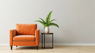
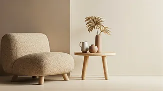
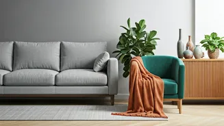
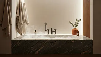
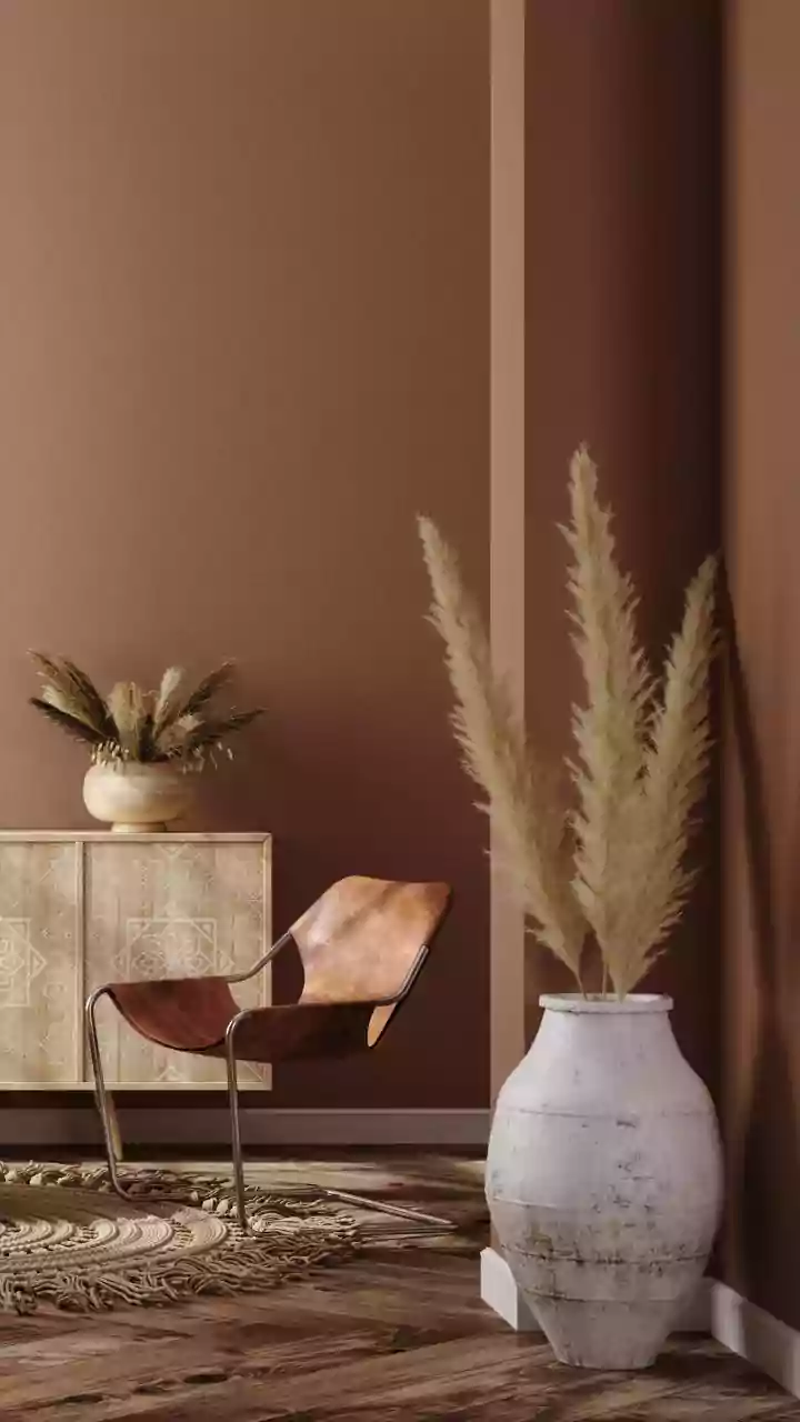
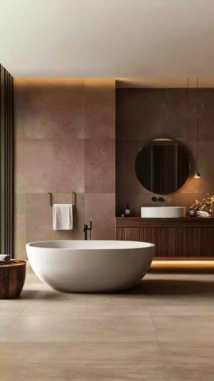
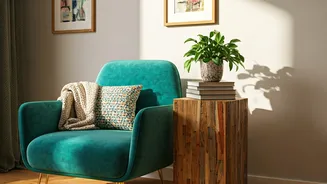
The most direct successor to the grey throne is a family of warm, earthy neutrals. Think less concrete jungle, more sun-drenched desert. This is where you find the mushroom, taupe, and warmer 'greige' tones that have a bit of brown or beige mixed in. Beyond that, colors like terracotta, ochre, camel, and creamy off-whites are having a major moment. These shades feel grounding and organic. They connect us to nature and evoke a sense of calm that's cozier and more inviting than grey's cool detachment. Paint companies have been all over this shift, with recent 'Color of the Year' picks from major brands leaning heavily into warm, gentle tones that feel both timeless and deeply comforting.
A Return to Bold Color
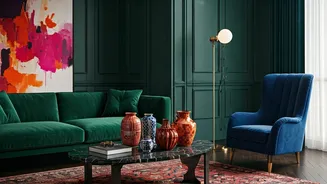
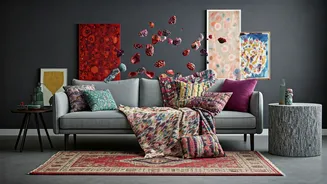
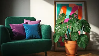
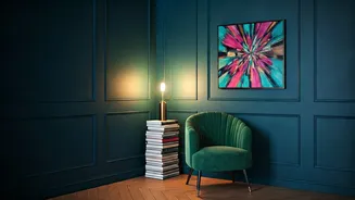
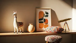
On the other side of the spectrum, the retreat from grey has also empowered a return to bold, saturated color. If minimalism is out, then its opposite—maximalism—is having a renaissance. Homeowners and designers are embracing deep jewel tones, moody blues, rich forest greens, and even dusty pinks. These colors are about creating a space that feels personal, layered, and full of life. Instead of a neutral box, the goal is a room with a distinct mood and point of view. This isn't about painting every wall in a shocking hue, but about using color strategically on an accent wall, on kitchen cabinets, or through furniture and decor to inject personality and joy into a space.
My House is Grey. Do I Panic?
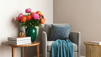
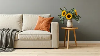
Absolutely not. The last thing anyone needs is 'decor anxiety.' If you love your grey rooms, keep them! A good neutral is timeless. But if you're feeling the pull toward warmth, you don't need a gut renovation. The key is layering. You can instantly warm up a grey space by introducing new textures and colors. Think about adding a cognac leather accent chair, rich wood tones in a coffee table or bookshelf, or swapping silver and chrome hardware for brass or bronze. Incorporate textiles like velvet, boucle, or linen in warmer colors through pillows, throws, and rugs. A few well-placed plants can also add life and a pop of natural green. Think of your existing grey as the sophisticated foundation for a new, warmer, and more personal chapter.