

The Great Grey Fade-Out
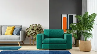
Remember the 2010s? It was the era of the 'house flip aesthetic,' where walls, floors, and furniture converged into a singular, marketable shade: grey. From cool-toned slate to warmer 'greige,' this neutral dominated starter homes, luxury condos, and HGTV
mood boards alike. Its popularity was practical. Grey was modern, sophisticated, and, most importantly, inoffensive. It created a blank canvas that made spaces feel clean and larger, and it appealed to the widest possible range of potential buyers. For a decade, decorating with grey wasn't just a choice; it was the default. It signaled a certain kind of adulting—one that was sensible, streamlined, and perhaps a little bit safe. But after years of living inside these muted boxes, a collective fatigue set in. The very qualities that made grey so popular—its neutrality and subtlety—began to feel sterile, impersonal, and devoid of personality.
The Pandemic-Fueled Pivot to Personality
Then, the world changed. The pandemic forced us indoors, turning our homes into offices, schools, gyms, and sanctuaries all at once. Staring at the same four grey walls day after day, many Americans realized their 'blank canvas' felt more like a blank void. The home was no longer just a place to sleep or an asset to be flipped; it was the central stage of life. This profound shift in perspective sparked a revolution in interior design. We craved comfort, joy, and a sense of self in our surroundings. The neutral, market-ready aesthetic suddenly felt out of touch with the need for a home that nurtured and inspired. People wanted spaces that reflected their unique personalities, memories, and passions. Color, in all its messy, exuberant glory, became the most powerful tool for reclaiming our homes from the clutches of monotonous minimalism and infusing them with life.
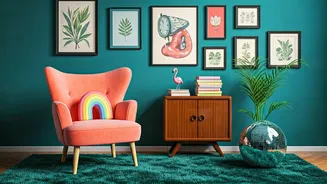
Enter 'Dopamine Decor'
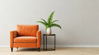
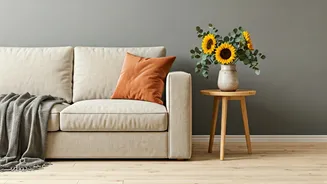
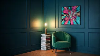
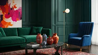
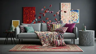
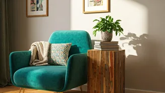
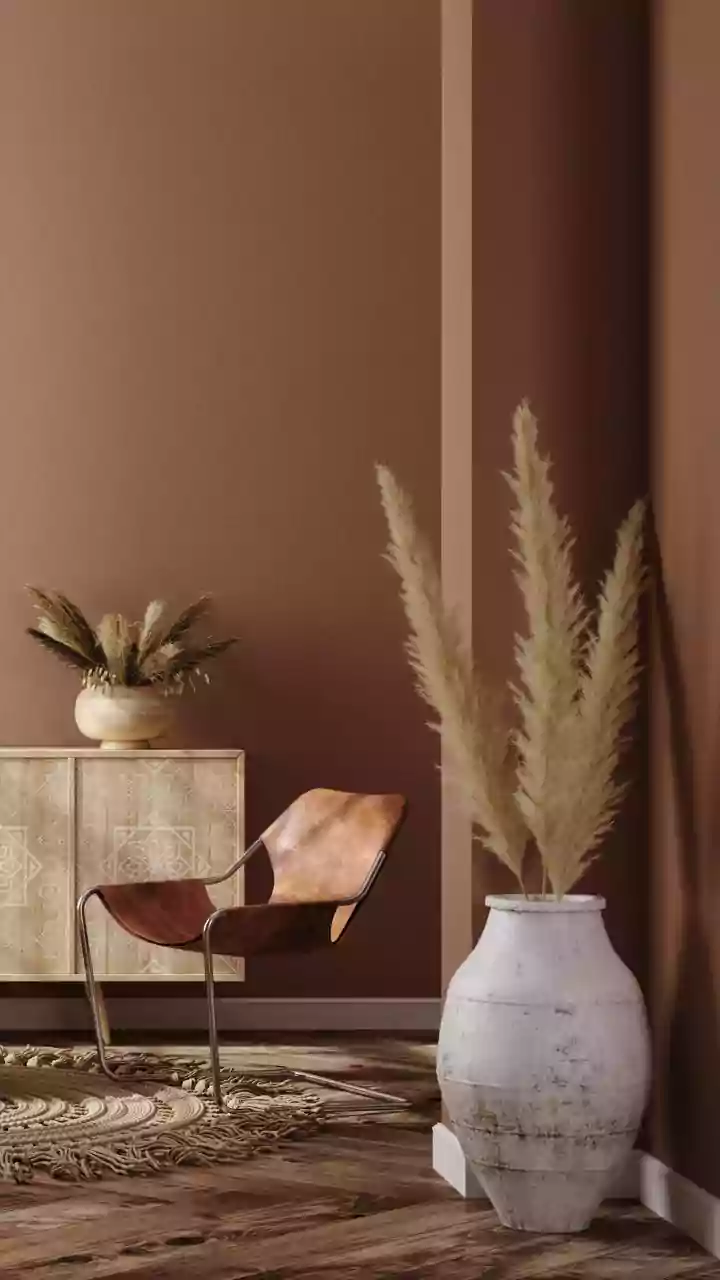
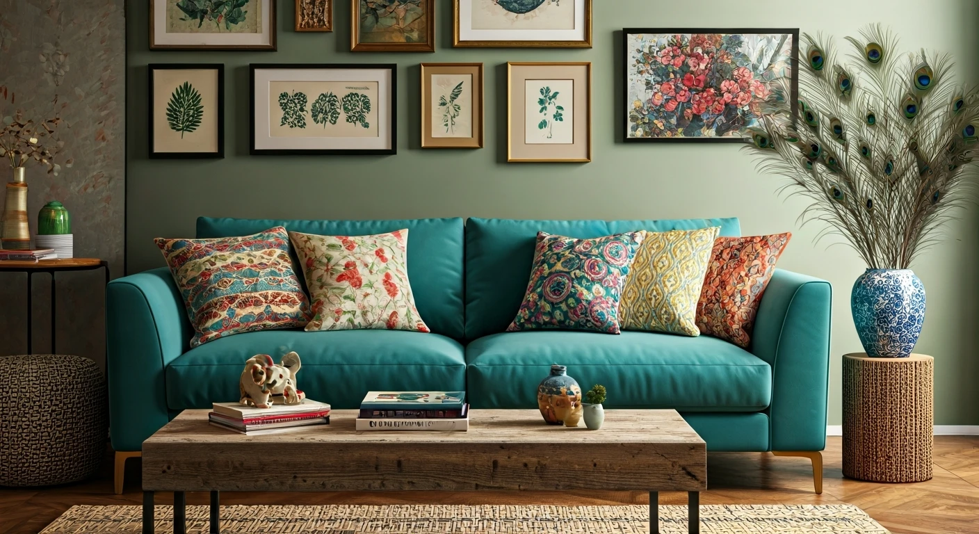
This new movement has been dubbed 'dopamine decor,' a term borrowed from the fashion world's 'dopamine dressing.' The philosophy is simple: surround yourself with colors, textures, and objects that make you feel good. It’s a design approach driven by emotion rather than rigid rules. Instead of sticking to a prescribed palette, people are painting their walls in rich jewel tones like emerald green and sapphire blue, embracing cheerful pastels, or even going all-in with bold, patterned wallpaper. Paint companies have taken note. Sherwin-Williams and Behr have championed earthy, restorative greens and warm, inviting terracottas, while Pantone has repeatedly chosen optimistic and vibrant shades for its Color of the Year. This isn't just about an accent wall anymore. It's about lacquered trim in a contrasting hue, a brightly colored velvet sofa, or a kitchen island painted a surprising shade of mustard yellow. It is design as an act of self-care.
More Than Just Paint
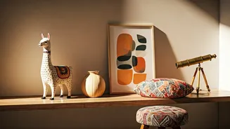
The return to color is part of a larger trend toward maximalism—or at least, a more personalized, 'collected' aesthetic. It’s an embrace of the things that make a house a home: books stacked on shelves, art collected over time, and meaningful trinkets displayed with pride. The fear of 'clutter' is being replaced by the joy of curation. This new colorful confidence is less about following a trend and more about granting yourself permission to experiment. It's about trusting your own taste over what a real estate agent might recommend. While a perfectly executed grey interior can still be beautiful, it’s no longer the only definition of sophisticated design. Today, a truly stylish home is one that tells a story, and that story is increasingly being told in full, glorious color.