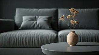

The Rise and Reign of Grey
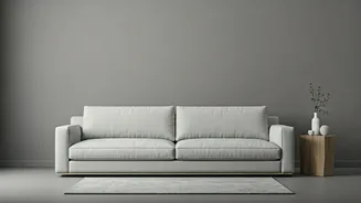
It’s hard to pinpoint exactly when the “grey-pocalypse” began, but for most of the 2010s, grey was the undisputed champion of American homes. Fueled by the modern farmhouse aesthetic popularized by HGTV and the clean, minimalist look that dominated social
media feeds, grey became the go-to neutral. It was everything beige wasn’t: sleek, modern, and a bit moody. It felt like a grown-up choice, a sign that you had graduated from the mismatched furniture of your twenties. Paired with white trim and a stainless steel appliance, a room painted in “Agreeable Gray” or “Revere Pewter” signaled tasteful restraint. It was the perfect, inoffensive backdrop for the burgeoning open-concept lifestyle, and it promised excellent resale value—a key concern for a generation navigating a volatile housing market.
The Backlash Gets Colorful
Like all trends, grey’s dominance eventually led to oversaturation and, inevitably, a rebellion. On platforms like TikTok and Instagram, a new consensus emerged: the all-grey-everything interior was sterile, corporate, and a little bit sad. The aesthetic that once felt chic now felt like living in a black-and-white movie with the sound off. Terms like “sad beige” and critiques of the “millennial grey” prison went viral, with users showcasing homes that looked more like sterile waiting rooms than personal sanctuaries. After years spent locked inside during a pandemic, homeowners began to crave spaces that felt warm, nurturing, and alive. The cool, detached elegance of grey simply couldn’t deliver the comfort people were suddenly desperate for.
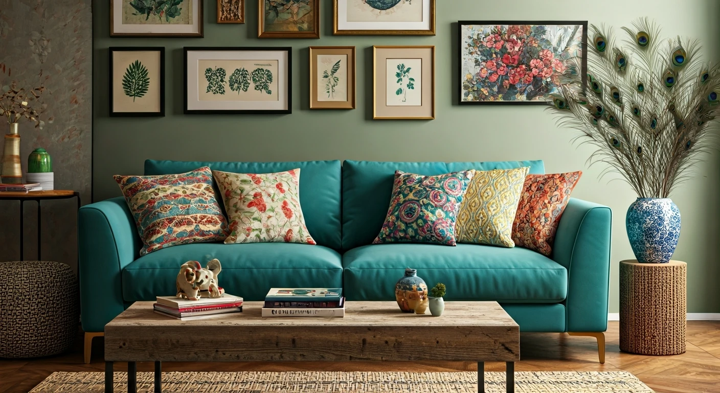
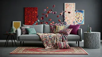
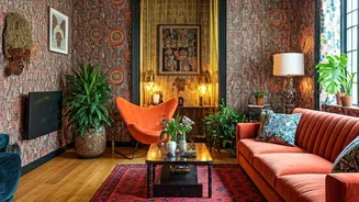
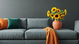
Meet the Decor of 2026
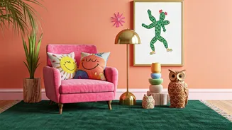
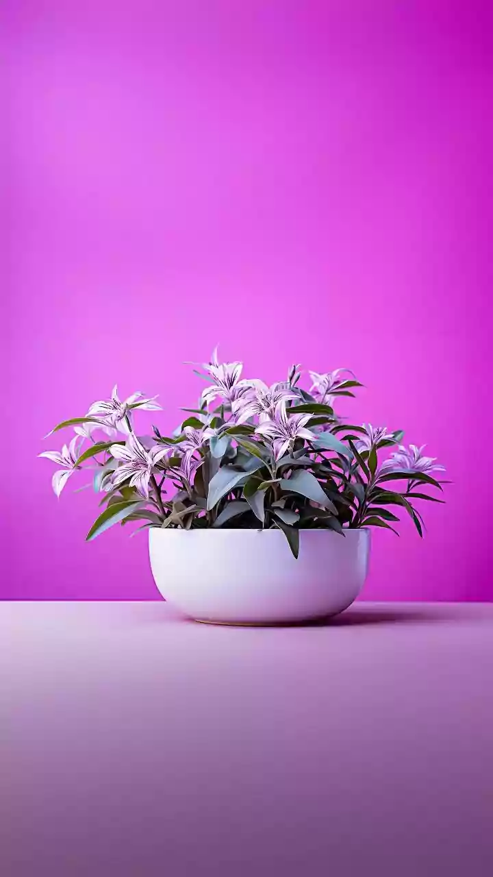
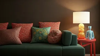
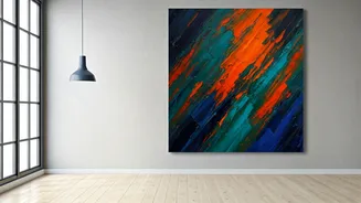
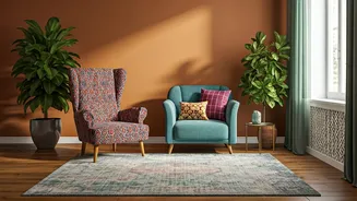
So, what’s taking its place? In a word: everything. The defining characteristic of mid-2020s decor is a rejection of rigid, one-size-fits-all rules. The new look is warm, personal, and unapologetically vibrant. We’re seeing a massive return to rich earth tones like terracotta, ochre, and chocolate brown, which ground a space and make it feel instantly cozier. At the other end of the spectrum are bold jewel tones—emerald green, sapphire blue, and ruby red—used on accent walls, velvet sofas, and cabinetry. Even the new neutrals are warmer, with paint companies championing soft, earthy blues (Benjamin Moore's “Blue Nova”), delicate pinks, and creamy off-whites instead of stark greys. Texture is also key. Think nubby bouclé chairs, plush rugs, rattan furniture, and limewash walls that add depth and character. The goal is to create a layered, lived-in space that tells a story.
It’s More Than Just a Paint Color
This seismic shift from grey to color is about more than just aesthetics; it’s a psychological reset. The 2010s were about optimizing, streamlining, and presenting a curated, perfect version of your life online. Your home was part of that brand. Today, the focus has shifted inward. The rise of “dopamine decor” reflects a collective desire for our homes to be sources of joy, creativity, and genuine self-expression, not just backdrops for an Instagram post. People are embracing what makes them happy, whether that’s a gallery wall of chaotic art, a collection of quirky vintage finds, or a bright yellow kitchen. The new ideal isn’t perfection; it’s personality. It’s the freedom to have a home that feels less like a showroom and more like, well, you.