
Anatomy of an Aesthetic
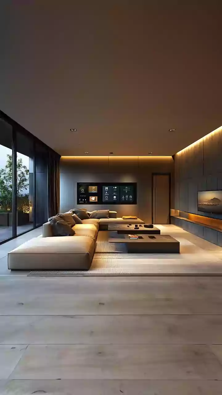
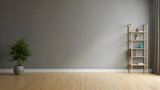
First, let's give grey its due. The 'Millennial Grey' phenomenon wasn't born from a lack of imagination, but from a specific cultural moment. Rising in the post-2008 recession era, it was the color of safety. It was neutral, clean, and above all, marketable.
Fueled by HGTV house-flipping shows where 'greige' walls were key to a quick sale, it became the default for a generation seeking stability and a clean slate. It photographed beautifully for Instagram, creating a sea of minimalist, Scandinavian-inspired interiors that were aspirational yet achievable. The problem? When everyone’s clean slate looks identical, it stops feeling personal. It starts feeling sterile, corporate, and—as the headline suggests—a little bit sad. The uniform became a prison of blandness.
Why We're Craving Color Again
The pendulum is swinging back, hard. The collective experience of spending years confined to our homes during the pandemic forced a re-evaluation of what we want from our spaces. We no longer need a 'market-ready' backdrop; we need a sanctuary. We need comfort, personality, and joy. Our homes have become our offices, gyms, and social hubs, and they need to reflect the full spectrum of our lives, not just a grayscale filter. Designers and trend forecasters point to a collective desire for optimism and self-expression. We're breaking up with the notion that good taste is quiet and reserved. The new good taste is loud, proud, and deeply personal.
The Rise of Earthy, Grounding Hues
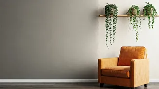
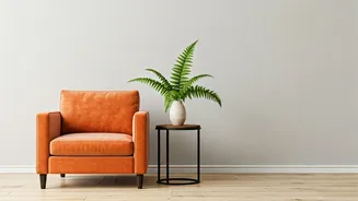
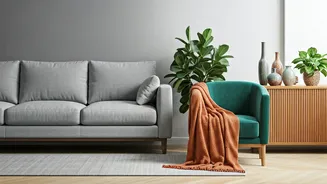
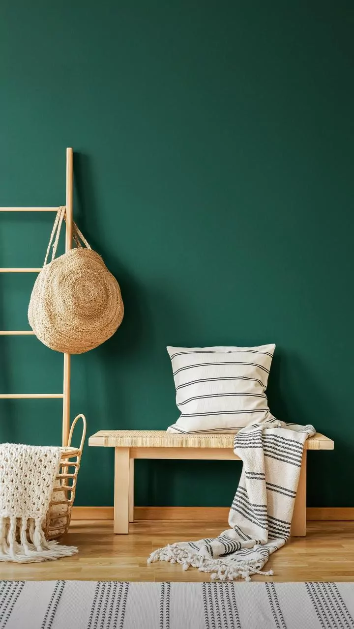
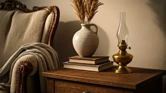
The first step away from cool grey isn't a leap into neon chaos, but a warm embrace of the earth. The new neutrals are anything but bland. Think warm, mushroomy beiges ('greige's' sophisticated older cousin), rich terracottas that evoke sun-baked desert landscapes, and deep chocolate browns that feel like a comforting hug. These colors are grounding and inherently natural, connecting our indoor spaces to the world outside. Paired with natural materials like raw wood, rattan, and linen, this palette creates a sense of stability and calm that cool grey could only mimic. It's less about a sterile absence of color and more about a rich, foundational warmth.
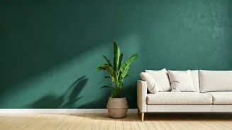
Welcome to Your 'Dopamine Decor' Era
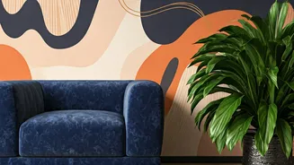
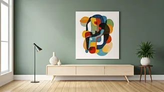
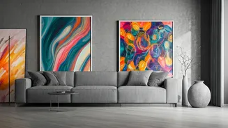
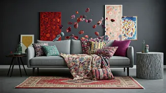
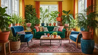
On the other side of the spectrum is the unapologetic return of bold, saturated color. Meet 'dopamine decor,' the interior design equivalent of 'dopamine dressing.' The idea is simple: surround yourself with colors that make you happy. This isn't about painting every wall in a shocking hue, but about using color strategically to create moments of joy. We're seeing deep jewel tones like emerald green, sapphire blue, and rich burgundy used on accent walls, kitchen cabinetry, and velvet sofas. Even softer, optimistic shades are making a comeback—think buttery yellows, dusty pinks, and serene sage greens. It's a maximalist-leaning philosophy that says your home should energize you, not just house you.
It's Not Just Paint—It's Personality
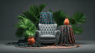
Ultimately, the rejection of 'Millennial Grey' is about more than just color. It’s a move away from conformity and toward character. The emerging 2026 aesthetic is tactile and layered. Smooth, flat surfaces are being replaced by textured plaster walls, nubby bouclé fabrics, and imperfect, handmade pottery. The perfectly curated 'shelfie' is giving way to collections of meaningful objects, vintage finds, and personal art. The new goal isn’t to create a space that looks like a page from a catalog, but to build a home that tells your unique story. It’s permission to mix patterns, clash colors (within reason!), and display that quirky flea market find with pride.