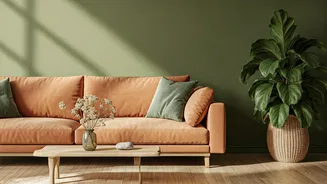

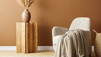


Embrace Grounding Earth Tones
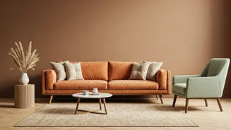
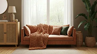
The return to earth tones is about more than just brown. Think of the rich spectrum of a desert landscape at sunset: warm terracotta, dusty rose, sandy beige, and rich clay. These colors bring an immediate sense of warmth and stability to a space. Terracotta,
in particular, has seen a major resurgence. It pairs beautifully with natural wood, linen textiles, and lots of greenery. You can use it boldly on an accent wall in a living room or introduce it more subtly through throw pillows, ceramic pots, and upholstery. Unlike the avocado greens of the '70s, today’s earth tones are sophisticated, muted, and incredibly versatile, creating a perfect backdrop for a cozy, inviting home.
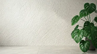
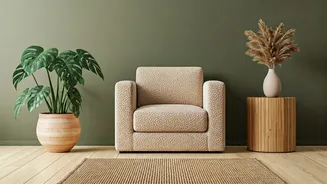
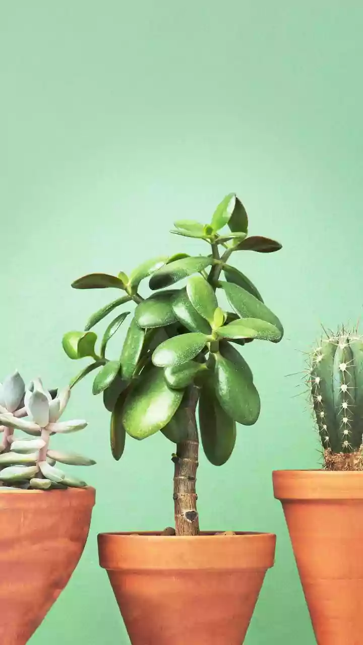
Channel the Forest with Calming Greens
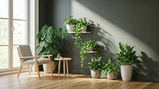
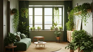
Green is nature’s neutral, and its calming effects are well-documented. In interior design, this translates to a desire for shades that mimic the tranquility of a forest. Muted sage green has become a go-to for bedrooms and bathrooms, creating a spa-like sense of serenity. For a more dramatic but equally soothing effect, deep forest or olive greens are making their way onto kitchen cabinets, study walls, and front doors. These colors connect us to the concept of biophilia—our innate need to affiliate with nature. Pairing these greens with light woods, brass accents, and creamy whites keeps the look fresh and modern, not dark and heavy.
Capture the Serenity of Water and Sky
Blue is a perennial favorite for a reason, but the trend is shifting away from vibrant navies toward softer, more atmospheric shades. Think of the pale blue of a crisp morning sky or the hazy, gray-blue of a distant ocean. These colors make rooms feel larger, brighter, and more peaceful. They are particularly effective in spaces where you want to encourage rest and relaxation, like a bedroom or a quiet reading nook. A muted blue-gray can act as a more interesting alternative to standard gray, providing a hint of color without overwhelming the senses. For a coastal vibe that feels sophisticated rather than cliché, pair these blues with sandy beiges, weathered woods, and woven textures like rattan or jute.
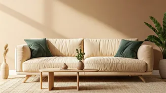
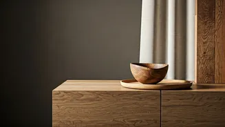
Go Subtle with Stones and Minerals
This trend is about the quiet, nuanced colors found in natural stone, sand, and minerals. Instead of stark white, consider a warm, creamy off-white that feels softer and more welcoming. Greige—a mix of gray and beige—continues to be popular because it provides a perfect, adaptable neutral base. These shades are ideal for creating a layered, textural look. You can paint the walls in a soft, mushroom-toned greige, then bring in furniture and textiles in slightly different shades of beige, cream, and stone. The result is a monochromatic space that feels anything but boring. It’s sophisticated, calm, and allows architectural details and personal treasures to stand out.
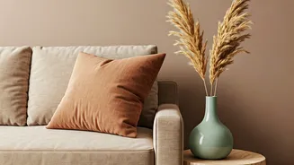
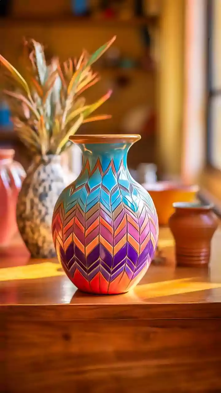
Add Warmth with Sunset Hues
For those who want a touch of optimistic color, look to the sky just before dusk. Soft, sun-baked yellows, muted corals, and dusty pinks can bring a gentle glow to any room. These aren't the bright, saturated colors of childhood, but rather their earthy, sophisticated cousins. A pale, buttery yellow can make a north-facing room feel sunny and bright, while a touch of dusty rose on a velvet armchair adds warmth and personality. These colors work beautifully as accents against a more neutral background of greens or beiges. Use them in artwork, a statement rug, or a collection of throw pillows to capture that fleeting, beautiful warmth of a perfect sunset.