


The Pitfalls of Pastels
When it comes to garage doors, designers often recommend steering clear of pastel shades, particularly light yellows and bright pinks. The rationale behind
this advice is that garage doors are typically elements meant to blend seamlessly with the rest of your home's facade, rather than drawing undue attention. Pastels, by their nature, tend to be eye-catching and can disrupt the desired subtle integration. Interior designers emphasize that an ideal garage door color should help the feature 'fade away' and complement the overall architectural aesthetic without becoming a focal point. They suggest opting for neutral tones or matching the garage door color to the home's existing trim or other accent colors to ensure a classic and cohesive appearance that stands the test of time and avoids looking jarring.
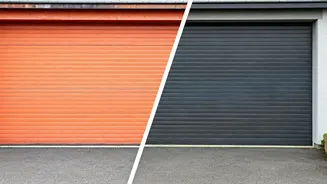
Why Jet Black Misses the Mark
Elana Mendelson, founder of Elana Designs, cautions against using jet black for garage doors, citing practical and aesthetic concerns. One significant issue is that dark colors, especially black, tend to show dirt, dust, and water stains almost immediately, which can be particularly noticeable in environments with natural debris like suburban or wooded areas. Furthermore, black can absorb a considerable amount of heat when exposed to direct sunlight, potentially leading to warping or material degradation depending on the garage door's composition. Beyond its susceptibility to showing imperfections and heat absorption, black can also present a visual challenge for many home styles. Mendelson notes that unless a home possesses a distinctly modern architectural design, a jet black garage door might appear overly harsh or visually heavy, detracting from the intended charm and balance of the exterior.
Red's Risky Exterior Statement
While red is a color renowned for its boldness and personality, it's generally not the preferred choice for garage doors, according to designer Taylor Fusco. Fusco explains that although a vibrant red front door can be an iconic and welcoming statement, applying the same hue to a garage door can inadvertently create an unintended aesthetic. Instead of evoking a cozy and inviting home atmosphere, a red garage door might give off the impression of a firehouse or an industrial building. For homeowners who adore the color red, Fusco suggests reserving its use for more targeted accents like the main entrance door or shutters, thereby incorporating its vibrancy without overwhelming the home's overall visual harmony.
The Blues of Garage Doors
Taylor Fusco also points out that blue, despite its popularity for front doors and decorative shutters, often proves unsuitable for garage doors. She has observed numerous instances where homeowners have painted their garage doors blue to match their shutters, only to be deeply disappointed with the resulting look. According to Fusco, this practice can significantly diminish a home's curb appeal, creating a 'tacky' and unappealing visual effect. The contrast or excessive duplication of blue, she suggests, fails to achieve a cohesive or sophisticated exterior design, leading to a regrettable aesthetic choice that detracts from the home's overall attractiveness.
Gray's Dingy Dilemma
Even seemingly safe neutral options like gray are cautioned against by designer Taylor Fusco for garage doors. Many homeowners might assume gray is a universally safe and classic choice due to its neutral nature, but Fusco strongly disagrees. She posits that gray garage doors can unfortunately make a home appear dingy and dated rather than timeless or elegant. Instead of falling into the trap of a potentially unappealing neutral like gray, Fusco strongly recommends opting for a crisp white. This shade, she explains, is inherently full of curb appeal and offers a clean, bright, and universally flattering aesthetic that enhances the home's overall presentation.