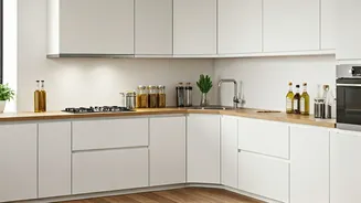


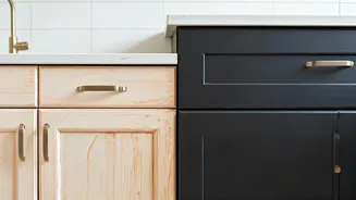
Shunning Stark White
While white has long been a staple in interior design, the specific application of bright white for kitchen backsplashes is now considered passé by design experts.
The crisp, clean aesthetic often associated with white subway tiles, popular a decade ago, is giving way to warmer, more nuanced tones. Professionals feel that a stark white backsplash can impart a clinical atmosphere and a lack of depth within a kitchen space. Current trends favor softer off-whites, like cream, and a move towards more organic materials such as natural stone or artisanal handmade clay tiles, exemplified by zellige, which offer superior texture and visual appeal over traditional porcelain and ceramic.
Gray's Fading Appeal
The reign of cool gray as a go-to neutral for kitchen backsplashes appears to be over. Interior designers widely agree that the pervasive use of gray, particularly in cooler undertones, has left it feeling overexposed and lacking in character. This once-modern choice now strikes many as tired and uninspired. To achieve a more contemporary and enduring look, designers suggest embracing warmer gray variations. This includes softer greiges, muted mushroom tones, or even subtle taupes that provide a sophisticated and inviting ambiance without the starkness of previous gray trends.
Ditching Tuscan Yellow
The warm, golden yellow hues reminiscent of Tuscan kitchens, which were highly fashionable in the early 2000s, are now seen as contributing to a feeling of heaviness and being overly saturated in contemporary design. Experts find that this specific yellow tone can appear dated and struggle to harmonize with modern kitchen fixtures and finishes. Furthermore, it can negatively impact how natural light is received within the space, making surrounding elements seem older than they are. For a more current aesthetic, designers recommend opting for gentle neutrals that incorporate warmth, such as light taupe, creamy whites, or the aforementioned soft greiges.
Rejecting Red-Brown
Similar to Tuscan yellow, red-brown backsplashes, once embraced for their ability to evoke a cozy, Old World charm, are now considered heavy and outdated. This particular color choice, when used for tiles, can unfortunately lend a dark and artificial quality to a kitchen, detracting from modern design sensibilities. The advice from designers is to move away from these intense reddish-brown tones. Instead, consider richer yet visually lighter options like a deep, moody sea salt gray or an earthy, natural green. These colors can introduce depth and sophistication without the visual weight, contributing to a more refined and contemporary feel.
Banishing Black Glass
In kitchens where stark white and all-gray schemes were popular, glossy black glass backsplashes also gained traction for their sleek, modern appearance. However, these high-contrast surfaces are now perceived as cold, unforgiving, and highly impractical. Their shiny nature makes them prone to showing every fingerprint, water spot, and smudge, requiring constant cleaning to maintain their intended aesthetic. Additionally, they often lack the textural richness that designers are now seeking. A more current approach involves textured tiles in softer neutral palettes, such as a warm charcoal gray, which provides contrast and visual interest without the upkeep and sterile feel of black glass.
Removing Avocado Green
The distinct shade of avocado green, frequently associated with retro kitchen designs, is now considered an instant signifier of an outdated space when used as a backsplash. While this color might have seen a brief resurgence in popularity, interior design professionals strongly advise against its extensive use. They note that while a small accent might be acceptable, a large application of avocado green can be visually tiring and clashes with current design principles. For those wanting to incorporate natural colors, designers suggest exploring more sophisticated and contemporary earthy greens like sage, olive, or forest green for an elegant connection to nature.