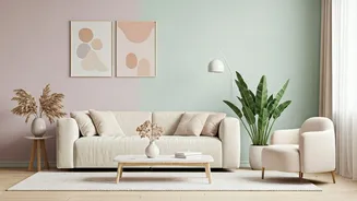


Neutral Walls, Bold Rugs
When your walls are painted in a solid, adaptable neutral shade, they act as a versatile backdrop for your rug choice. Interior designer Janine Weeks often
opts for rugs featuring playful, graphic metallic designs to complement these serene walls. This pairing achieves a look that is undeniably neutral yet far from monotonous, injecting an element of surprise and contemporary flair into the space. The beauty of this combination lies in its flexibility; you can confidently reverse the approach, placing neutral rugs against walls with graphic metallic patterns, and still achieve a sophisticated and modern aesthetic that feels both grounded and exciting.
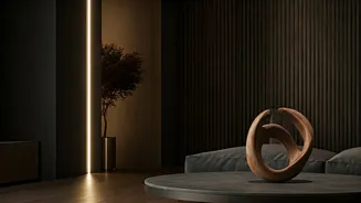
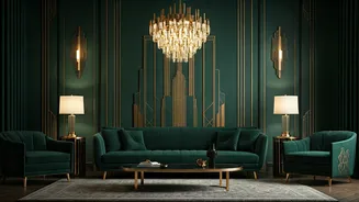
Moody Navy & Ebony
This combination might initially sound too dark, but its potent, moody atmosphere is precisely what makes it so effective. Designer Janine Weeks is currently drawn to spaces that exude personality and a sense of depth. Pairing two dark hues might seem unconventional, yet it results in a high-impact, enveloping effect that makes a room feel incredibly intimate and cozy. When both the walls and the flooring share a deep, dark palette, it effectively draws attention to and highlights other decorative elements within the room, such as artwork, allowing them to become focal points.
Deep Cream & Blue
Another captivating choice for those who appreciate a darker, more atmospheric feel is the pairing of deep blue walls with a creamy rug. Interior designer Elizabeth Vergara highlights this as an excellent option for creating a luxurious, moody ambiance without overwhelming the space with color. Blue is celebrated for its enduring versatility, and when juxtaposed with cream, it evokes a sense of natural earthiness without the need for green tones. This sophisticated combination offers a rich visual experience that feels both grounding and opulent, perfect for a refined interior.
Off-White & Light Gray
This enduring, classic combination is a perennial favorite and is unlikely to ever fall out of favor. Its inherent simplicity makes it exceptionally easy to style, allowing it to seamlessly adapt to a wide spectrum of interior design aesthetics. Elizabeth Vergara frequently recommends a light gray wall paired with an off-white rug, particularly for clients seeking a neutral room that eschews traditional cream or brown palettes. This pairing provides a clean, understated foundation that feels fresh and modern, offering a subtle alternative to warmer neutral tones.
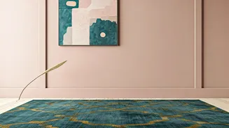
Pastel Purple & Soft Yellow
For those with a more adventurous taste or who embrace a maximalist design philosophy, the interplay of purple and yellow can be a delightful choice. Elizabeth Vergara finds this combination particularly appealing, as these hues possess a natural ability to complement each other beautifully, lending a bolder statement to a room. She suggests pairing soft yellow walls with an abstract rug in a pastel purple shade. To further unify the space, she recommends incorporating elements like throw pillows, blankets, and curtains that echo these chosen colors, creating a harmonious and vibrant environment.
Cream & White Harmony
The pairing of cream and white is another time-tested classic that consistently delivers impressive results. Much like the cream and light gray combination, these shades blend harmoniously to cultivate an airy and luminous atmosphere within a home. This aesthetic feels effortlessly fresh, sophisticated, and wonderfully cozy. Elizabeth Vergara often turns to the tried-and-true approach of off-white walls with a cream rug, viewing it as an excellent way to establish a blank canvas. This strategy allows all other decorative pieces and furnishings in the room to take center stage and express their unique character.